95 m2 apartment with a study for a young family in Moscow: Photos, Video, and Interior Estimate

This is the second apartment we have worked on for these clients. Having previously collaborated with us on an interior design project for their relatives, they confidently entrusted us with their own, larger apartment. The clients—a young couple working in IT with a small child—wanted to have a clean, light-filled interior where they could recharge.
They knew that, beyond aesthetics, ensuring the family's comfort required key technical systems: supply ventilation, air conditioning, and humidification. We developed the engineering plans and seamlessly integrated all of these systems into the interior design. As part of the project, we also prepared a cost estimate and included it in the contract; the total cost remained unchanged throughout the implementation phase.
| Size |
95 m2 |
| Type |
A three-bedroom apartment |
| Years |
2025–2026 |
| Features |
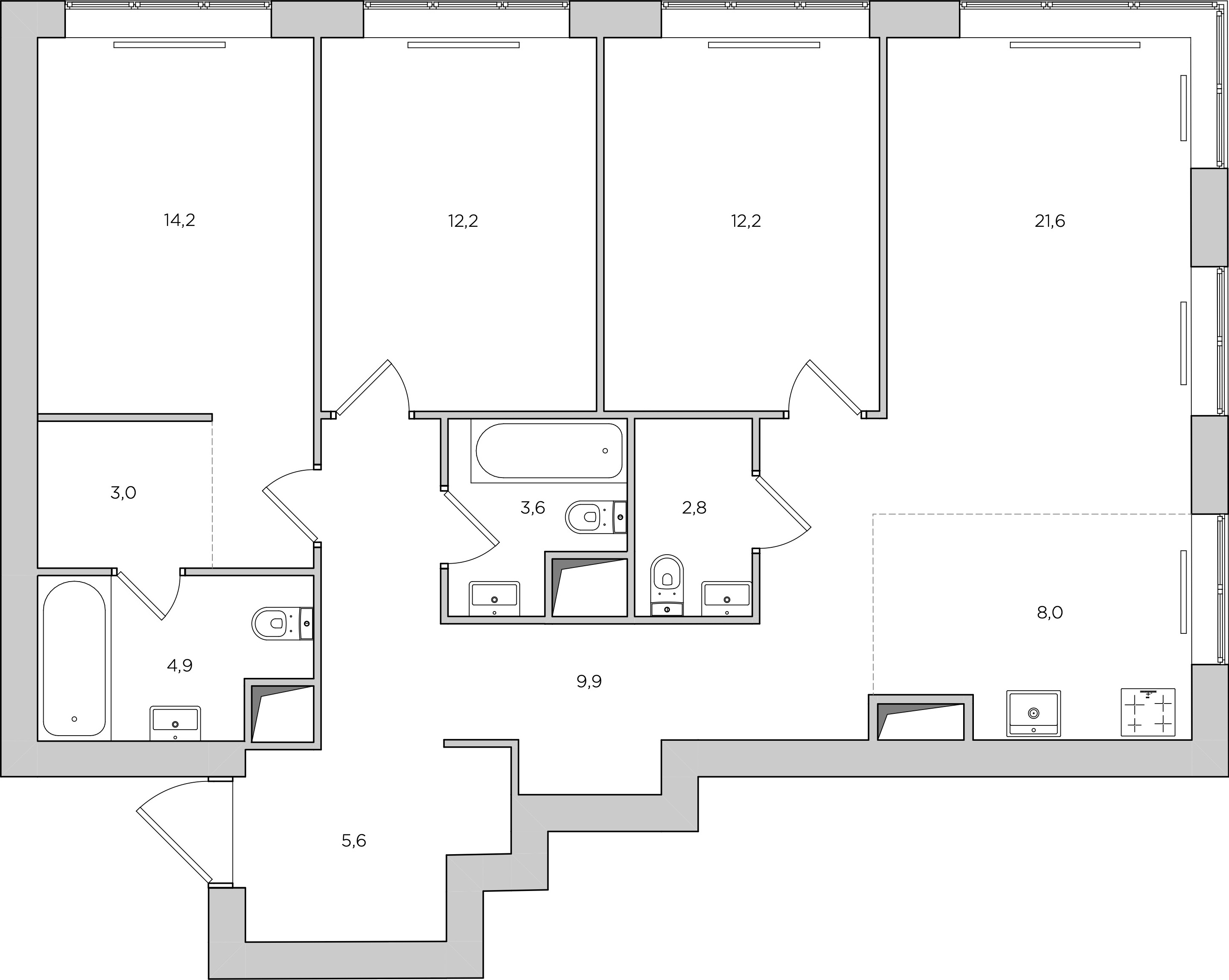
A long, irregularly shaped corridor; a kitchen niche that cannot accommodate a full set of kitchen cabinets |
The dressing room is separated from the bedroom by a partition wall
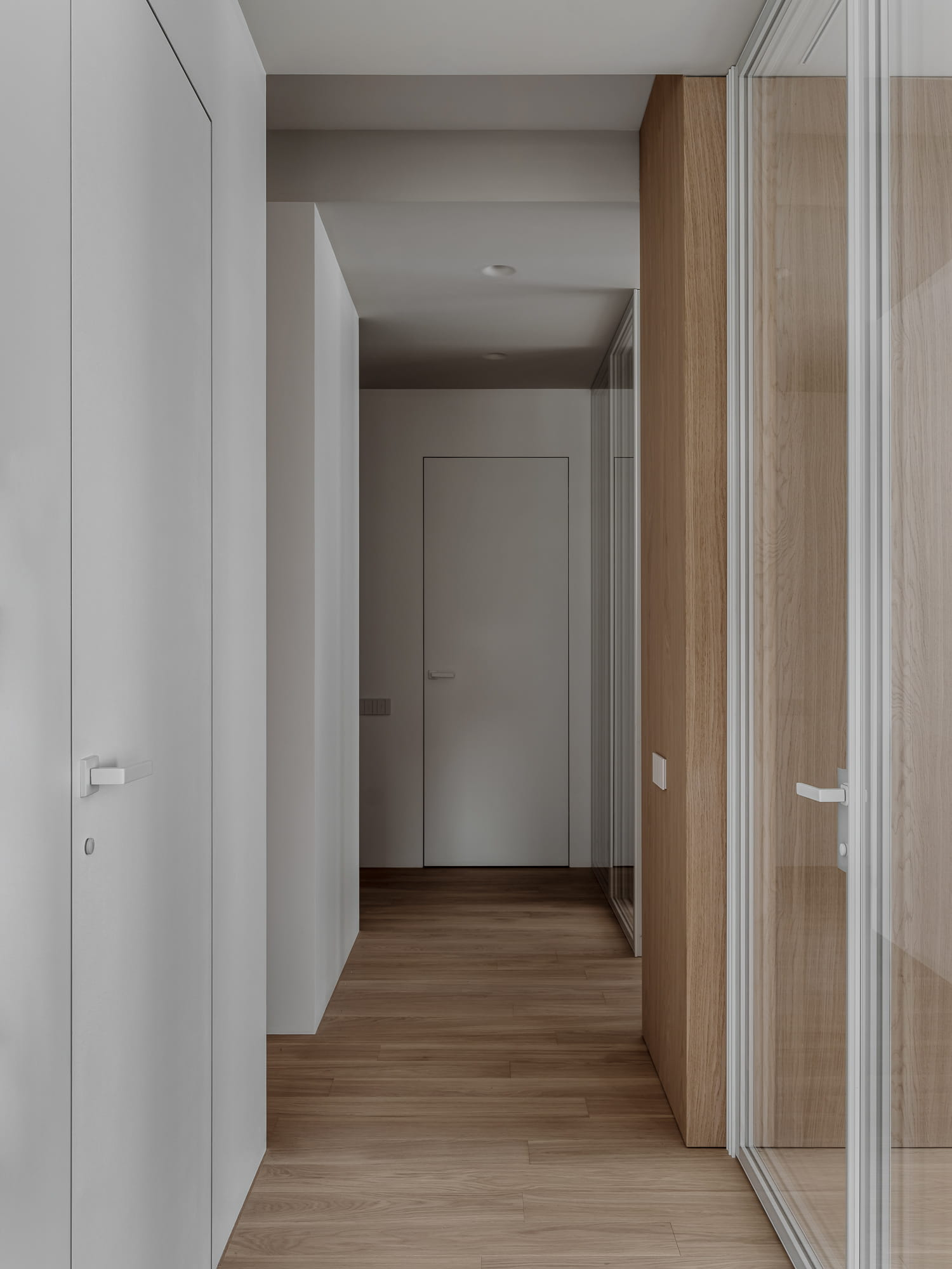
A long, irregularly shaped corridor
A small kitchen niche surrounded by the living area
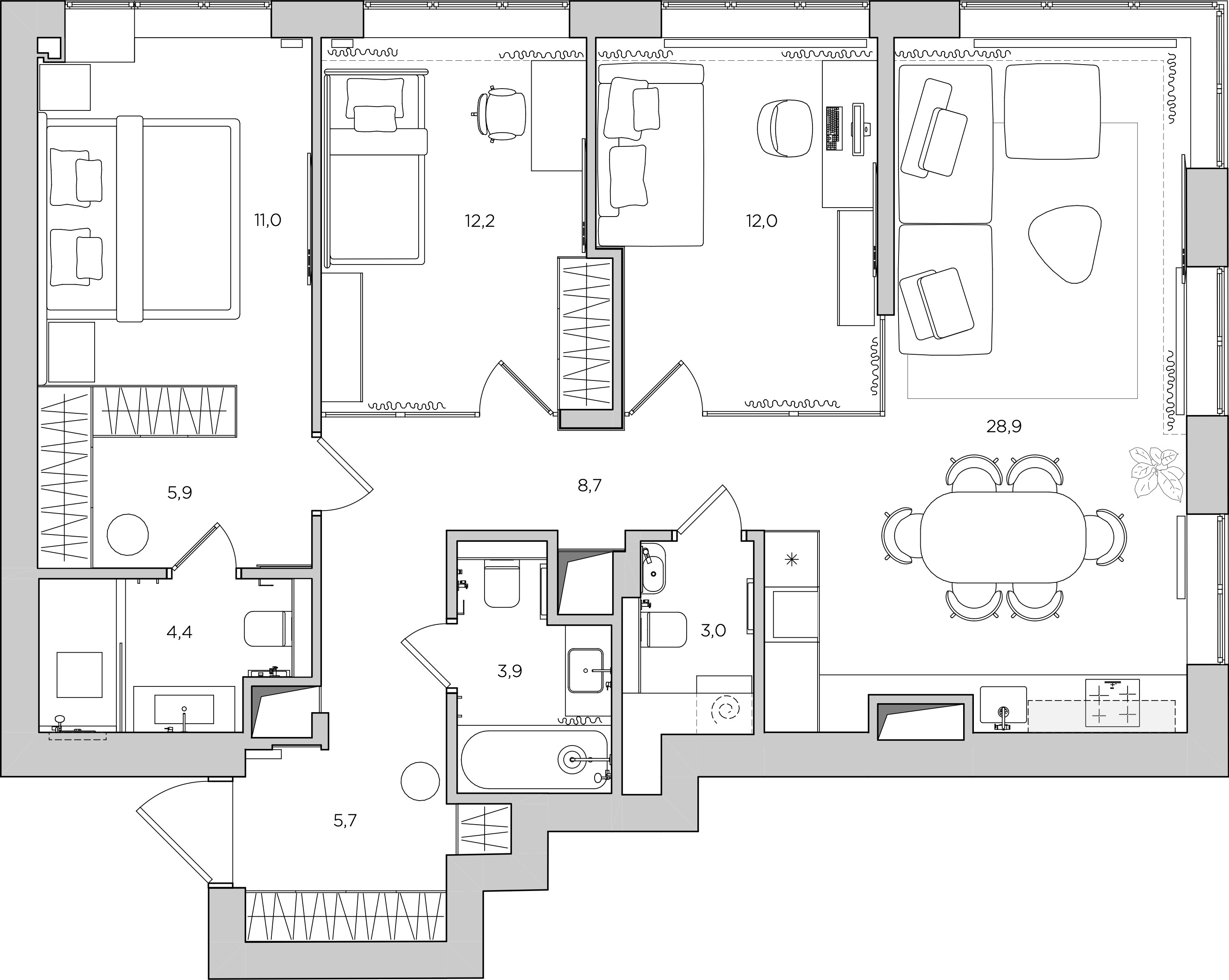
Separated the dressing room from the bedroom using a wardrobe instead of a partition wall, which saves space
Relocated the bathroom and toilet to make room in the kitchen for tall units housing appliances and storage
Enlarged the kitchen by extending the tall units into the living room area
Installed a glass wall at the corner of the study to create a seamless flow between the two spaces
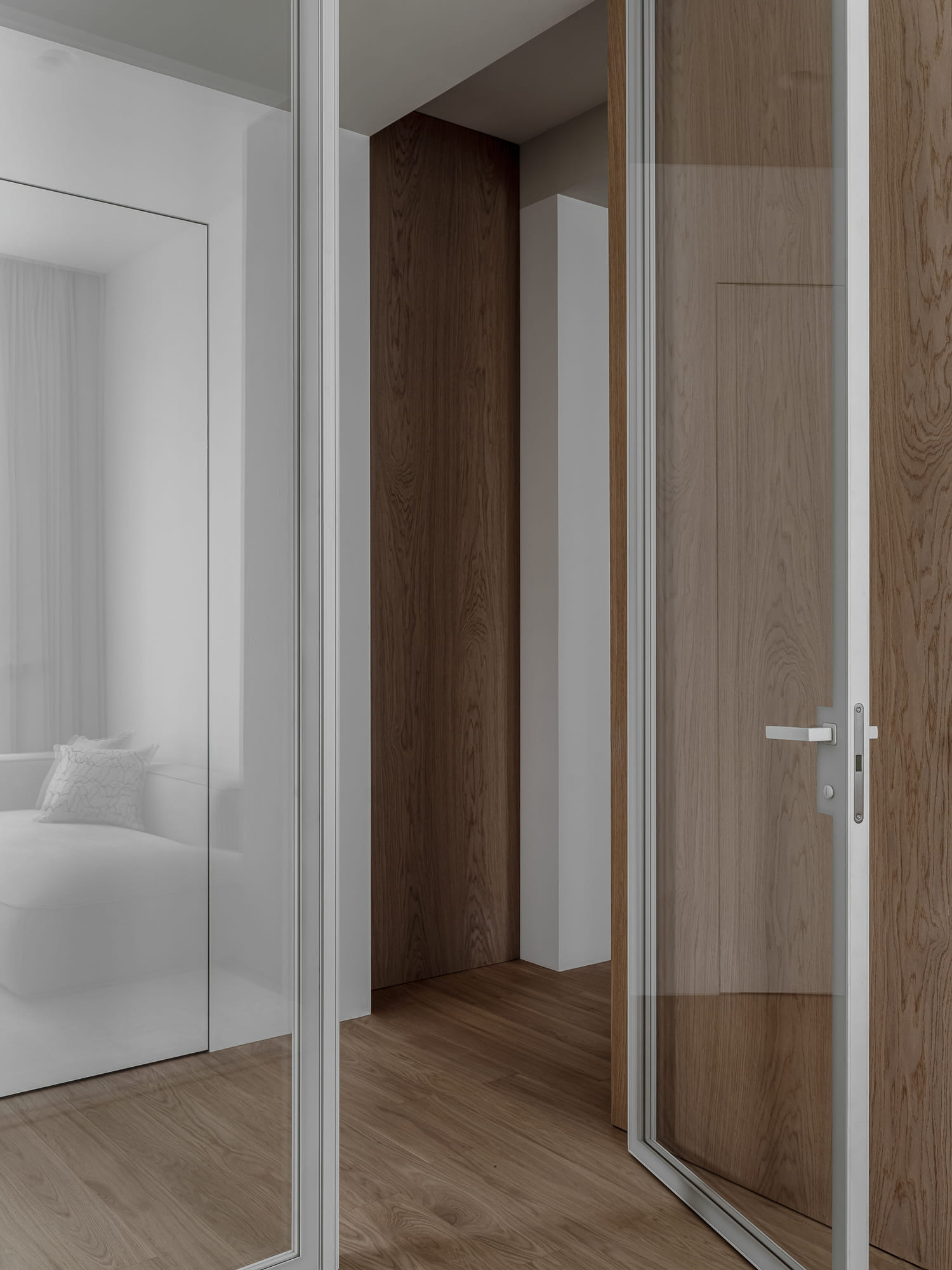
Introduced natural light into the corridor through glass partitions in the child’s room and the study
The clients requested an interior design that was calm, minimalist, and bright. We were excited to take on this project, as it allowed for a thoughtful approach to form. For the finishes, we chose a limited palette of materials: porcelain stoneware with a subtle texture, understated oak veneer, and white paint for the walls and ceilings. To introduce contrast within this light palette, we incorporated furniture with a metallic enamel finish, which interacts with light and appears different depending on the viewing angle.
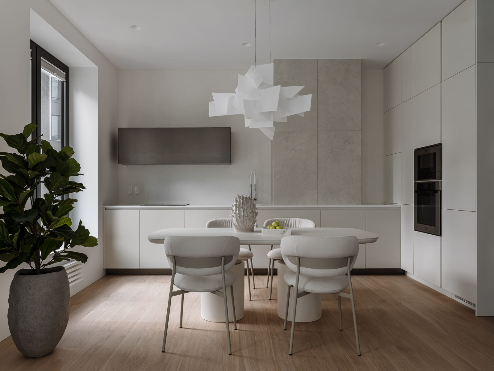
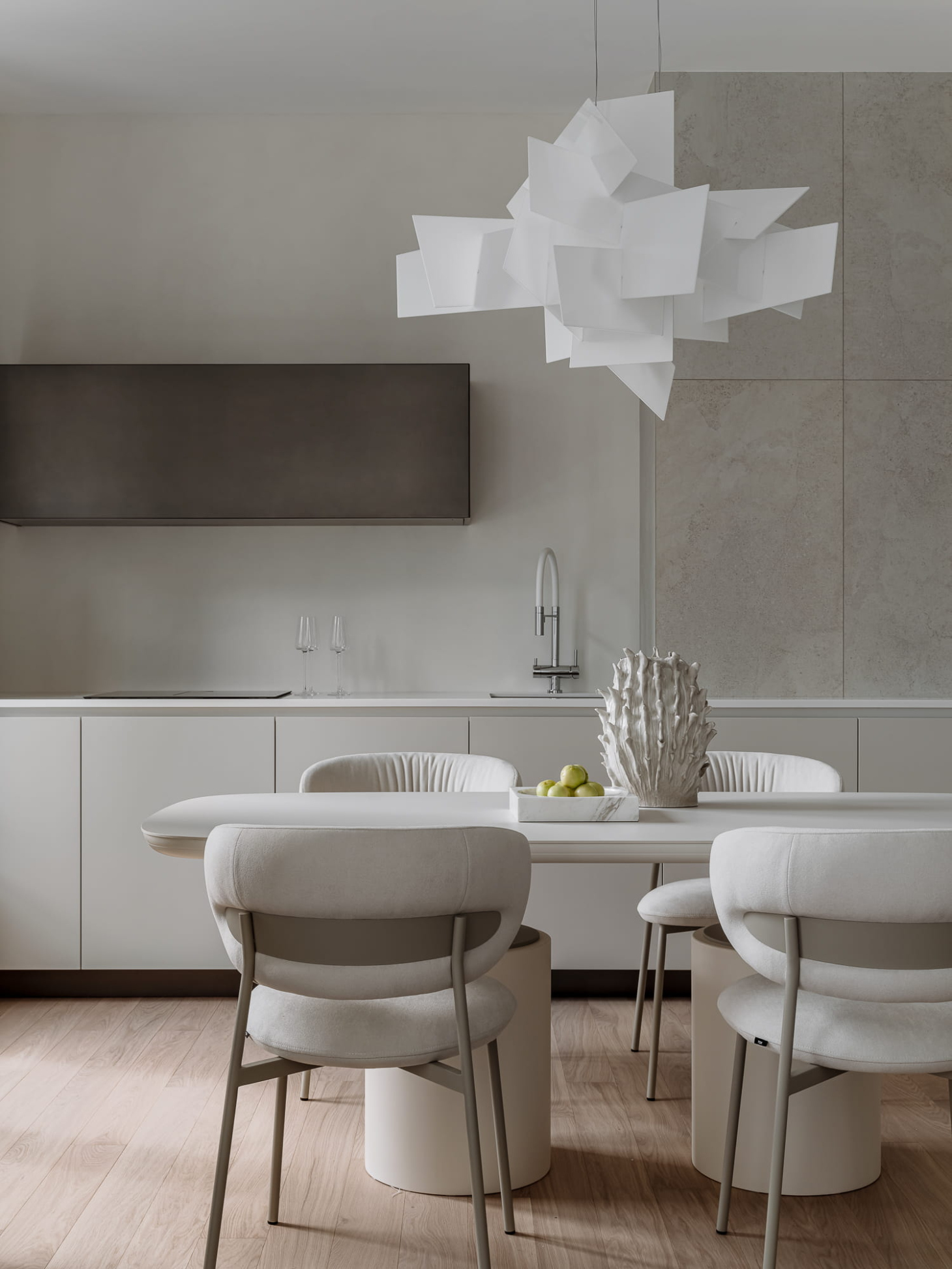
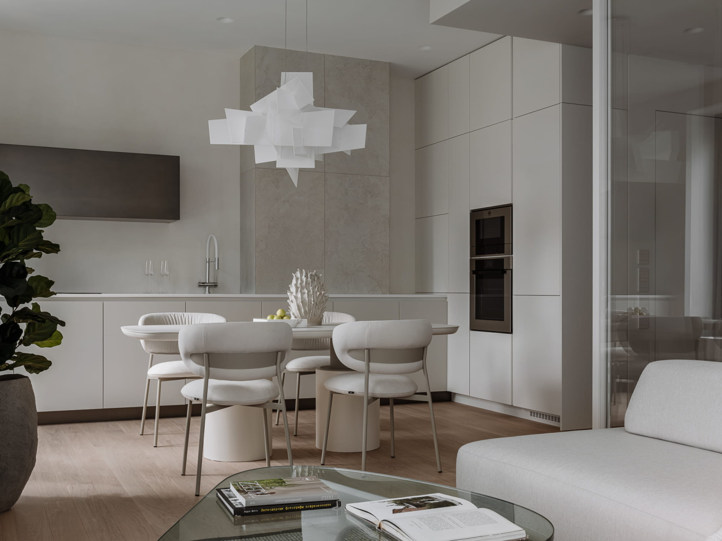
We finished the wall-mounted kitchen cabinet in the same metallic enamel. We intentionally left some space between the cabinet and the ceiling and walls to prevent the unit from overwhelming the area, allowing it to complement the clean lines of the kitchen-living space. This cabinet does not contain a range hood; instead, the extractor is built into the cooktop. The lower kitchen units resemble a neat white chest of drawers with integrated handles. These units wrap around the ventilation shaft, which we covered in porcelain stoneware laid without offset or trimming. The resulting consistent lines ensure that the shaft does not draw unnecessary attention.
We placed the tall kitchen units in what used to be the living room, allowing us to create a spacious kitchen and dining area. This transformation wouldn't have been possible if we had remained within the original confines of the kitchen space.
By the way,
If you're looking for a stunning design and top-quality renovation without getting into the details, please submit a request
By the way,
If you're looking for a stunning design and top-quality renovation without getting into the details, please submit a request
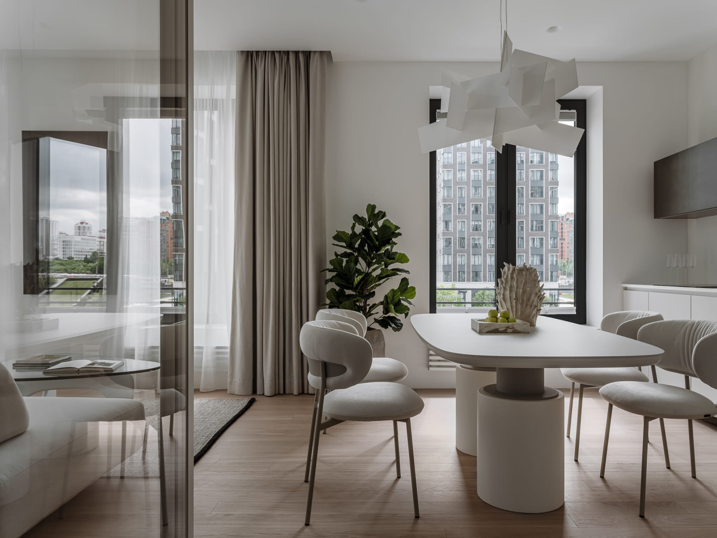
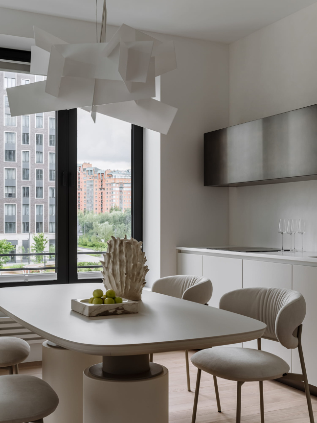
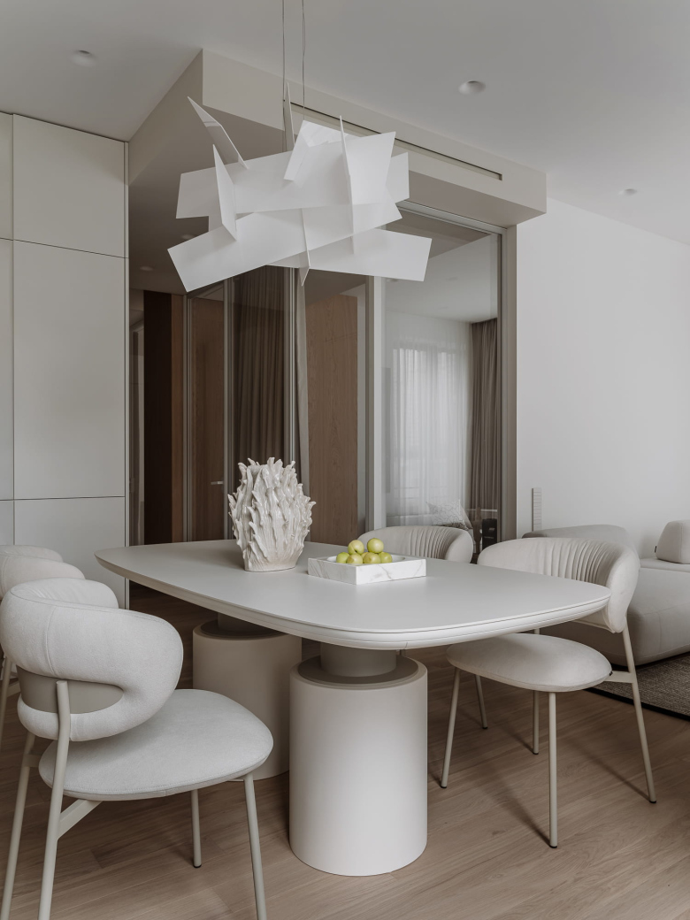
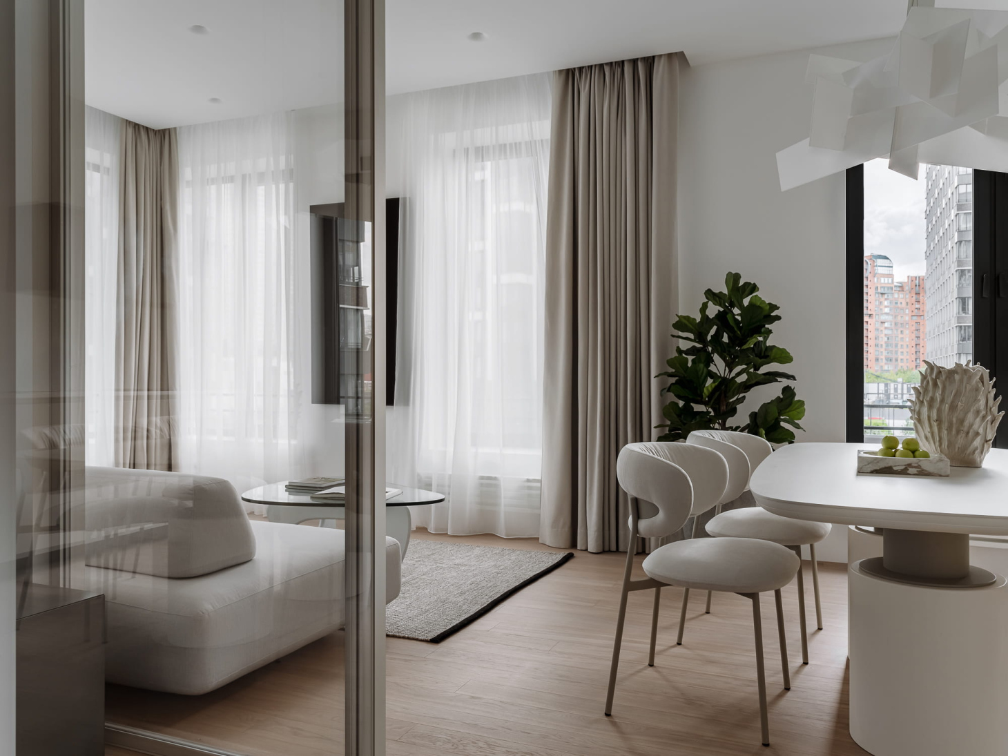
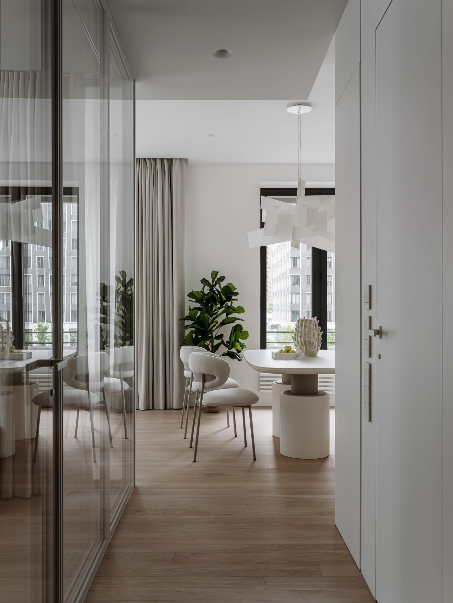
Against the backdrop of the graphic kitchen, we designed a more dynamic dining area that features a table and chairs with fluid lines, along with a light fixture comprised of chaotically splayed panels.
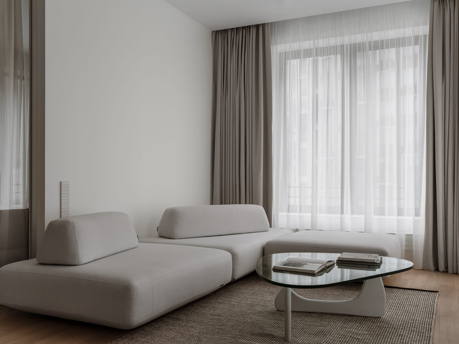
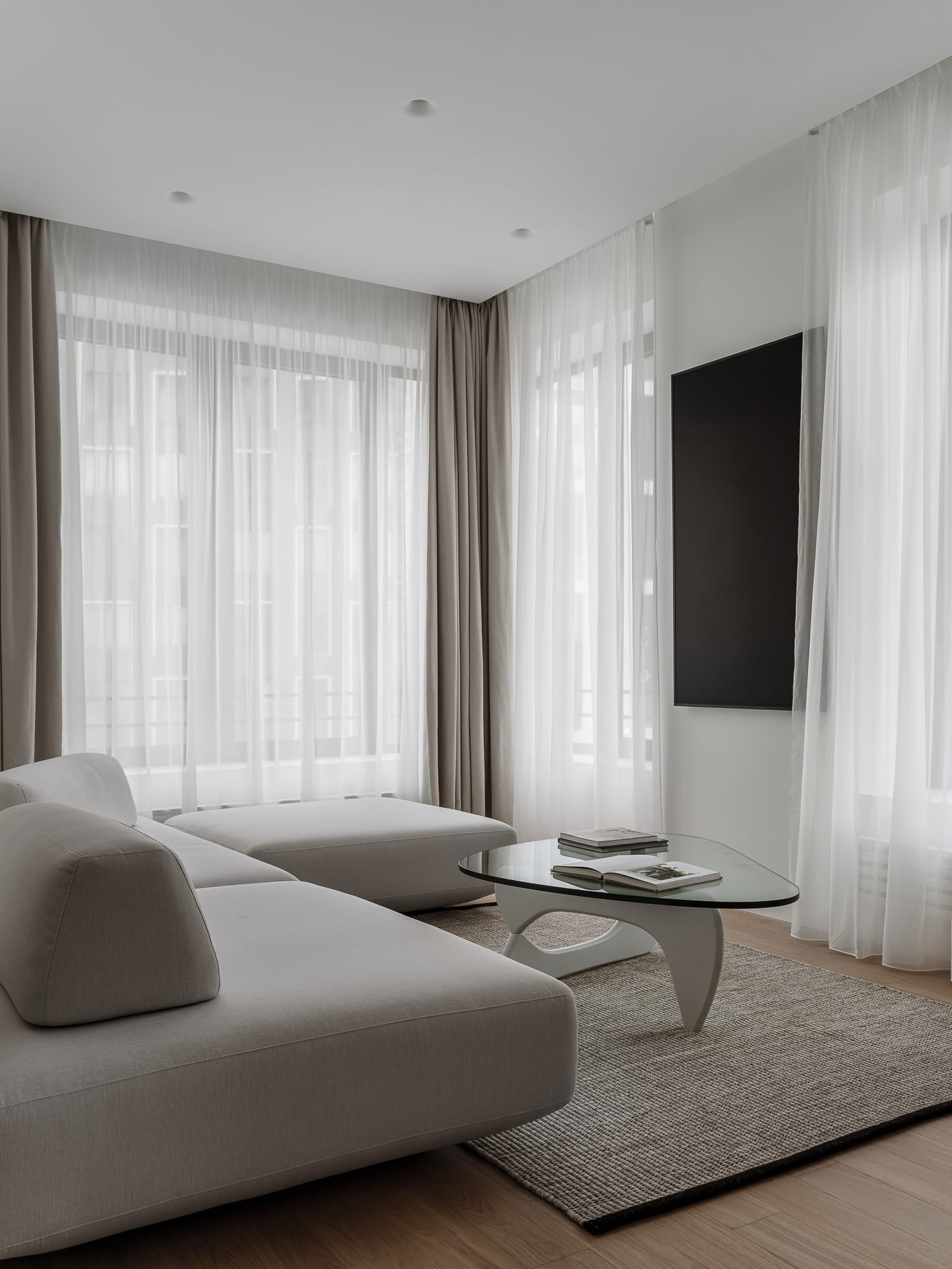
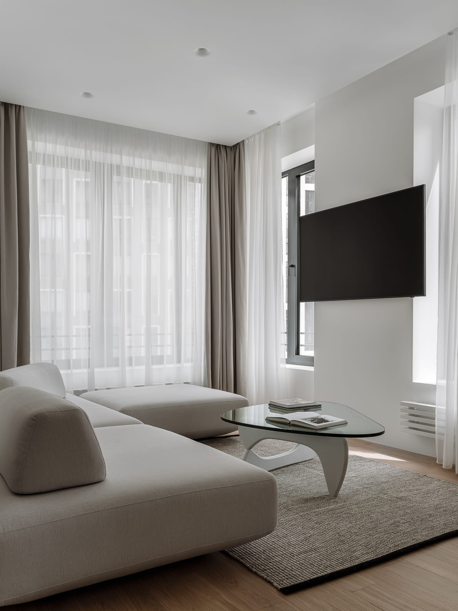
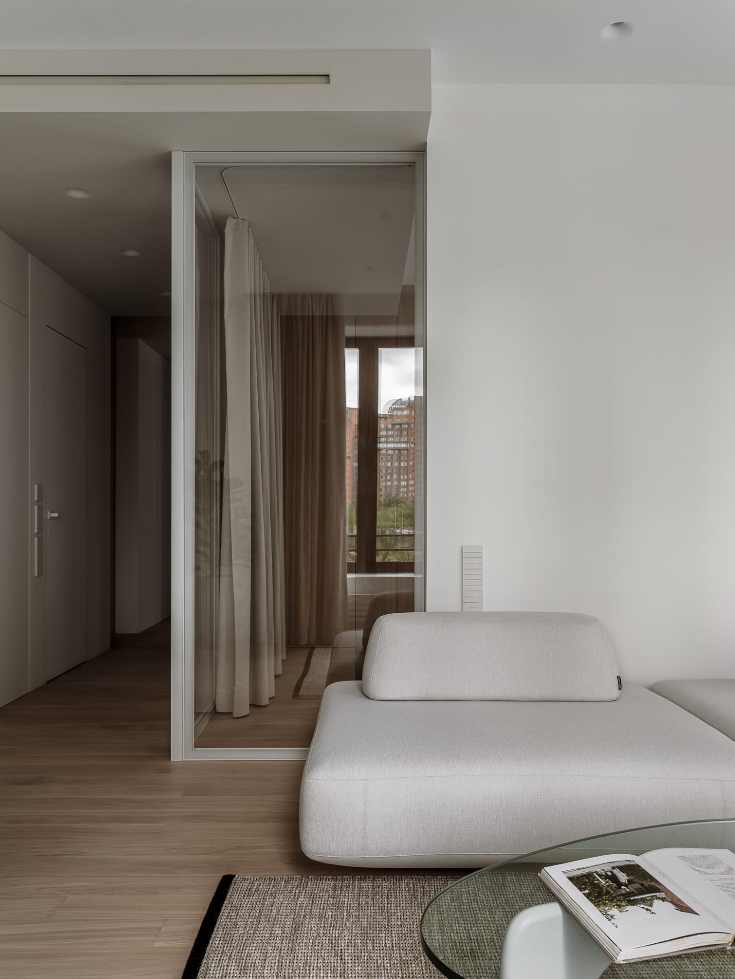
A low modular sofa occupies the main area of the living room. The sofa is approximately the same height as the windowsills of the large windows, making the room feel spacious and visually clean.
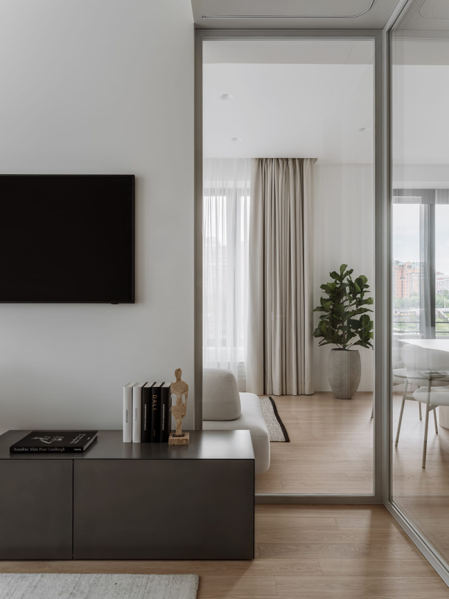
Across from the sofa, there is a TV mounted on a swivel bracket, positioned vertically. Since the mounting pillar is narrower than the TV's diagonal, together with the clients, we decided that keeping the TV vertical when not in use would be the neatest solution. This way, the TV fits neatly within the width of the pillar without blocking the window. If the clients prefer, they can easily conceal it behind the sheer curtains and drapes.
The kitchen and living area has an elongated shape. To create a more spacious feel, we replaced the corner partition that separated it from the study with a glass wall. This change allows for visibility from the kitchen-living area into the study, effectively merging the two spaces and making the combined area feel larger and brighter.
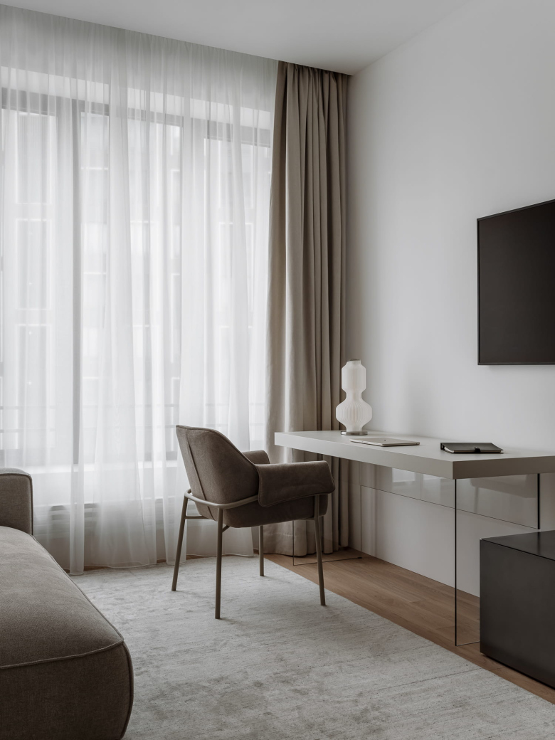
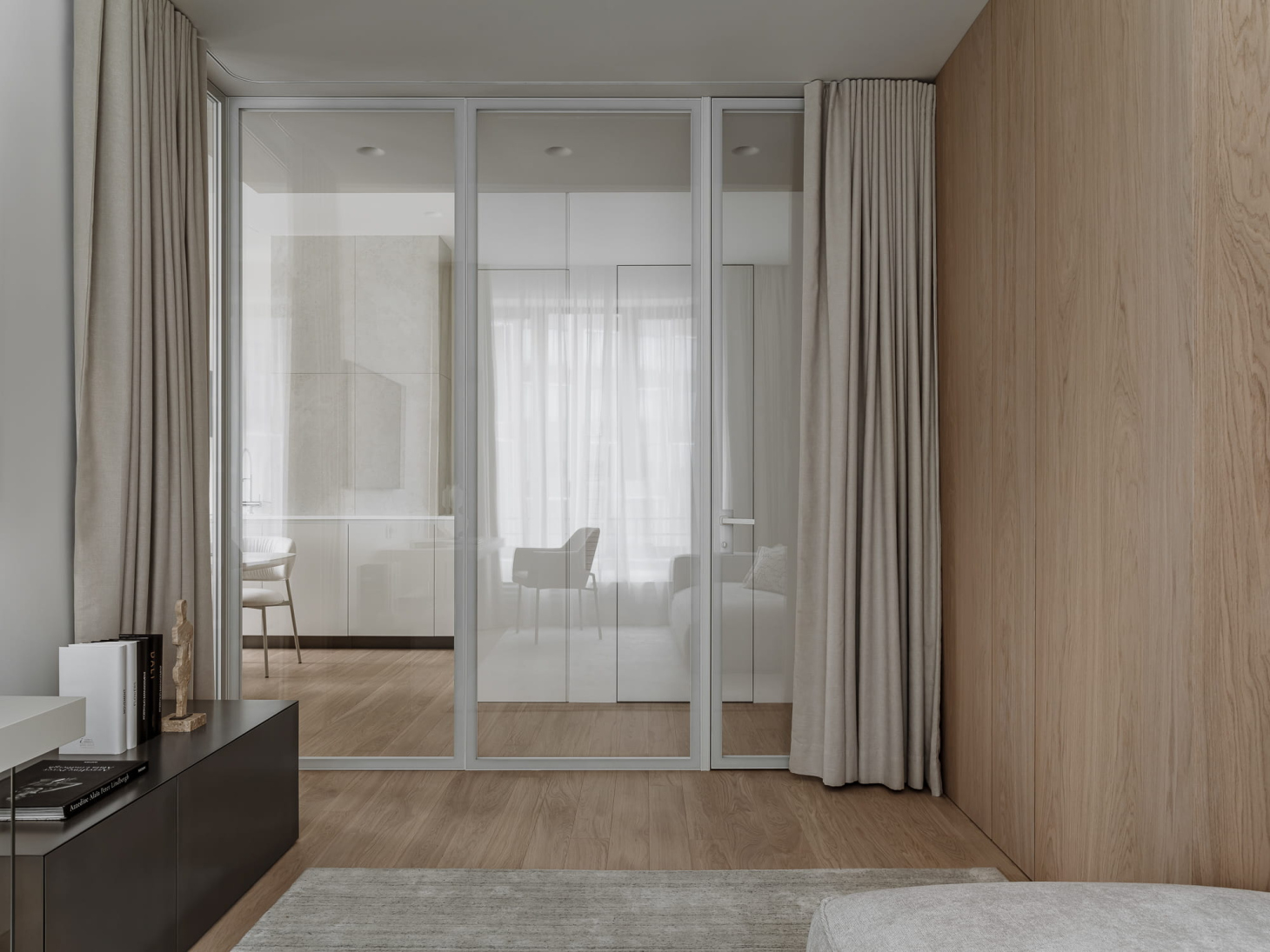
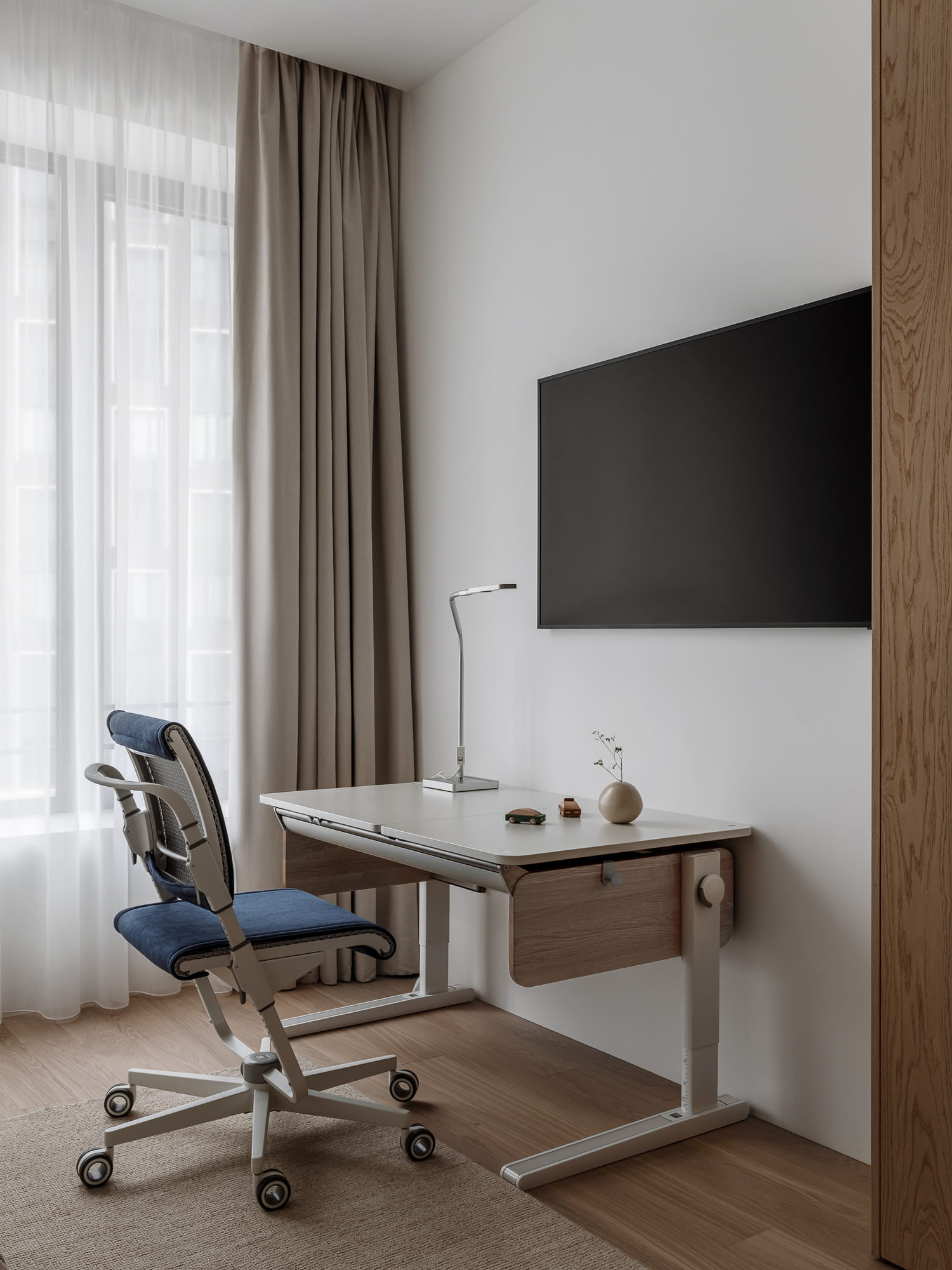
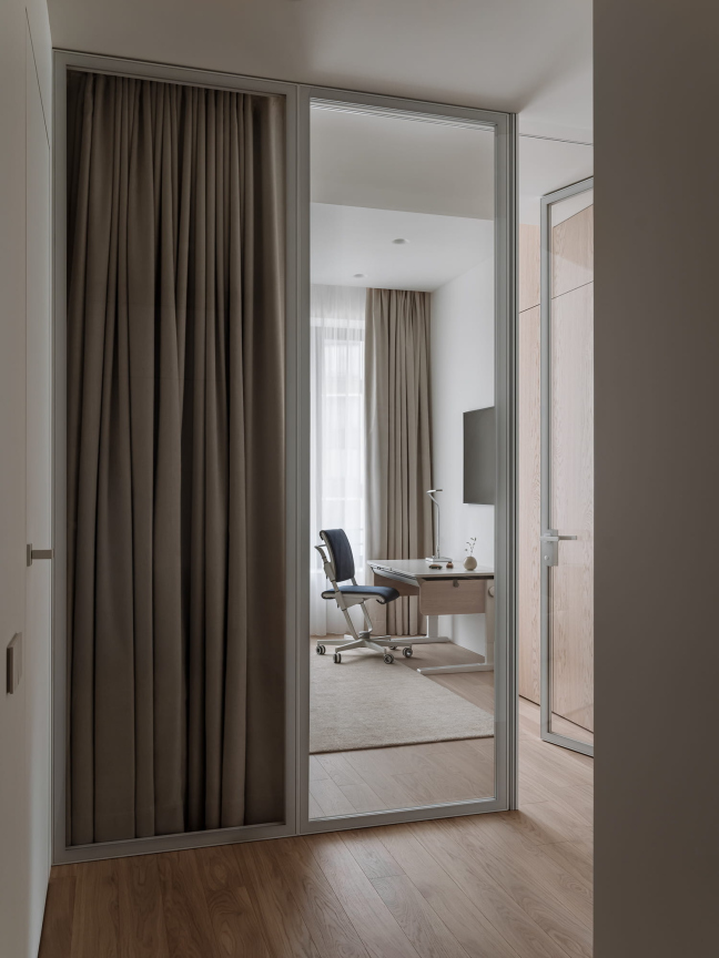
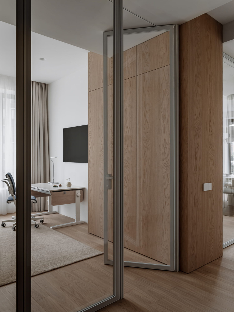
The study can be made private by using a heavy curtain. Inside, we have placed a desk supported by glass legs, a cabinet with a metallic enamel finish on the right, and a small sofa opposite the desk. On the study side, the oak-clad volume is formed by wall panels; on the child’s room side, it accommodates a wardrobe. This study has the potential to serve as a second child's room; we selected freestanding furniture specifically to accommodate this future possibility.
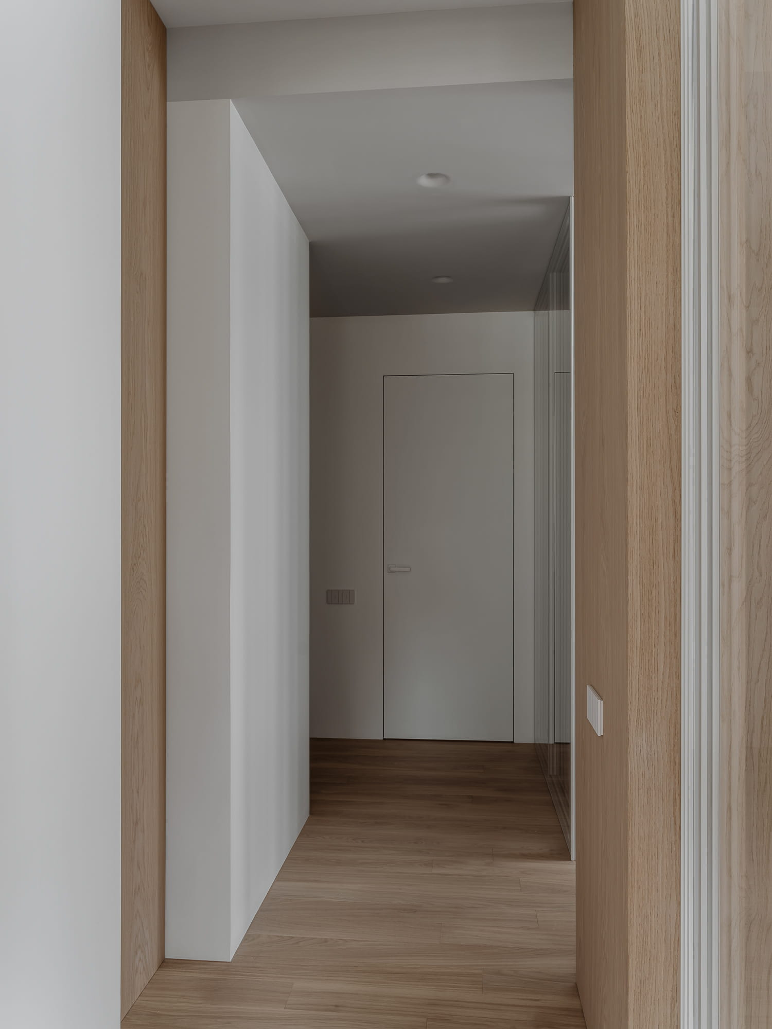
The wardrobe and wall panels create a striking sense of depth and dimension, enhancing not only the rooms but also the corridor. We intentionally extended the end of the wardrobe outward to add visual interest to the corridor. Opposite this projecting section, we included a niche of the same width, also finished in oak veneer. This niche helps to break up the monotony of the white wall.
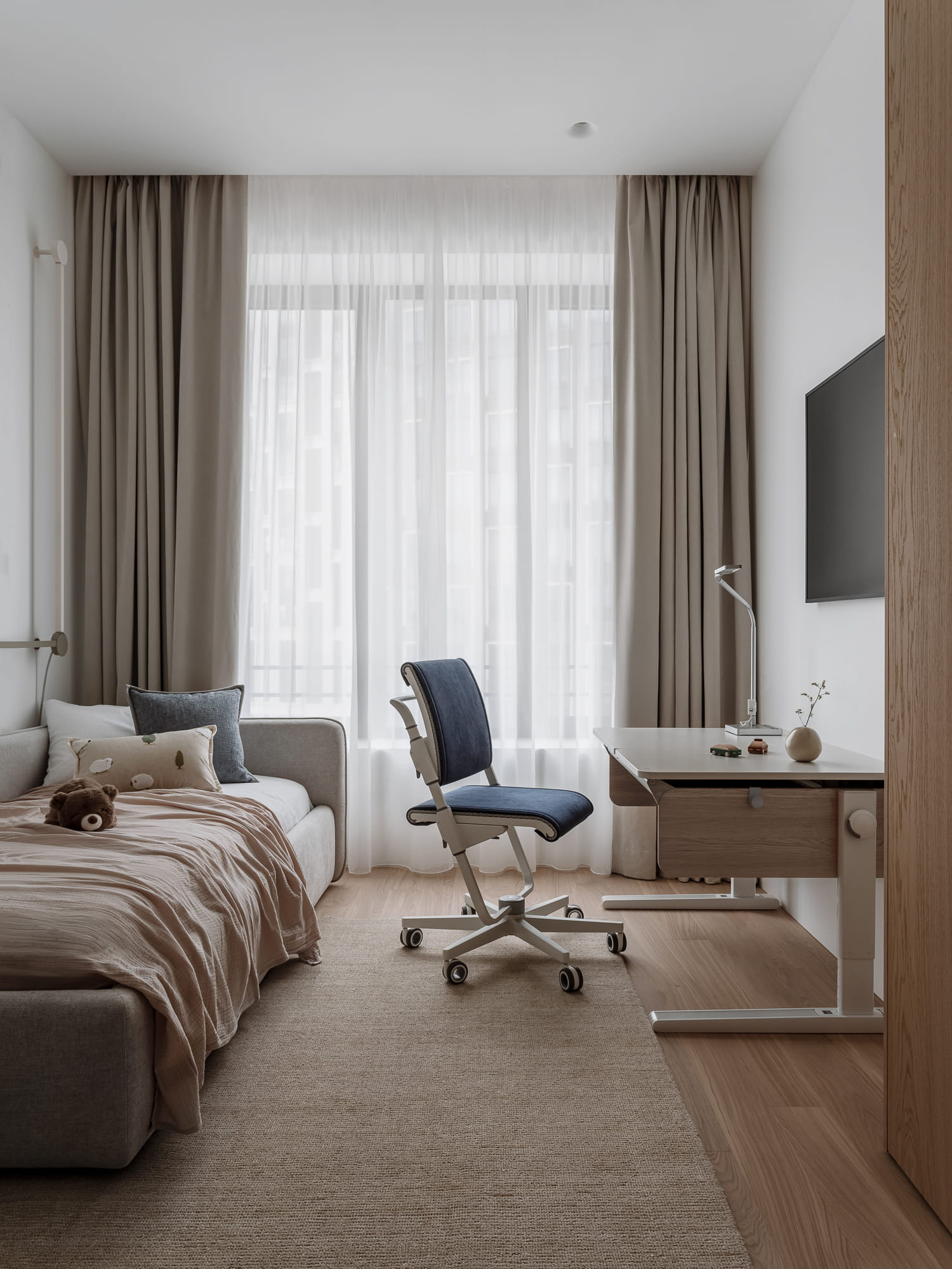
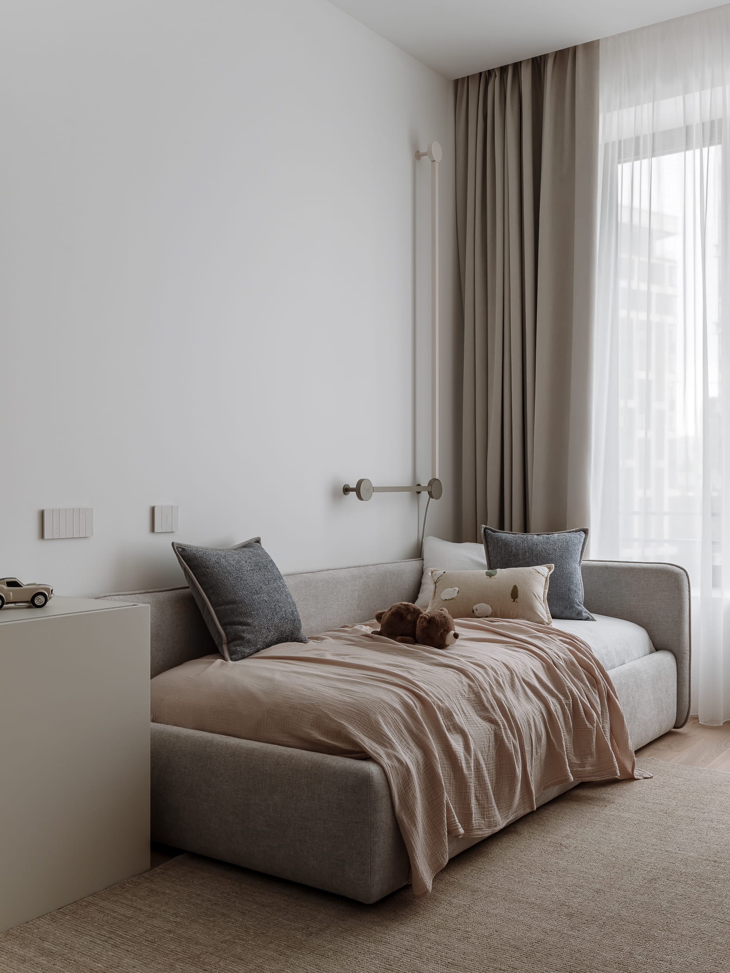
In the child's room, we installed a full-sized bed along with a desk and chair that can grow with the child. Additionally, we included a large wardrobe and a chest of drawers where the young user can store his toys independently.
The partition in the child's room is made of glass, allowing light to flow into the corridor and entryway. By incorporating glass partitions in this area and the study, we addressed a key design challenge: transforming the long corridor that leads from the front door to the kitchen and living area, and integrating it into the overall light-filled interior. As a result of the glass partitions, the corridor now feels much wider and warmer—an effect that is further enhanced by the curtains, which add a touch of soft texture.
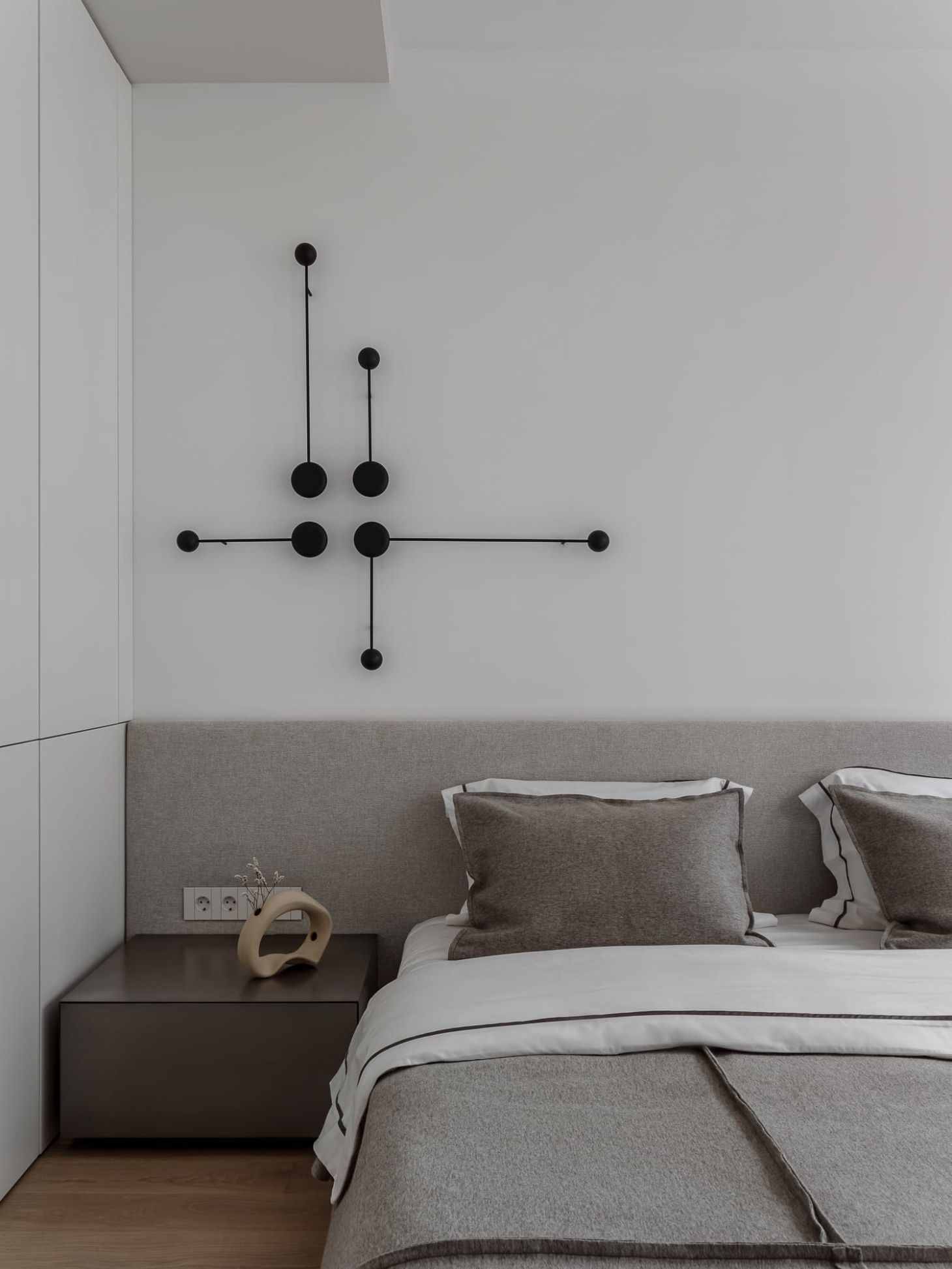
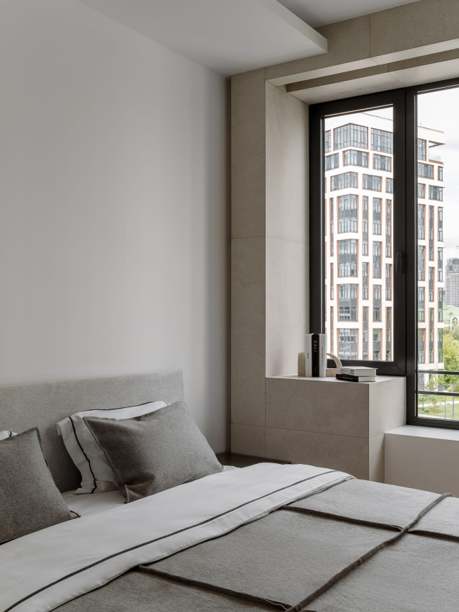
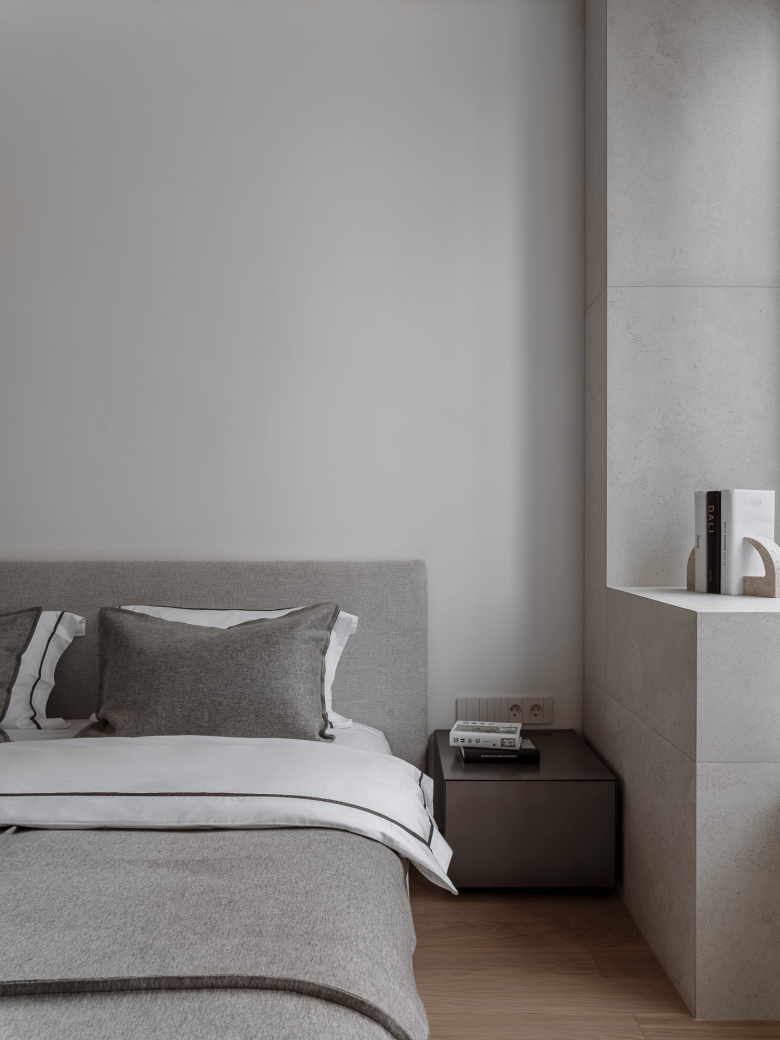
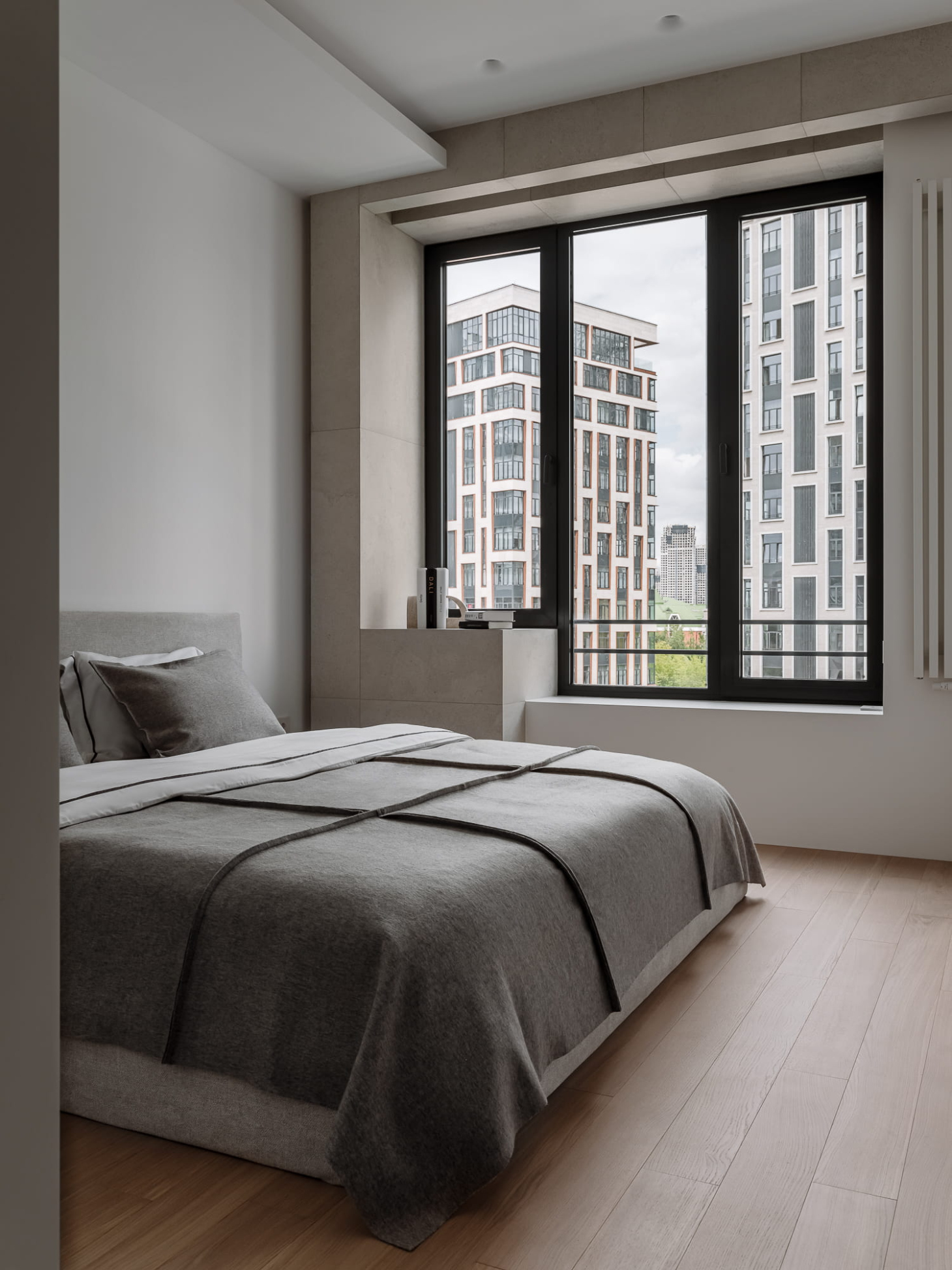
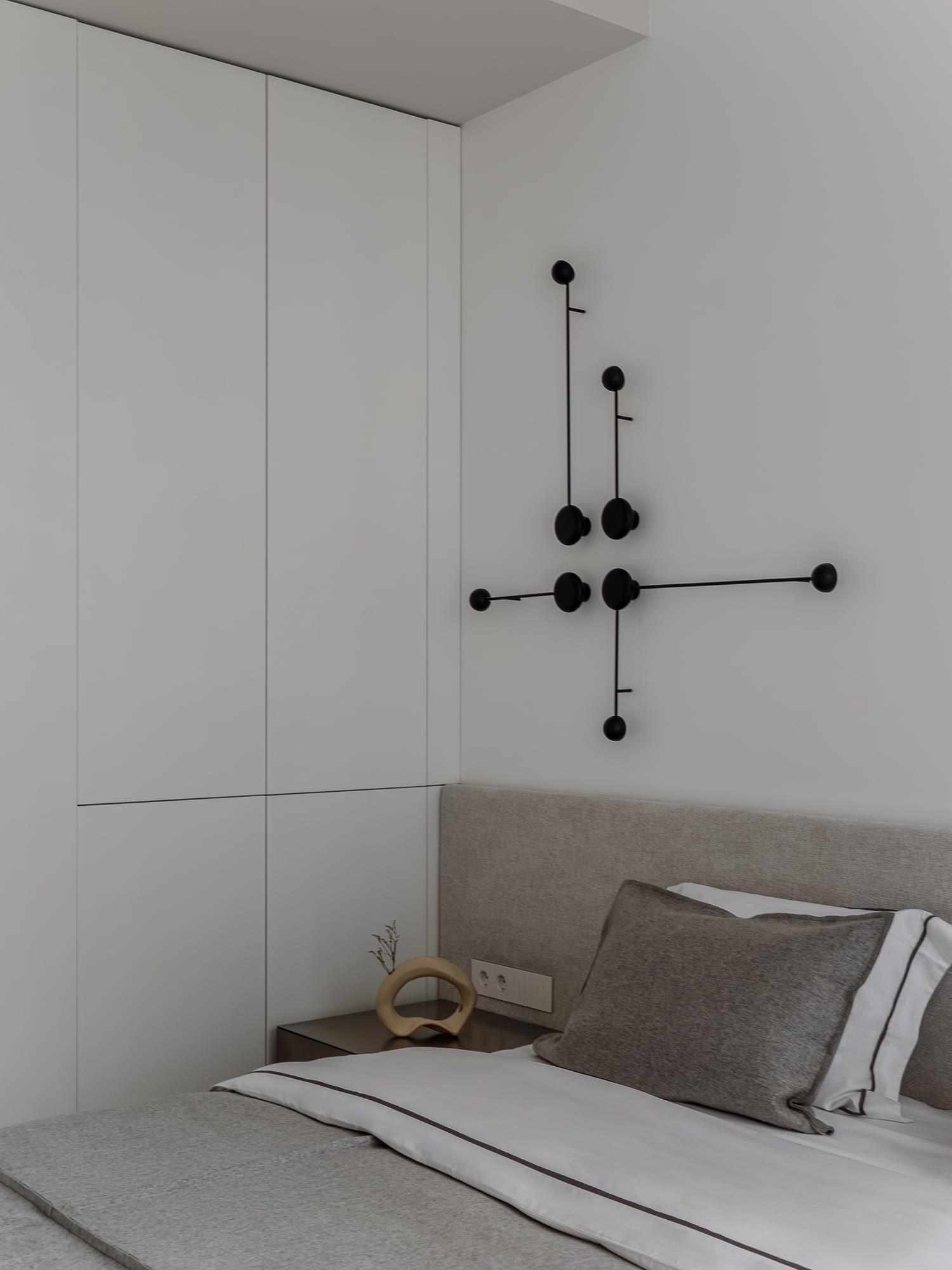
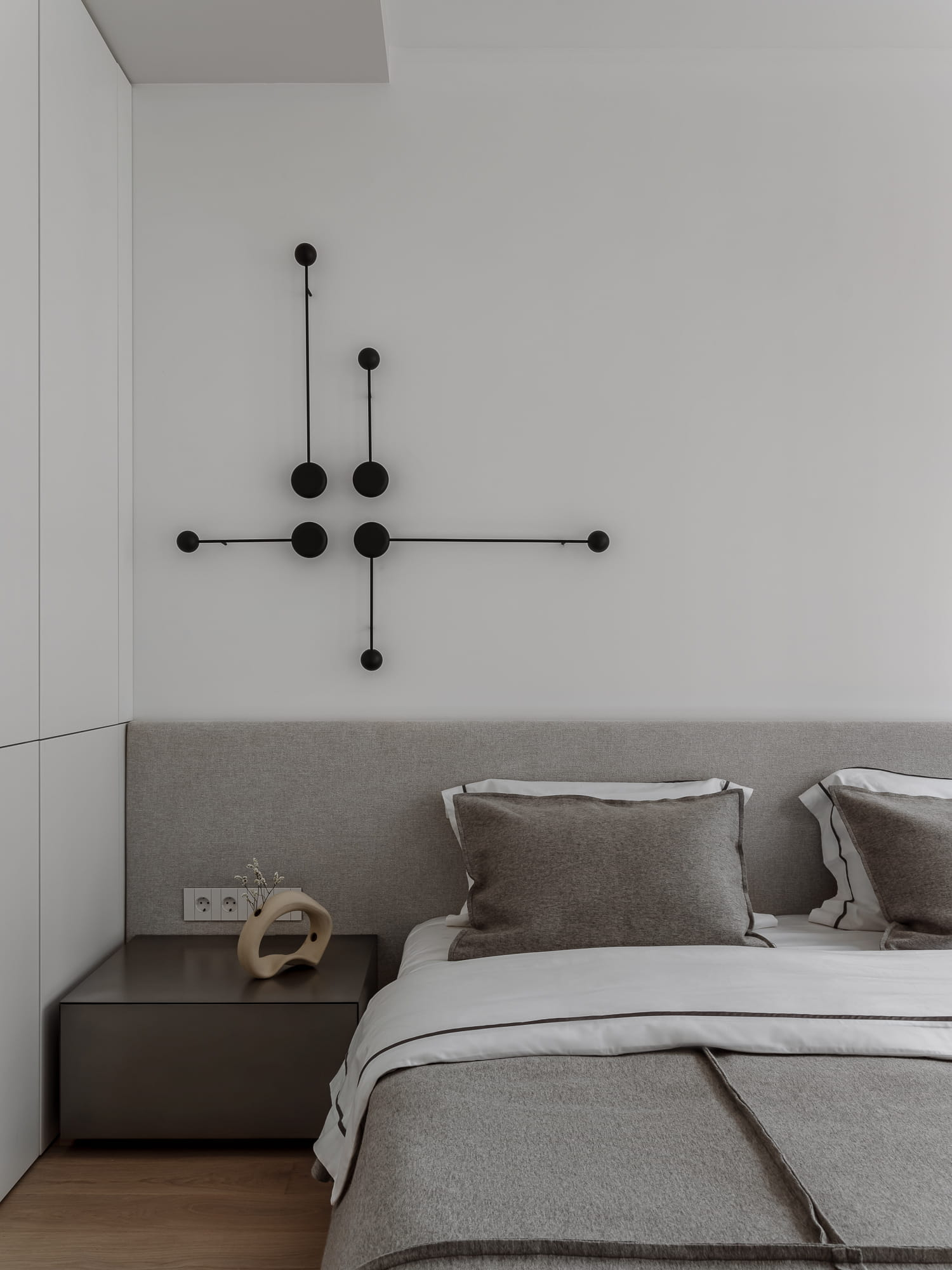
We designed and produced a custom bed for the master bedroom, envisioning a low-profile model with an asymmetric headboard. On either side of the bed, there are nightstands finished in metallic enamel. Above the headboard, a minimalist light fixture with clean geometric lines enhances the wall.
A significant change in the bedroom design occurred during implementation. The developer clarified the regulations regarding outdoor air intake, leading us to build a pedestal by the window to conceal the air duct.
Designing the apartment's climate control system was a crucial part of the interior design and implementation process. One of the main benefits of the supply ventilation system is that it eliminates the need to open windows, protecting residents from the noise and dust of the city. For humidification, we chose a nozzle-based system that operates independently of outdoor temperatures, ensuring consistent performance throughout the winter.
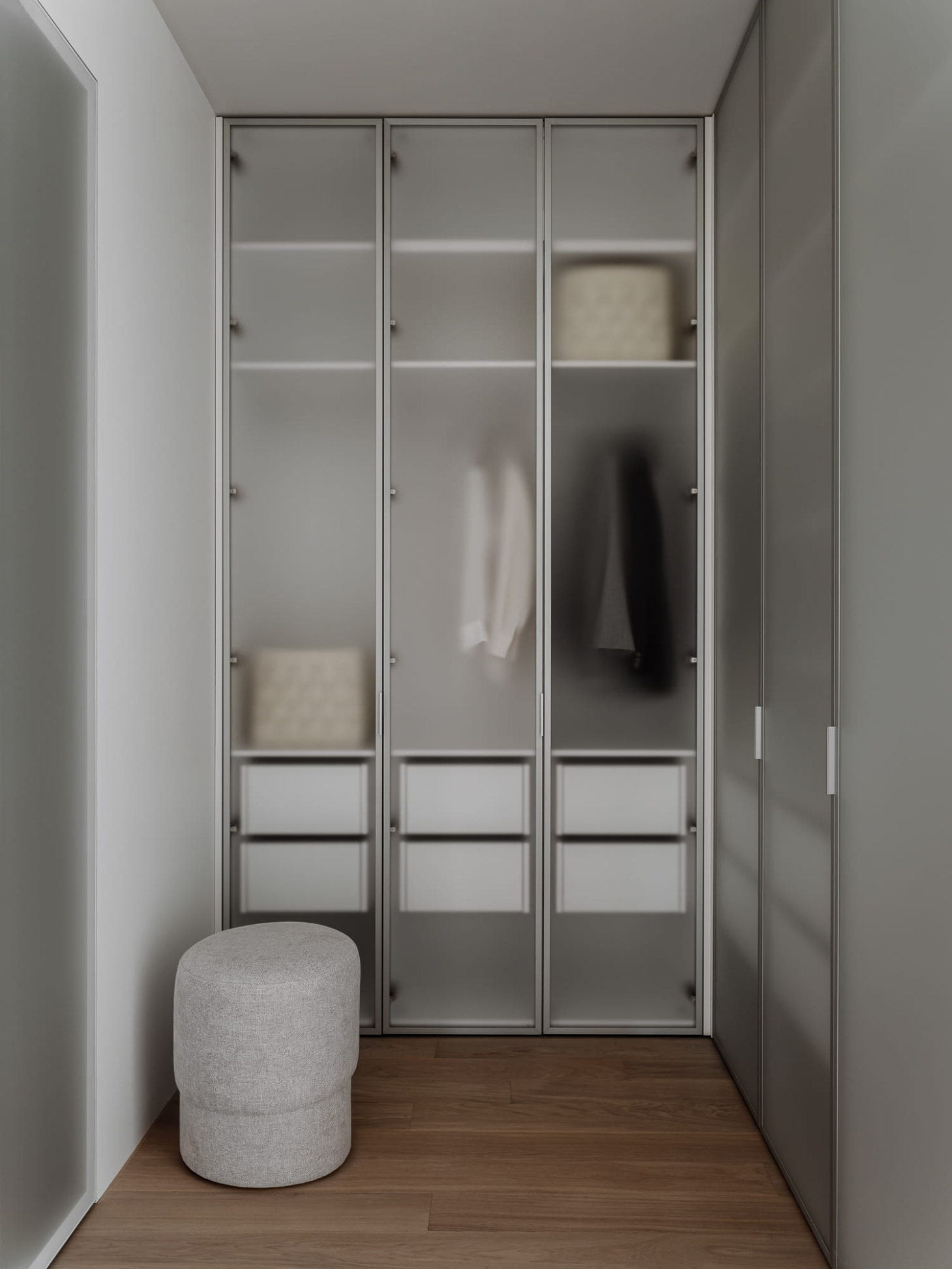
In the original layout, a partition separated the dressing room from the bedroom. We removed this partition to make better use of the space by installing a double-sided wardrobe. The main storage is now located in the dressing room, while a corner module includes shelving that is accessible from the bedroom side.
We intentionally decided not to divide the dressing room from the bedroom with a door. This allows light from the window to illuminate the mirror and wardrobes. The closet fronts are crafted from frosted glass within slim metal frames, and we have installed internal lighting to highlight the shapes of the clothing.
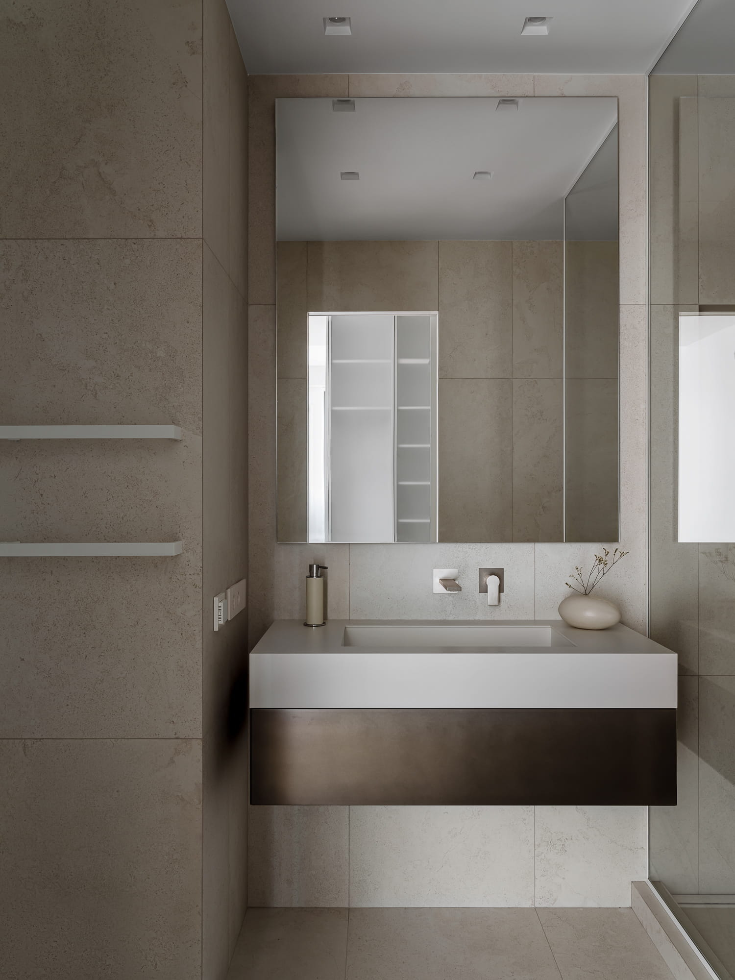
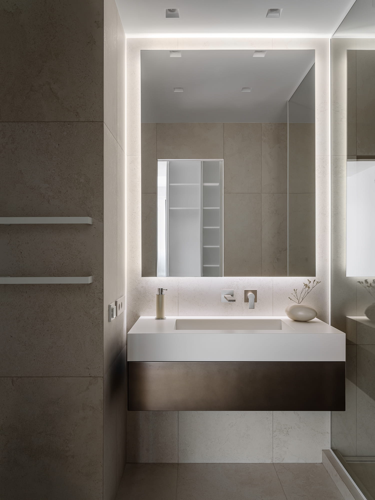
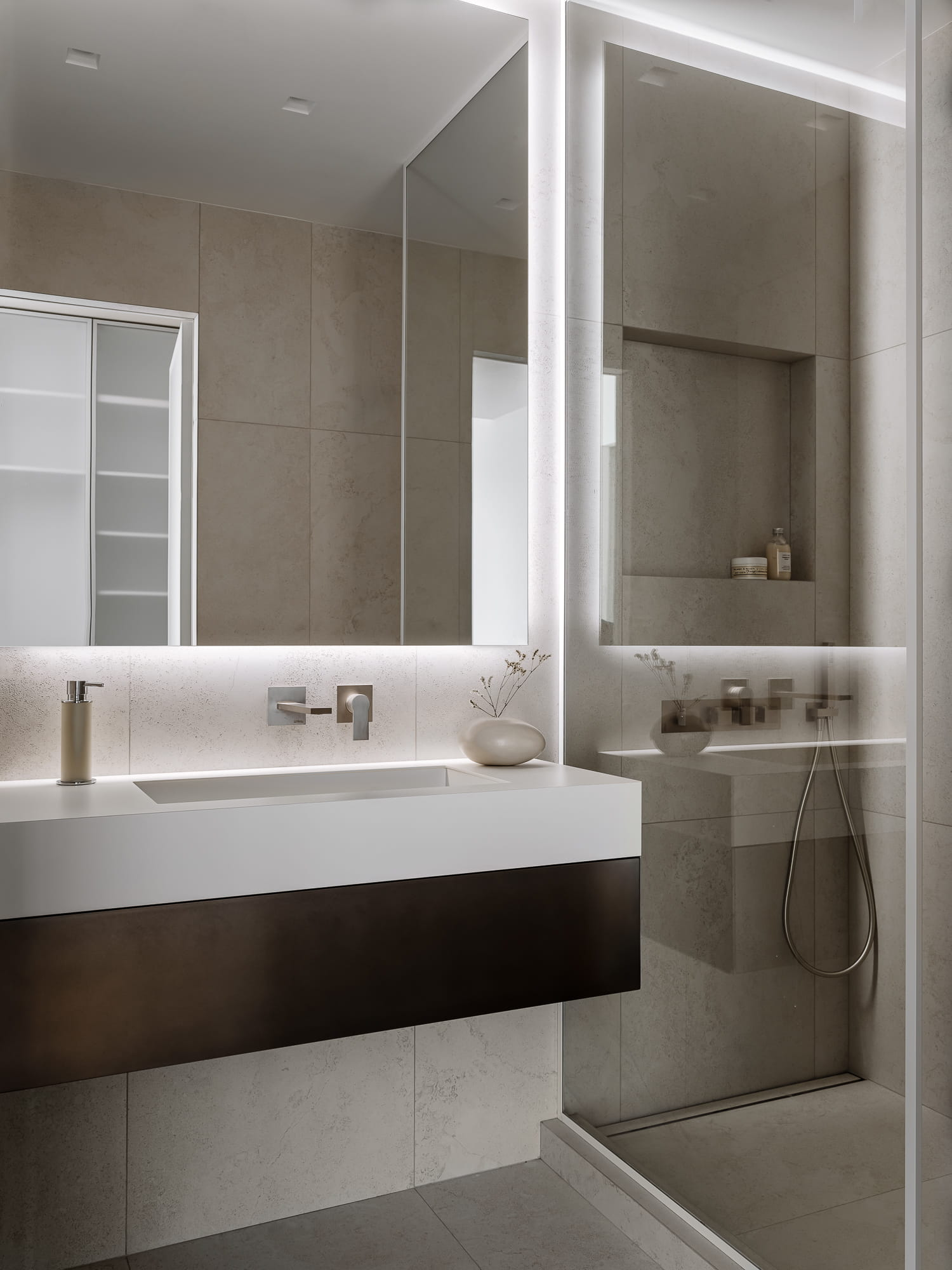
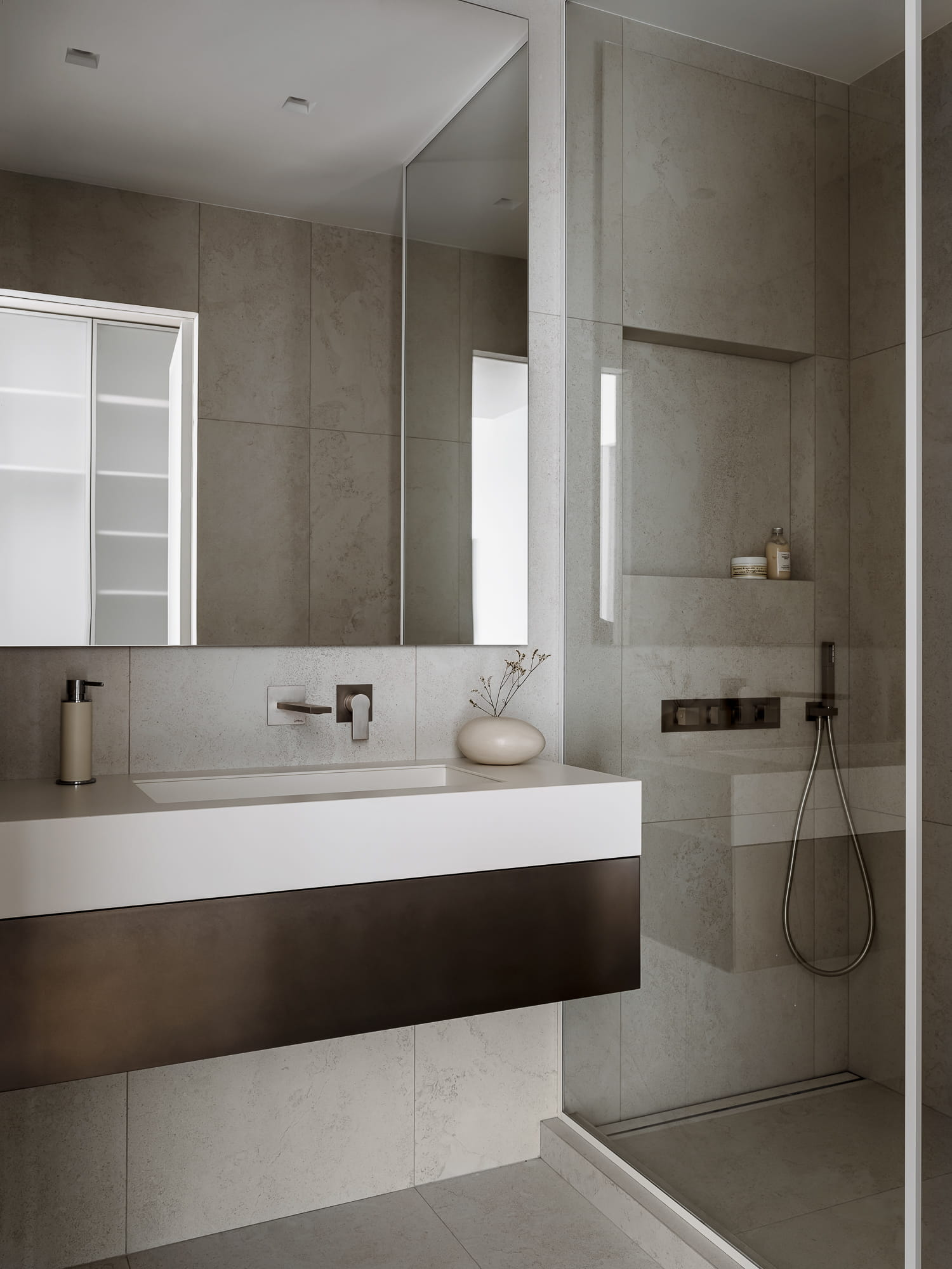
You can access the bathroom from the dressing room through a door made of frosted glass. For the bathroom finish, we selected porcelain stoneware with a subtle texture, the same type used in the kitchen. We laid the tiles without offset and echoed their straight lines in the clean geometry of the metallic-enamel vanity, mirror and glass partition.
The plumbing fixtures were chosen in a matte nickel finish, providing a subtle sheen in the light. A square niche was created in the shower area to hold gels and shampoos. Additionally, a minimalist linear drain was selected, spanning the entire width of the shower.
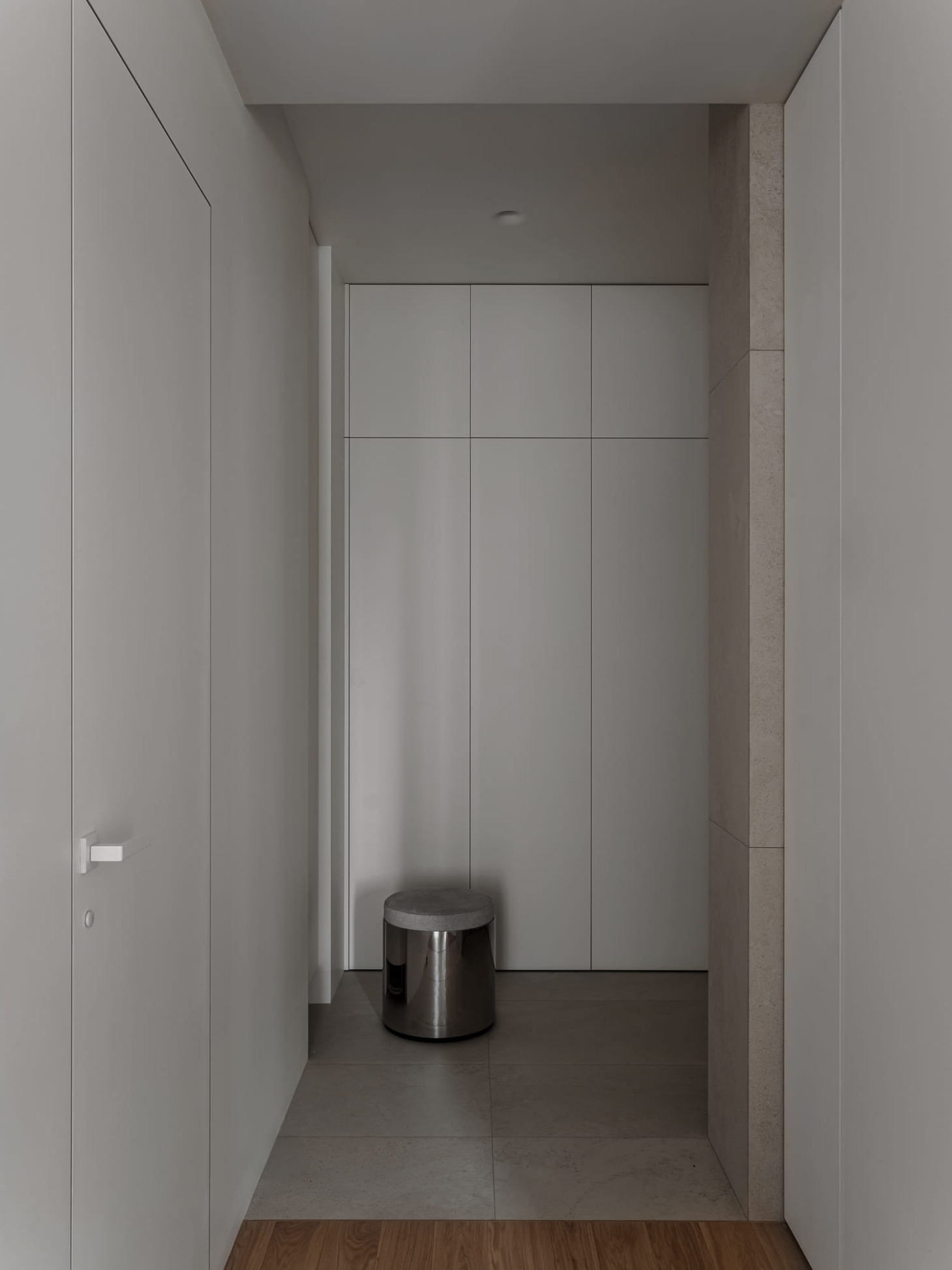
In the corridor, to the right of the entrance, we installed a large floor-to-ceiling wardrobe. To the left, we added a narrow, tall cabinet with a front panel that does not reach the floor. This design allows the robot vacuum to move in and out without any obstruction.
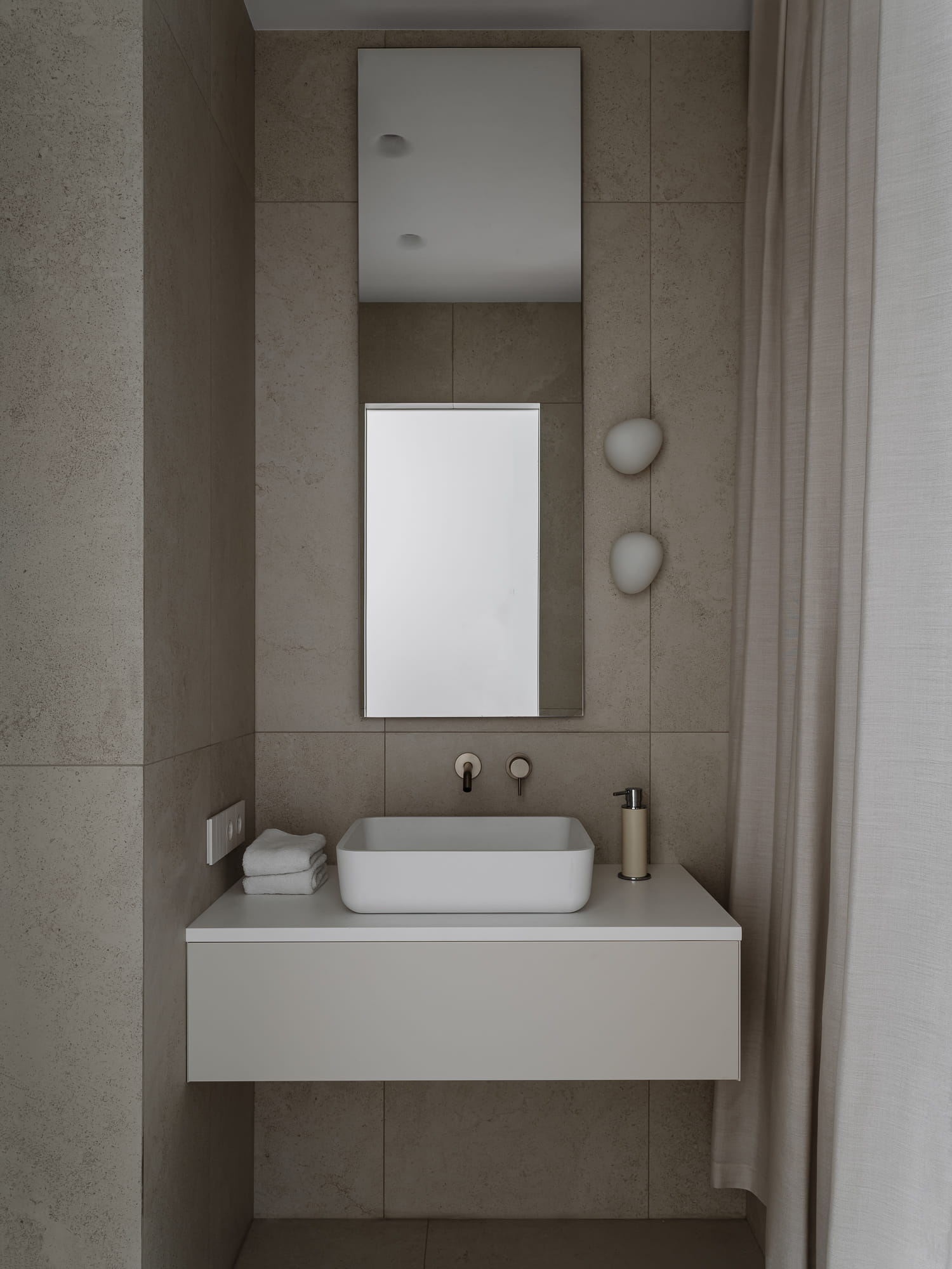
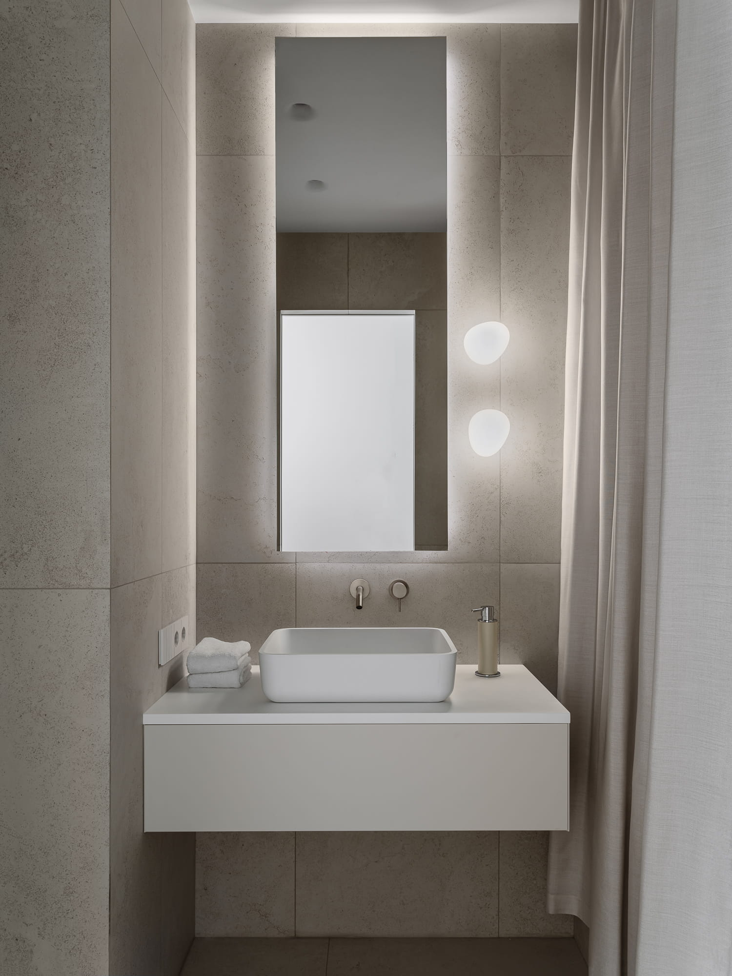
More fluid lines were incorporated into the child's bathroom: irregularly shaped light fixtures, a sink with rounded corners, and a bathtub curtain.
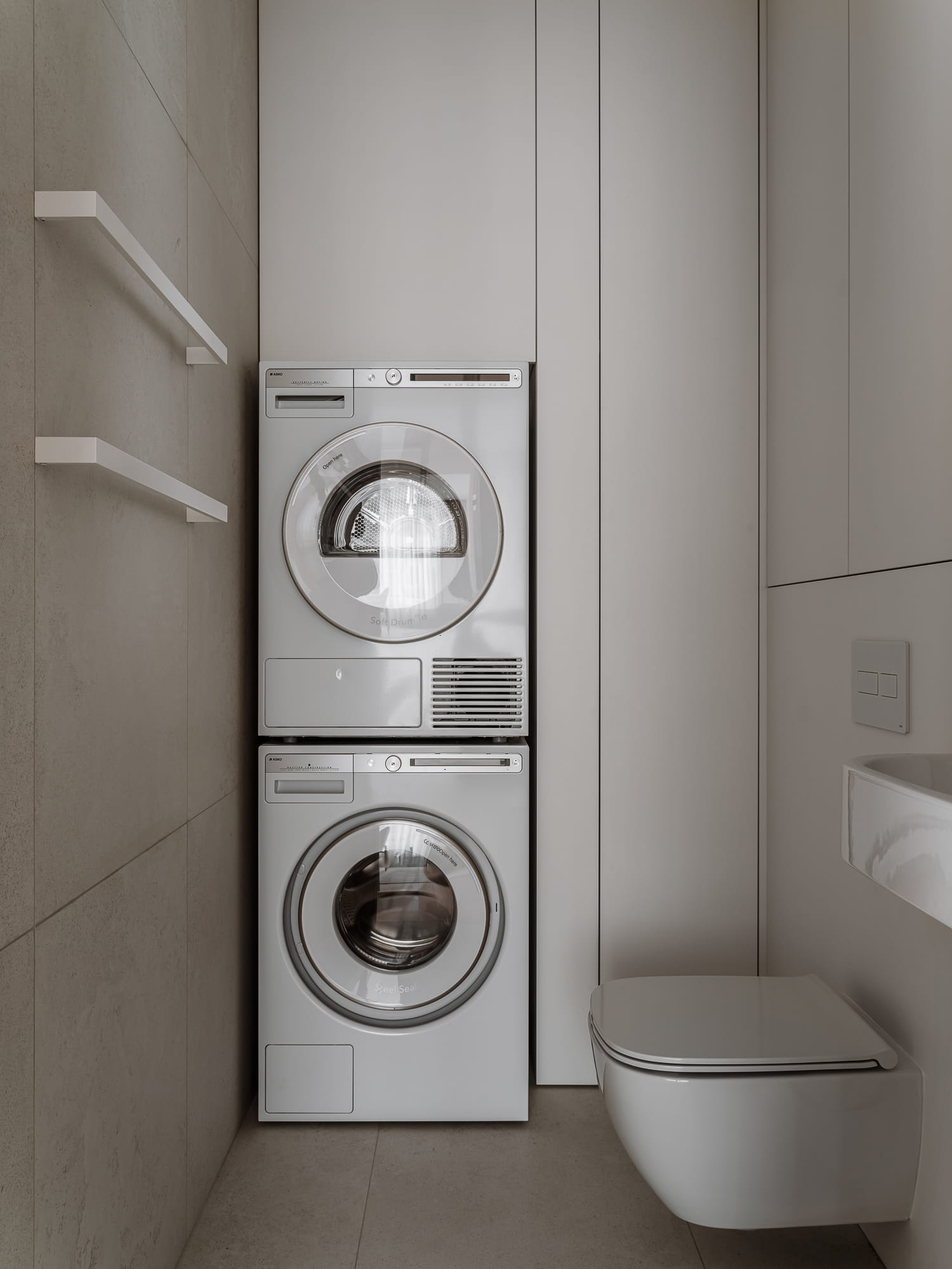
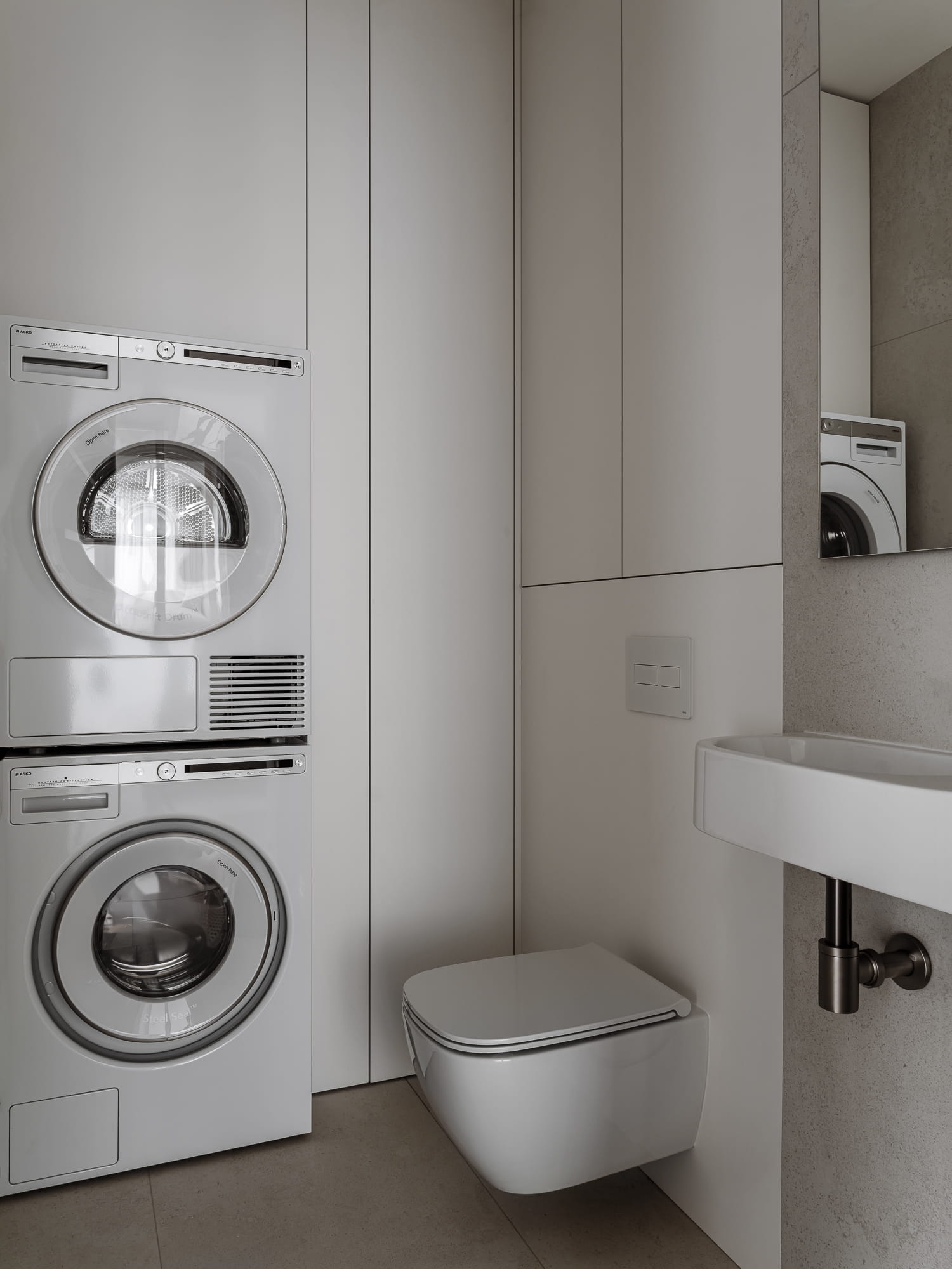
We placed the washing machine and dryer in a separate laundry room. To their right, there is a deep cabinet for household cleaning products, a laundry basket, and a handheld vacuum, for which we also installed a power outlet.
We were inspired by the challenging original layout to propose using glass for some of the walls. We are thrilled that the clients supported our idea, and together we created a truly unique interior.
?autoplay=1"
title="YouTube video player" frameborder="0"
allow="accelerometer; autoplay; clipboard-write; encrypted-media; gyroscope; picture-in-picture"
allowfullscreen>
In our full video walkthrough of this interior, we discuss these technical and design solutions in greater detail. The video is available on our YouTube channel.