A Delicate Apartment with an Office for a Young Lady in Yekaterinburg: photos, video, and a complete interior estimate
This interior was commissioned by long‑standing clients of ours. This time, they asked us to design an apartment for their daughter. We created a delicate interior that will help the future homeowner relax comfortably and work productively.
We handled both the design and the renovation of this space. We prepared an estimate and locked in the cost during the design phase – the price did not change throughout the construction process.
| Size |
66 m2 |
| Type |
An one-bedroom apartment |
| Years |
2024–2026 |
| Features |
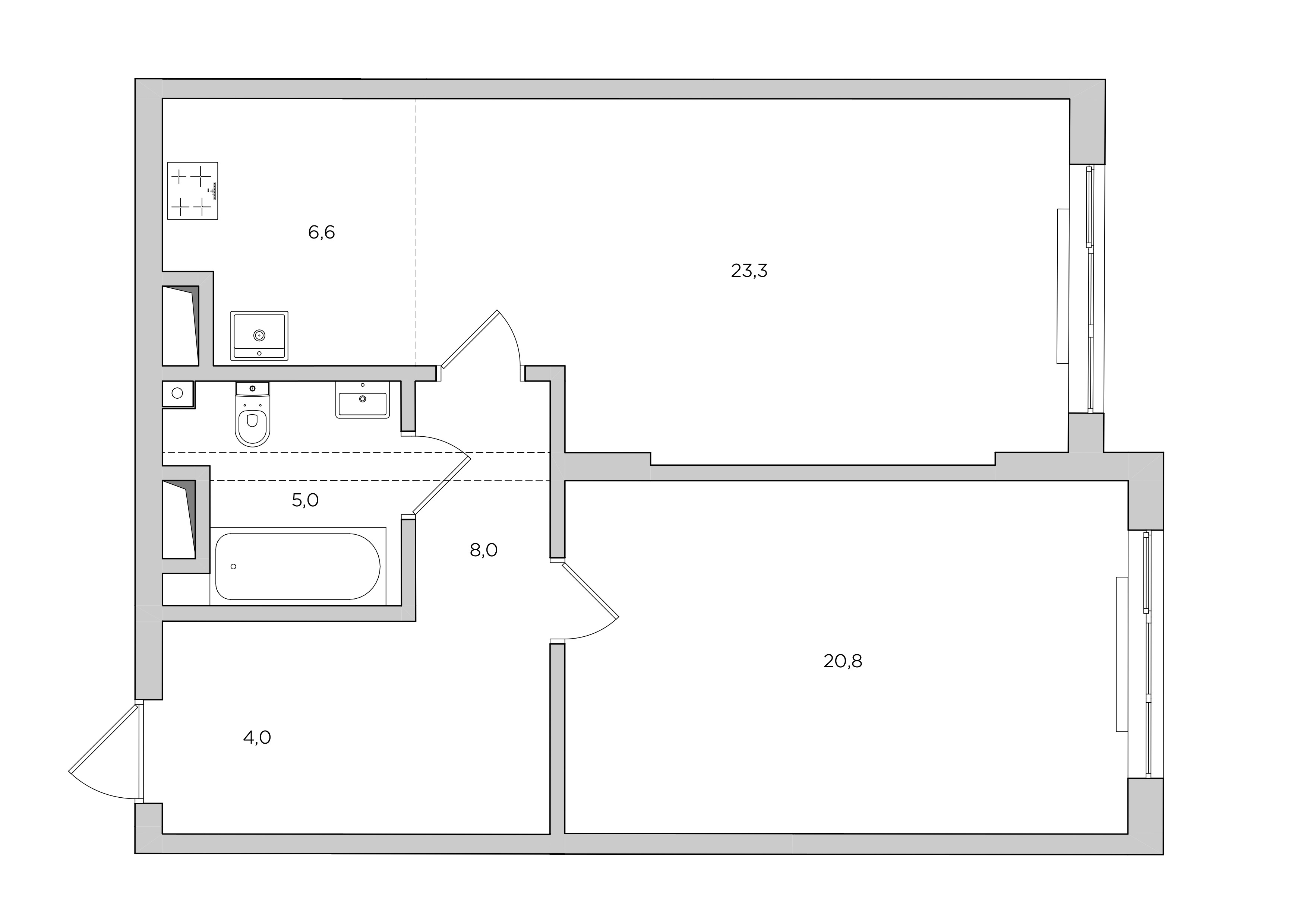
Load‑bearing beam, spacious kitchen‑living room with a narrow alcove, and load‑bearing pillars |

Load‑bearing beam under the ceiling in the hallway and bathroom
Load‑bearing pillars in the living room
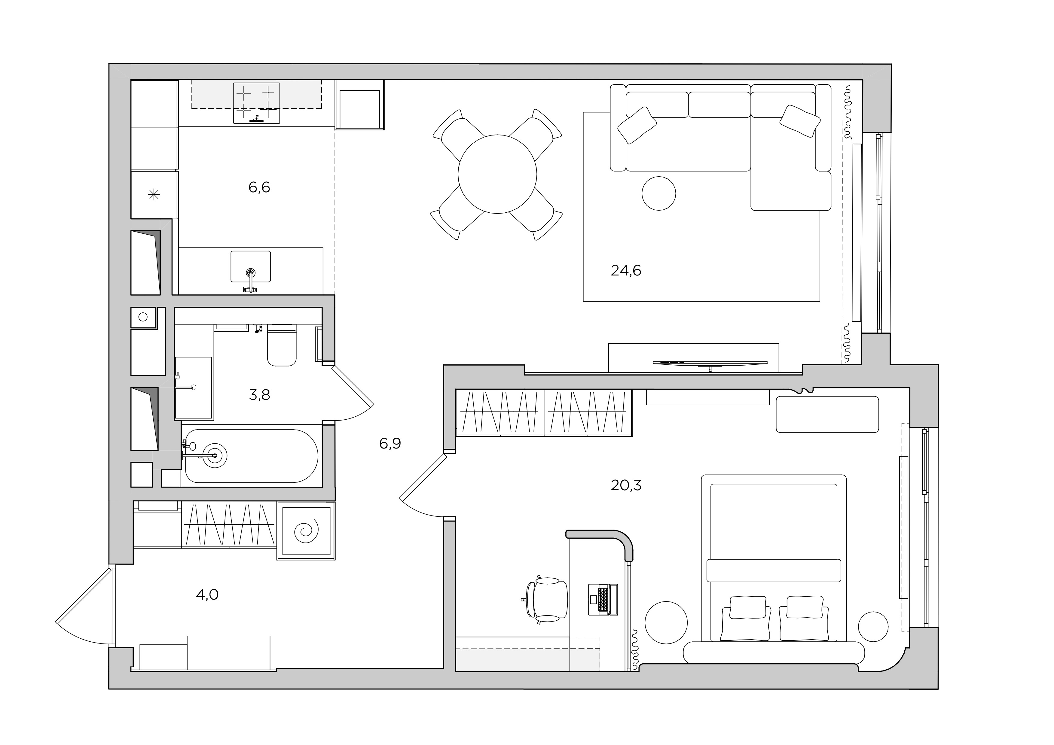
An office created inside the bedroom
Partitions between the hallway and the kitchen‑living room removed
Kitchen cabinets placed on both sides of the alcove
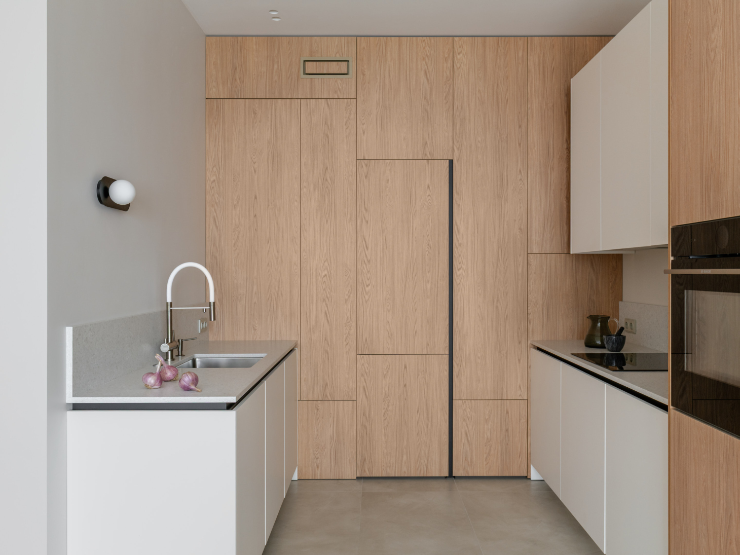
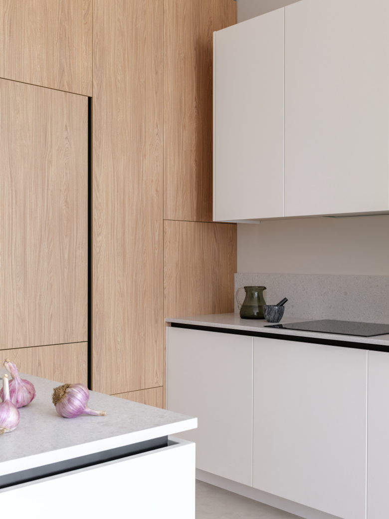
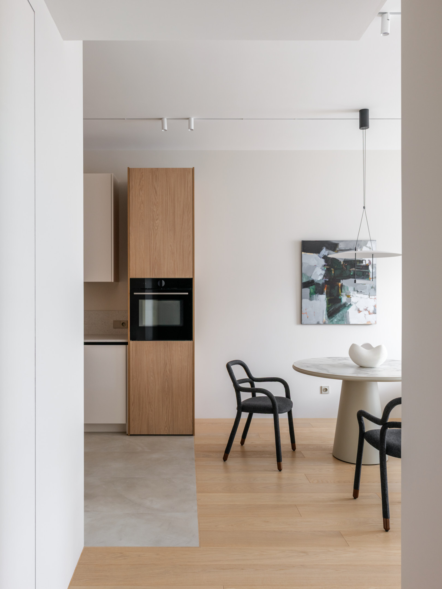
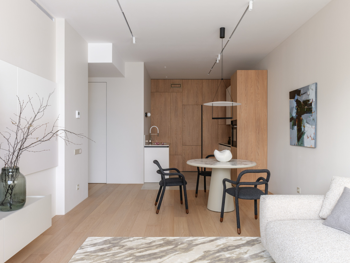
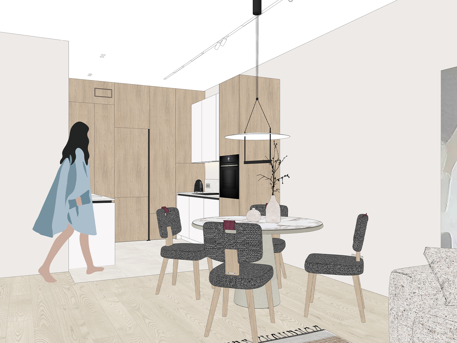
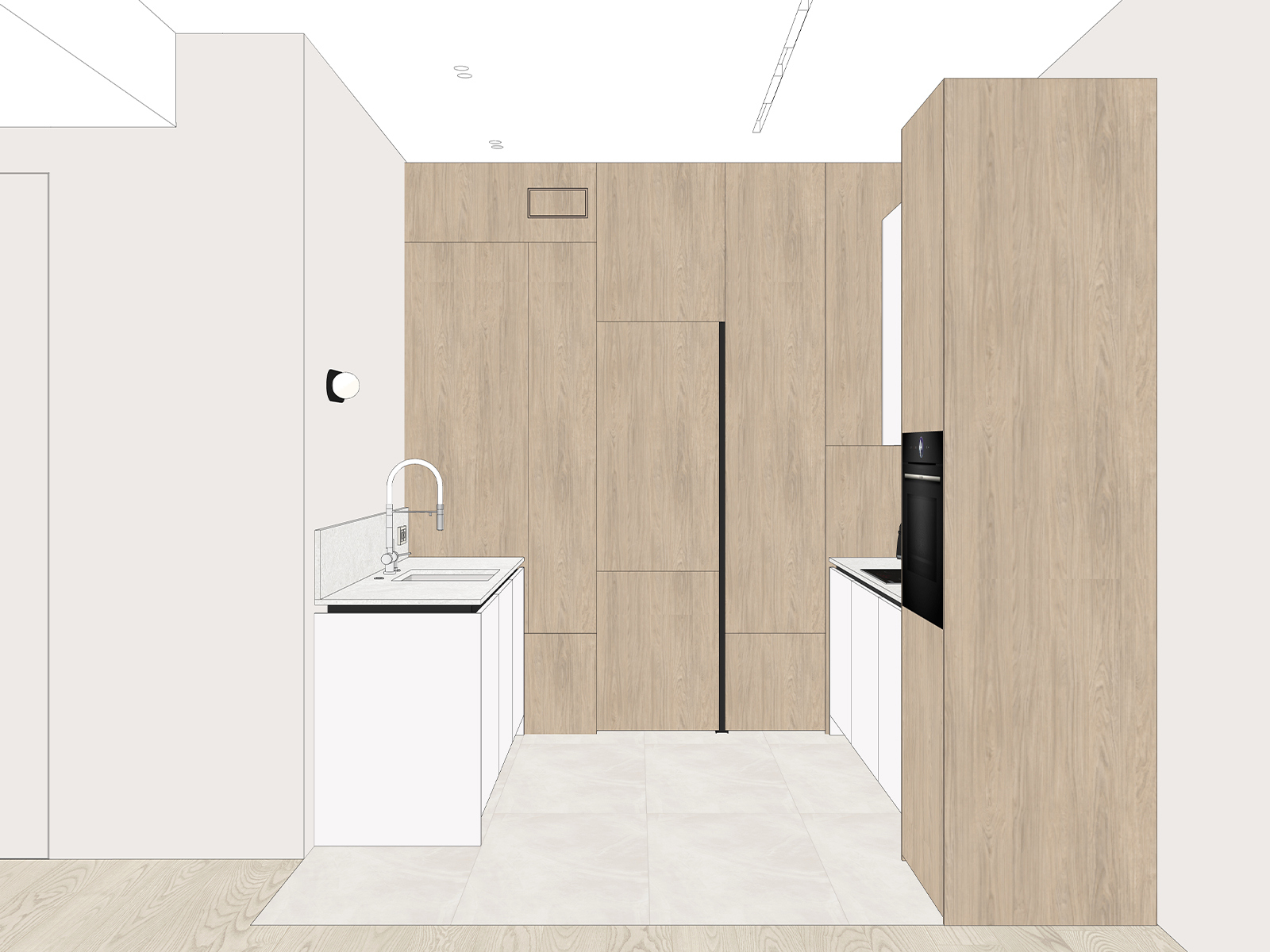
Layouts where the kitchen area is noticeably narrower than the rest of the living room are quite common these days, and this apartment is no exception. Based on that configuration, we designed the kitchen to wrap around all three sides of the alcove. Facing the living room are clean, simple panels that hide the ventilation duct, as well as the cabinet fronts that conceal the refrigerator and shelves.
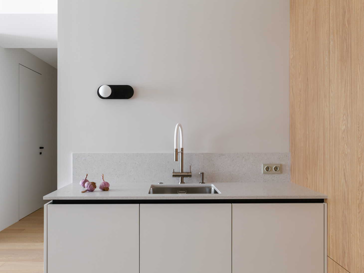
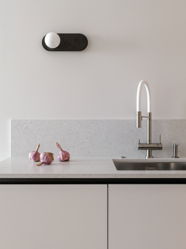
We made the lower cabinets symmetrical and minimalist: the countertop and low backsplash match the color of the cabinet fronts.
In this kitchen, we visually separated the countertop from the cabinets by extending the handle profile onto the end of the unit. This makes the quartz countertop look even thinner and lighter.
Choosing a backsplash that is only 25 cm high instead of running it up the whole wall was a deliberate decision – it makes the kitchen feel more like a tidy chest of drawers, which fits this delicate interior perfectly.
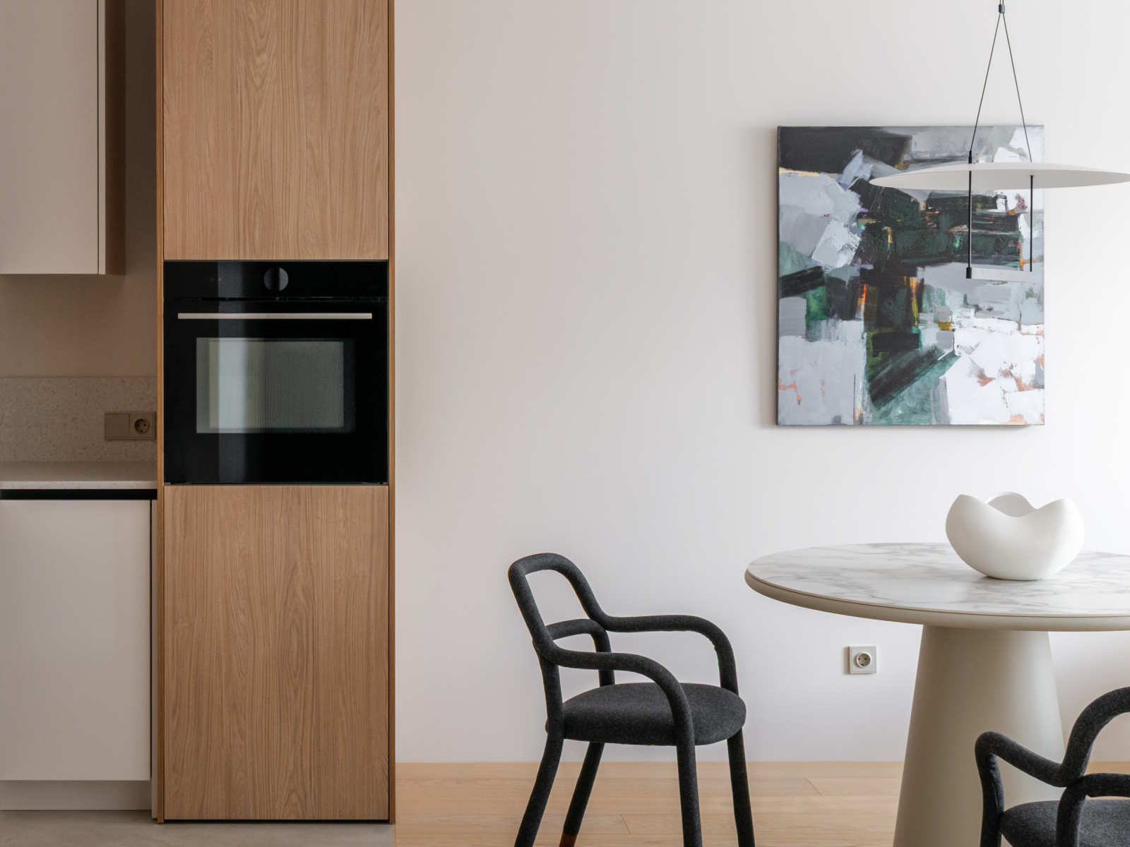
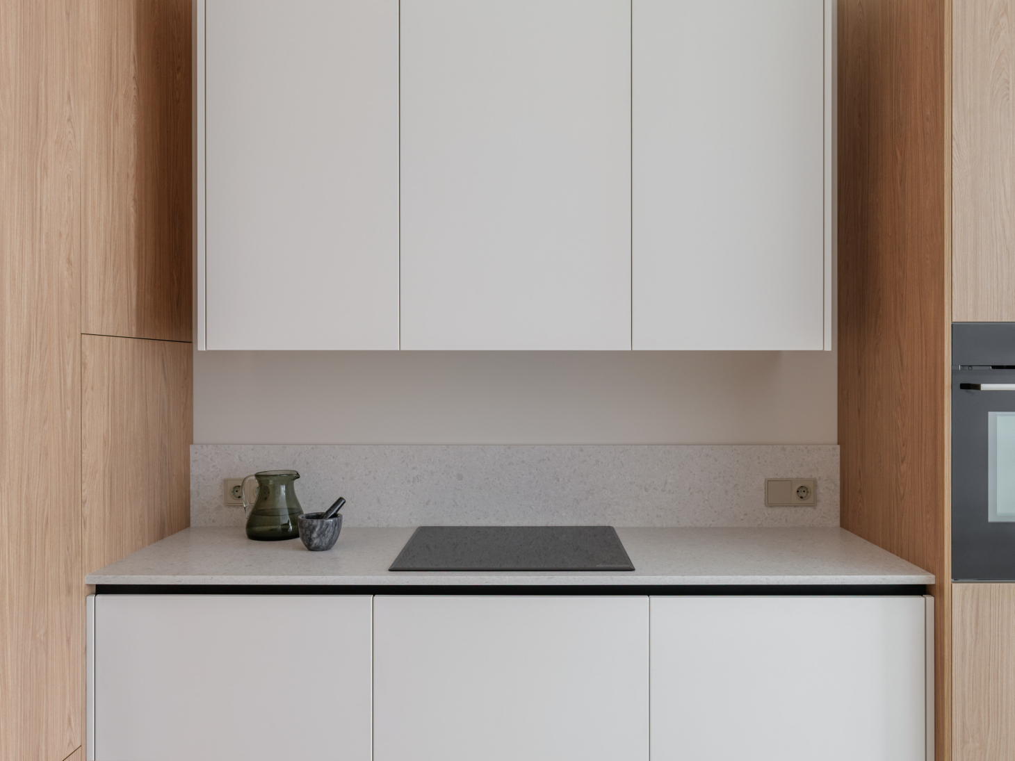
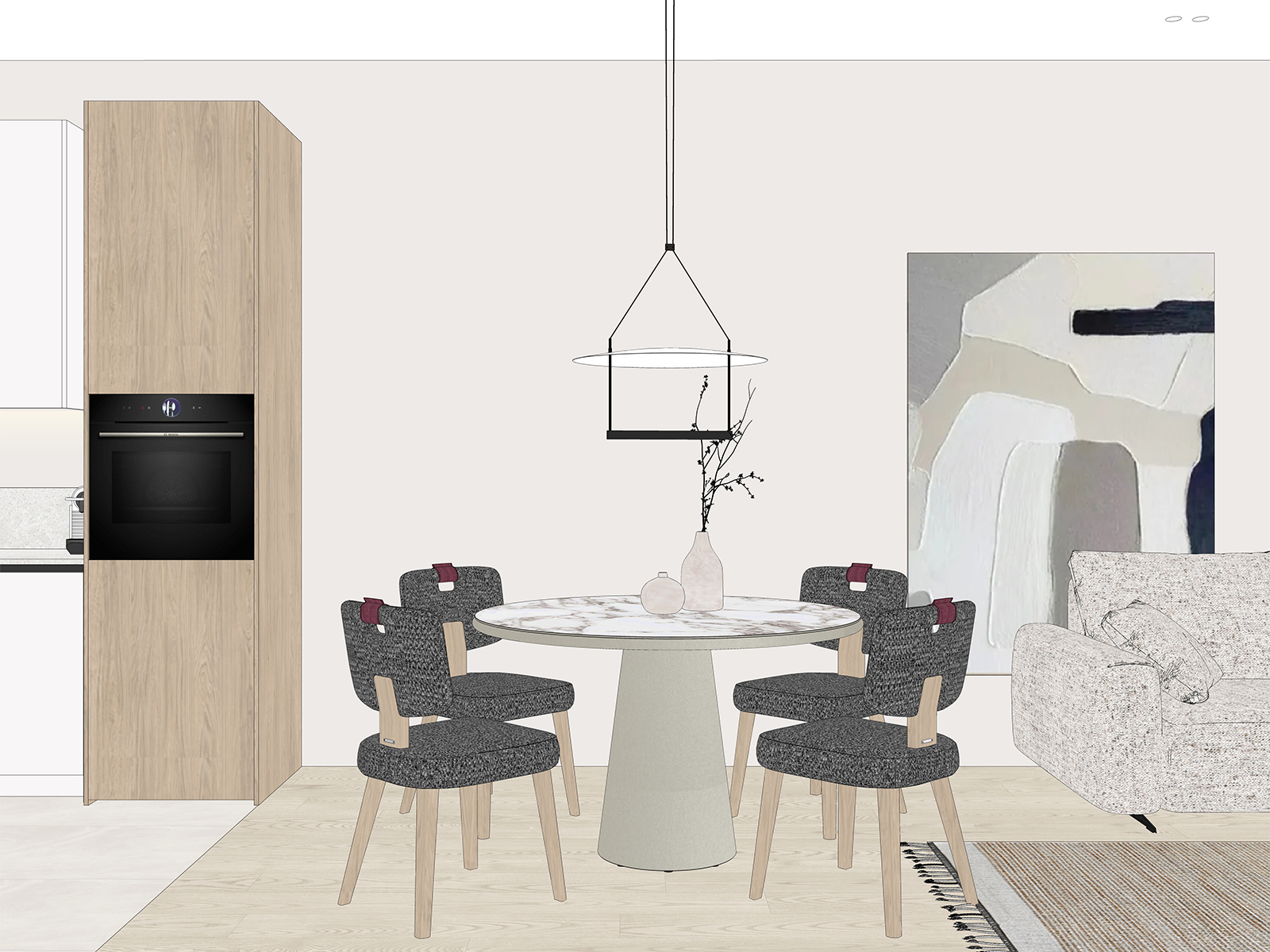
Because the ventilation duct takes up part of the alcove, we placed the tall oven cabinet separately. Along its edge, we combined neutral‑textured porcelain tile with honey‑warm engineered oak flooring.
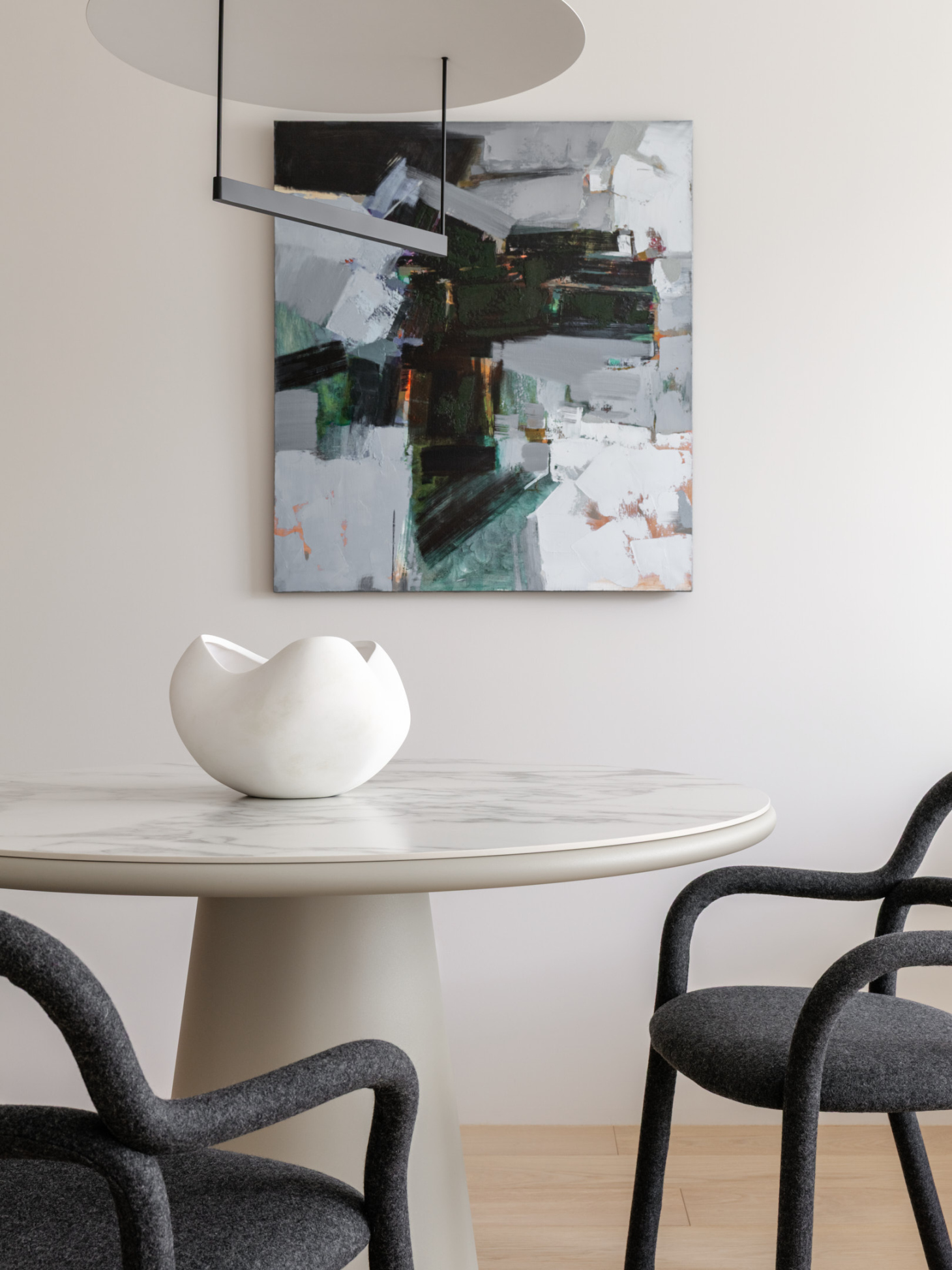
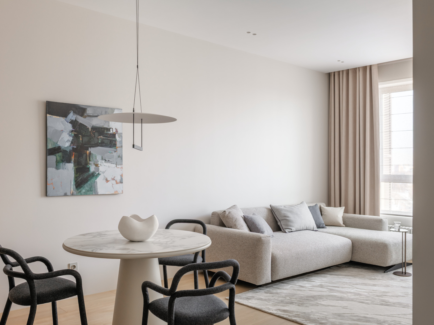
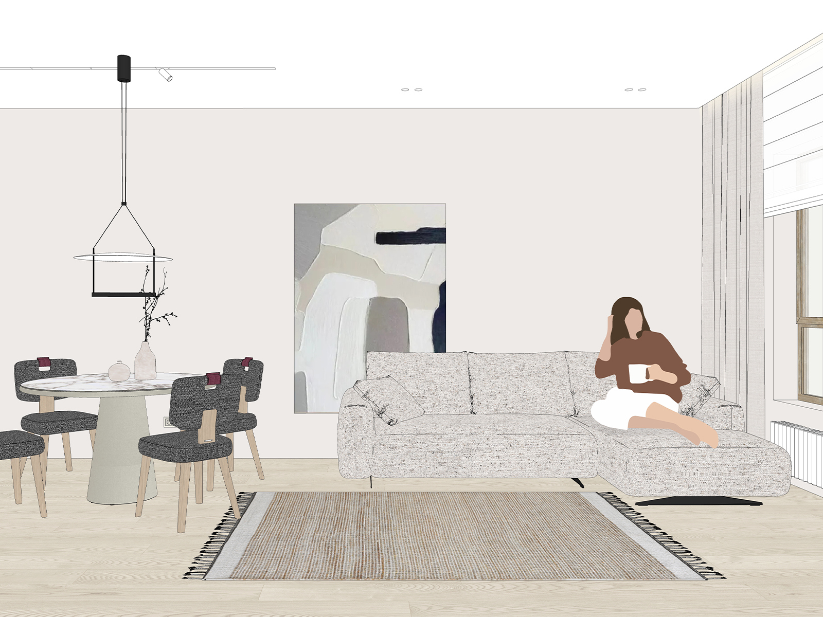
We chose a minimalist dining table with a delicate marble pattern on top. To go with it, we picked a round lamp that directs light upward onto a white disk, filling the space with soft, reflected light.
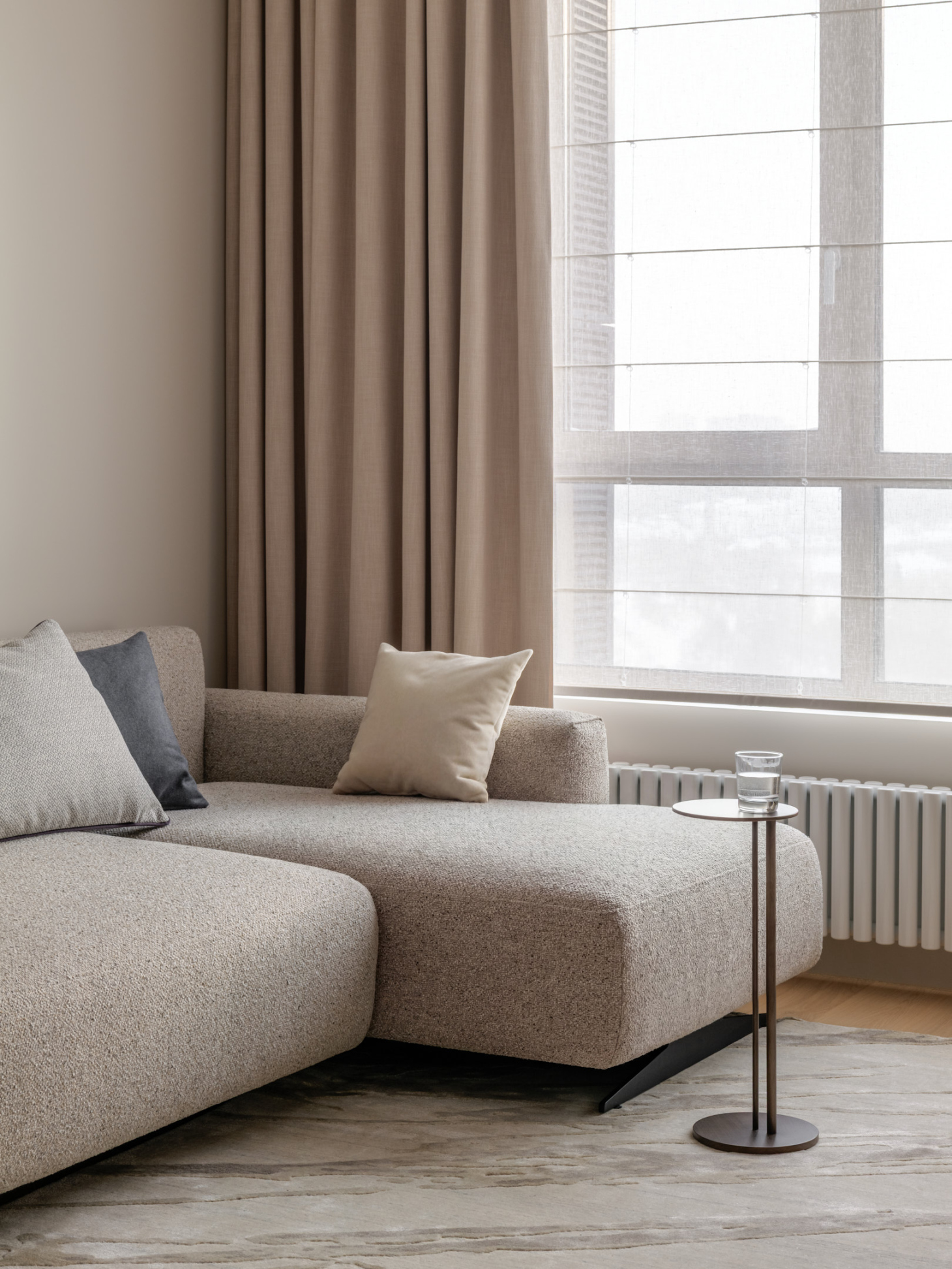
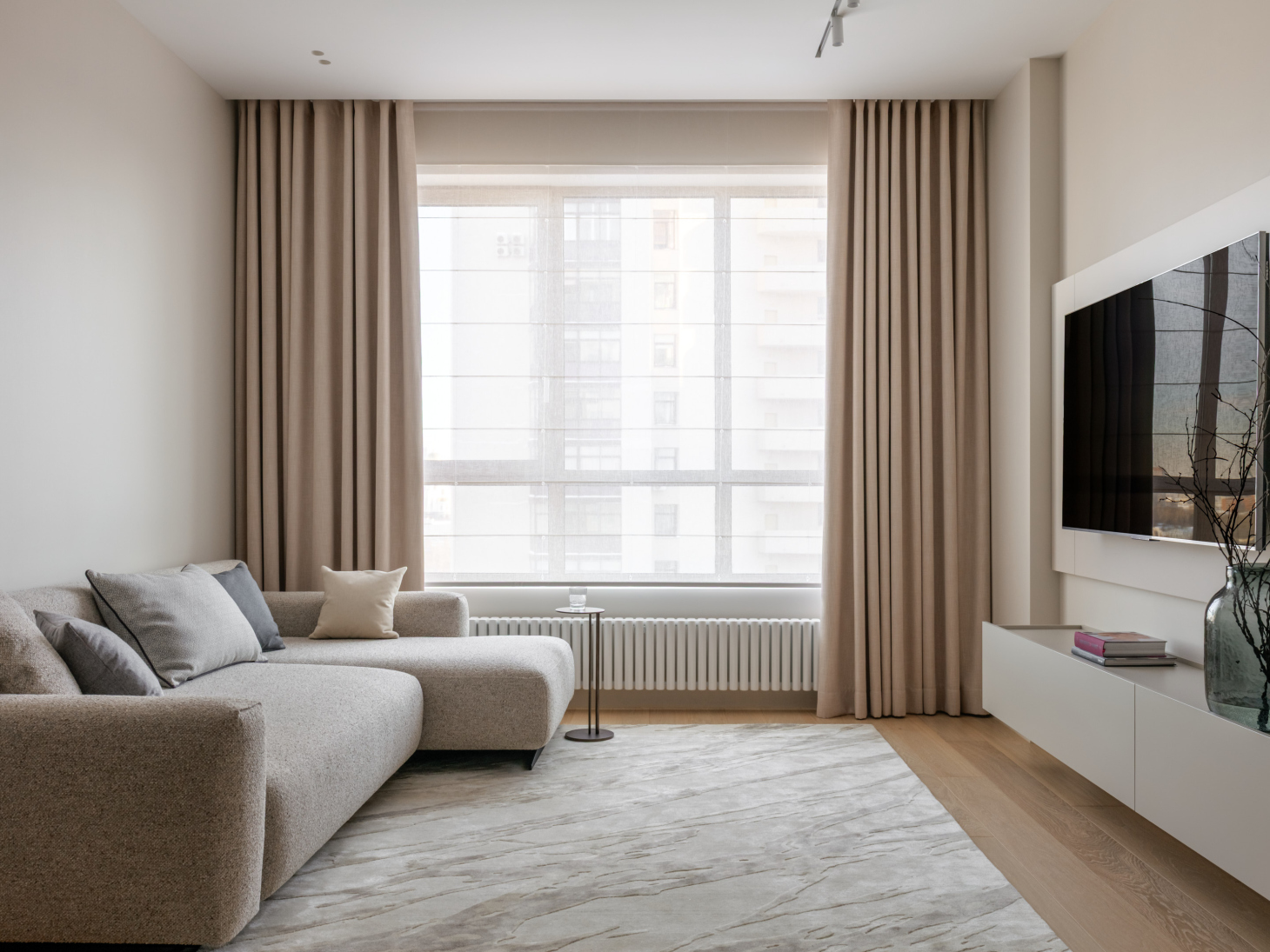
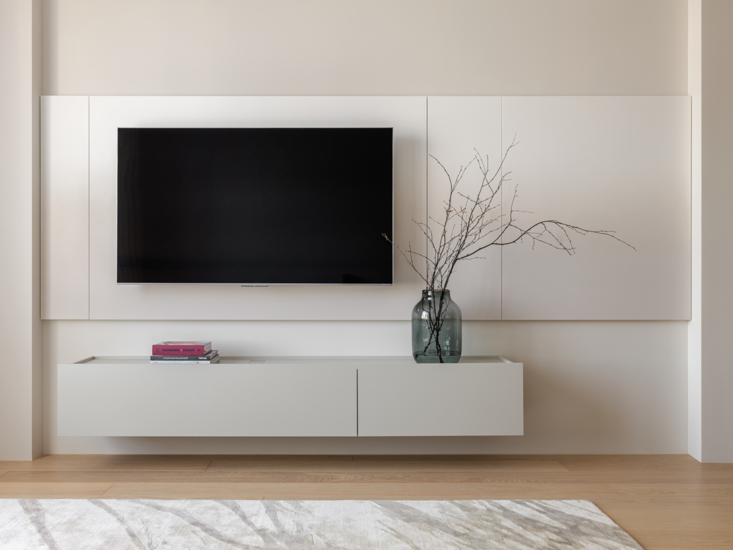
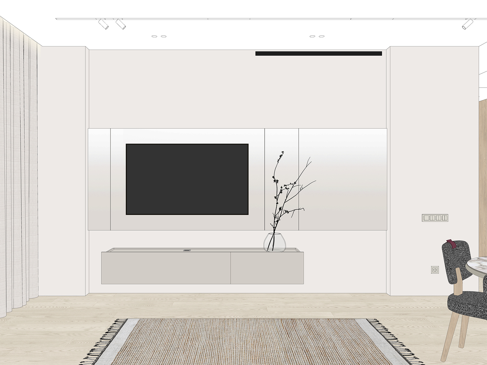
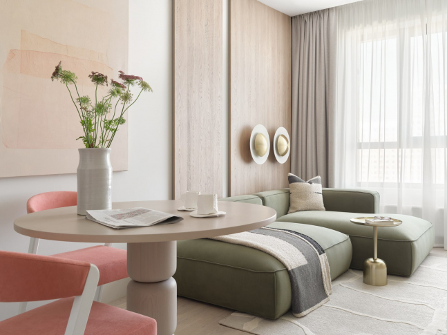
In the living room, we installed a large sofa that folds out – in case the homeowner’s friends want to stay overnight. Opposite the sofa is a wall‑mounted cabinet with minimalist fronts.
To bring more texture and variety to the large wall surface behind the TV, we invited an artist. Together we chose a paint shade slightly darker than the wall, and the artist used a sprayer to create a gradient on the panel. The result is very subtle, barely noticeable, and extremely soft.
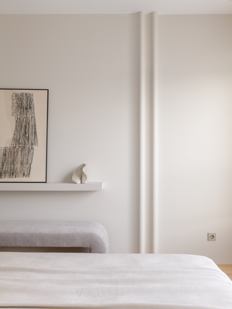
A load‑bearing beam starts under the ceiling to the right of the TV. The clients were actually worried about it when they were choosing the apartment – they asked us whether the beam would interfere with future remodeling or the ventilation system. After looking at the photos and the floor plan, we assured them it wouldn’t. To treat it in an unusual way, we added a small box that echoes both the pillar and the protruding kitchen alcove, giving the simple volume of the room a sense of rhythm.
That beam also influenced the placement of the ventilation grilles in the kitchen‑living room. Normally, the air supply grille would be located above the entrance to the living room. Instead, it was moved closer to the TV, routed around the beam.
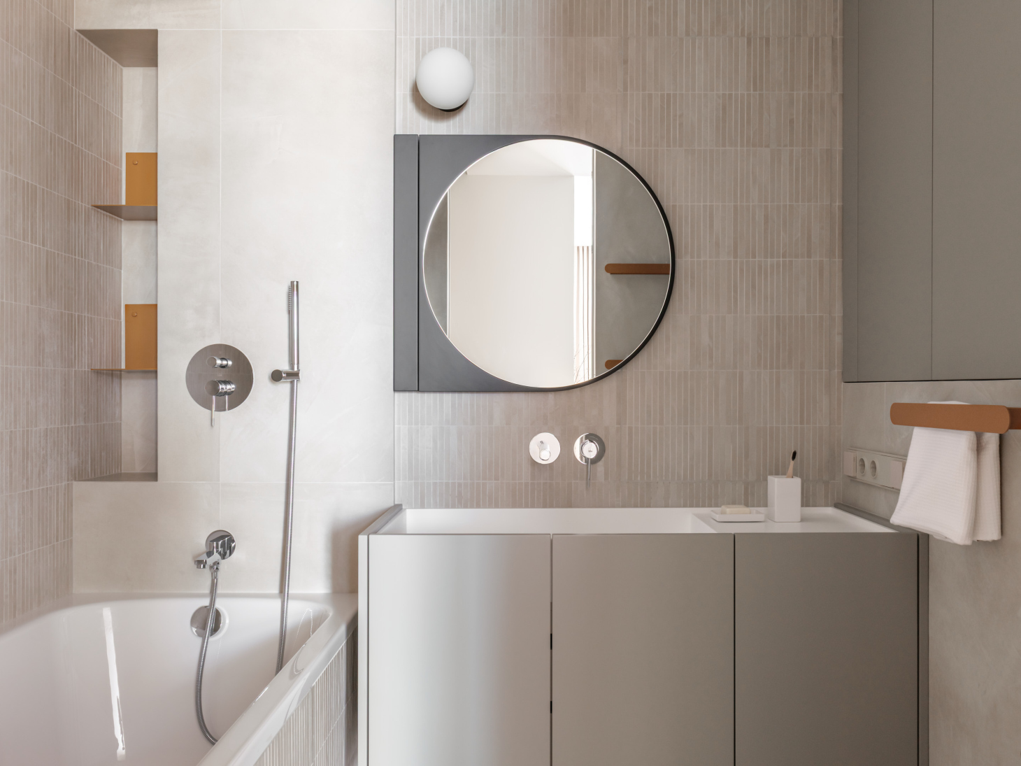
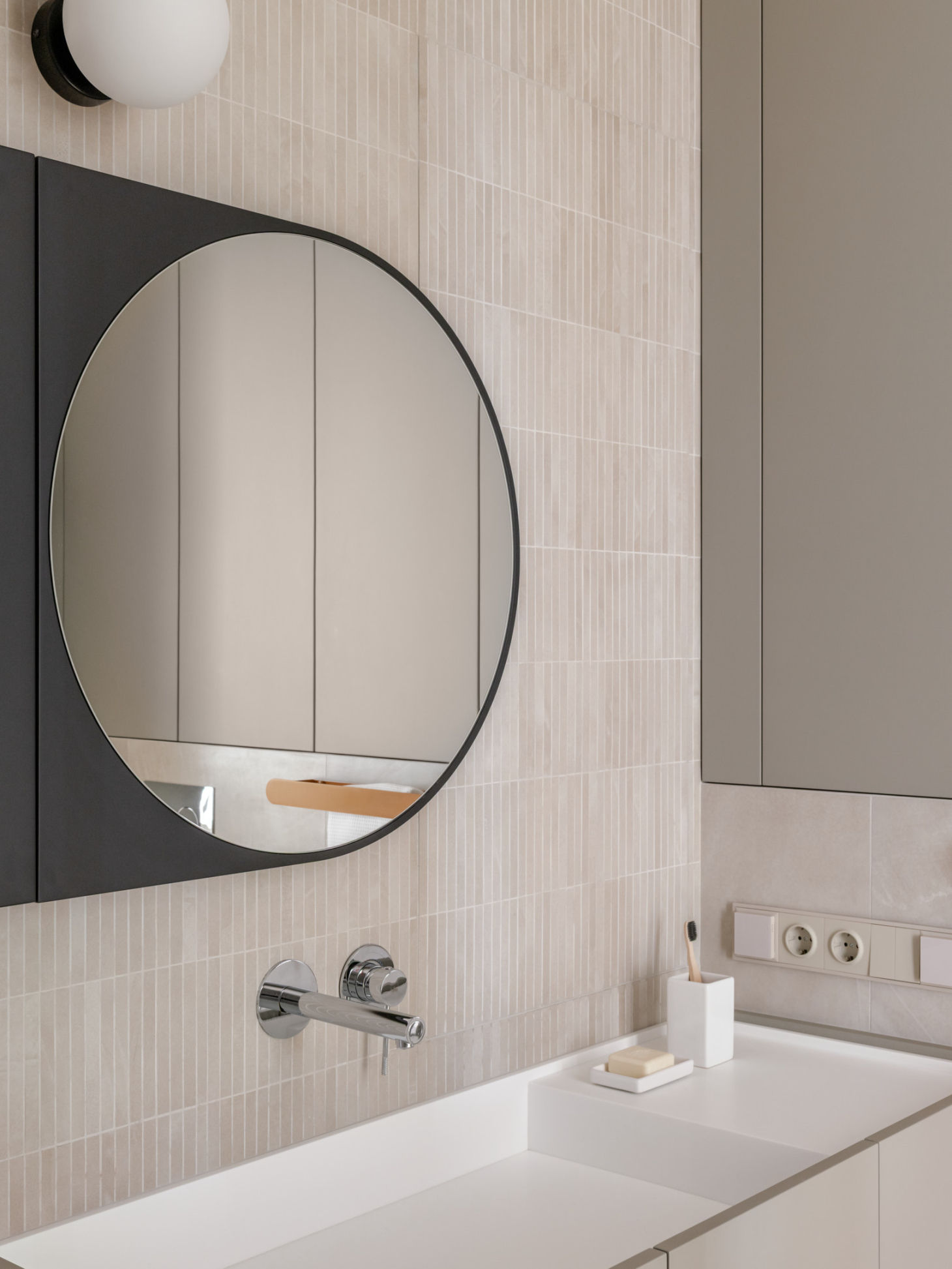
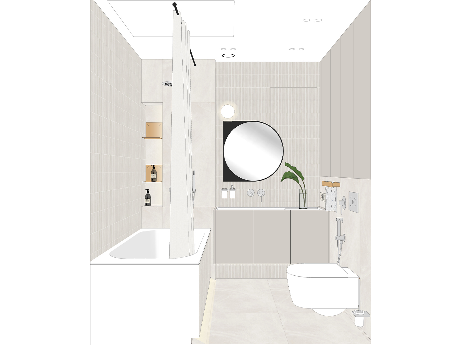
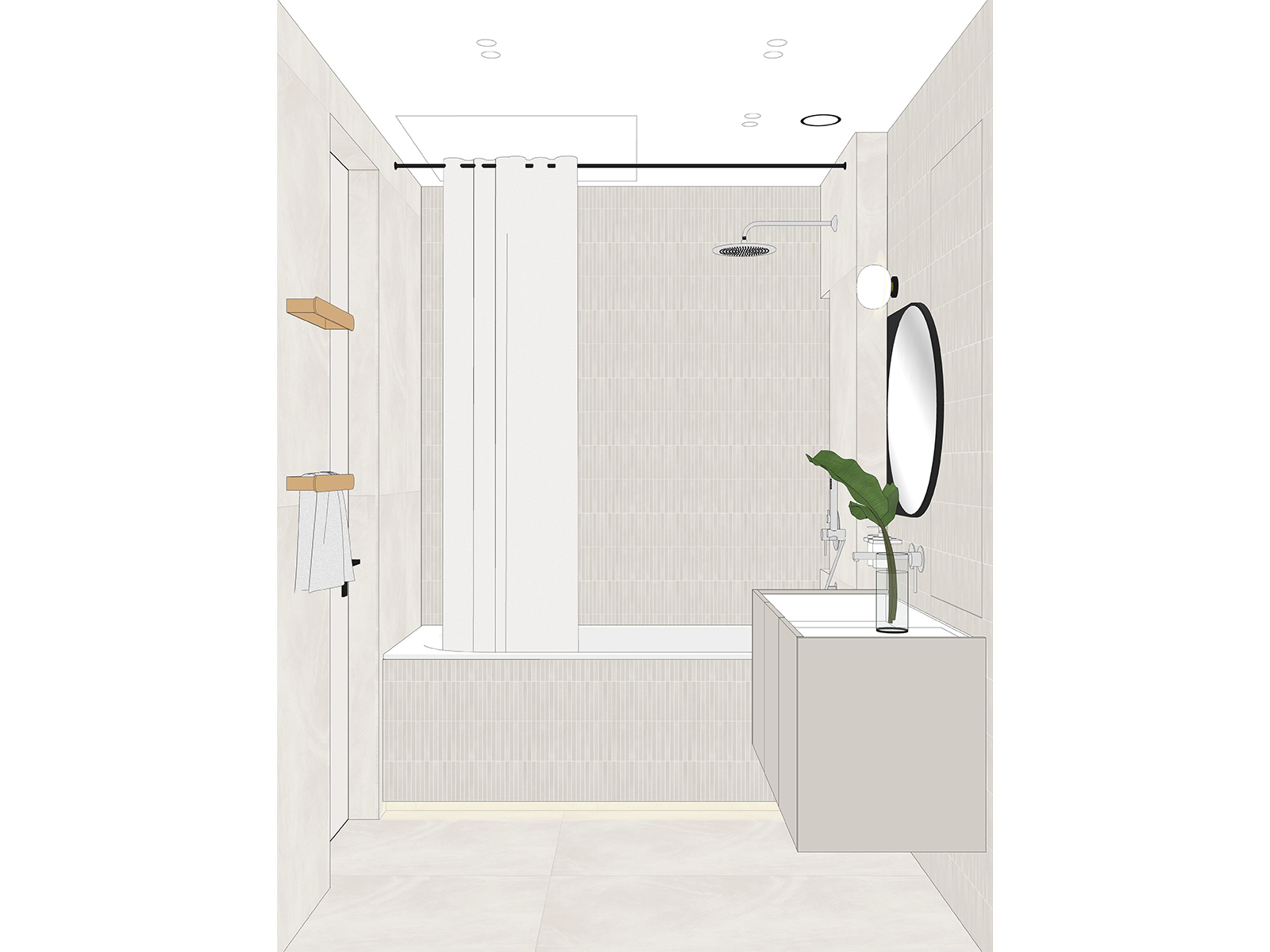
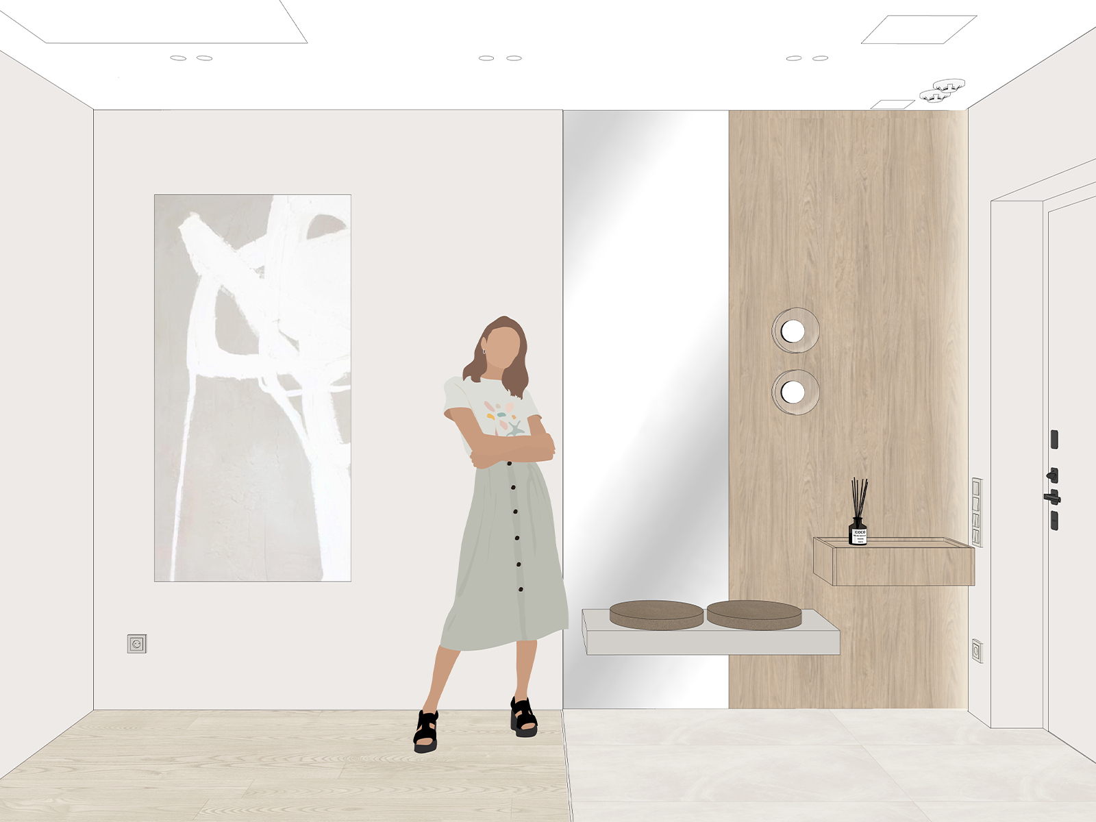
In the bathroom, we introduced texture and color. For the walls, we used not only neutral Italon porcelain tile but also mosaics from the same series – they add a delicate relief to the space. The accessories are bright orange, bringing a playful lightness. We placed the washing machine in the hallway because we believe the bathroom should always be a place to relax, not a laundry room.
The manifold assembly is in a niche to the right of the mirror. We camouflaged the access hatch by tiling it with the same mosaic, and then filled the perimeter gap with sealant so the seam doesn’t stand out. The mirror has soft‑close hinges: it opens to the left like a cabinet door, while the hatch opens to the right.
The washing machine cabinet is located in the hallway. It also contains a dryer and shelves for cleaning supplies.
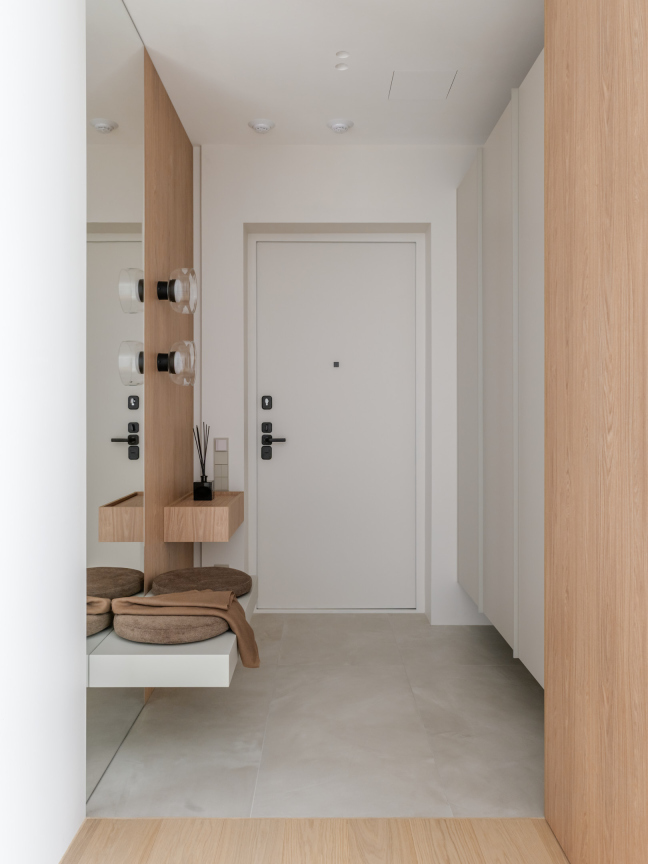
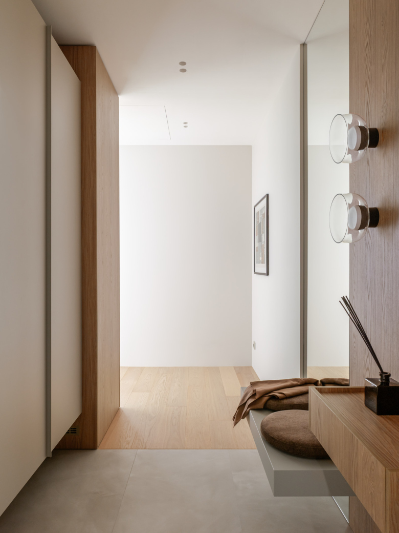
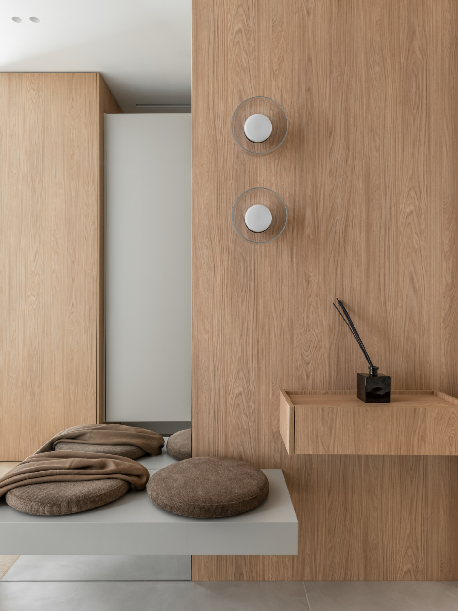
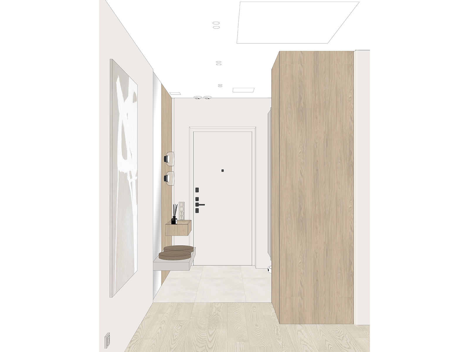
In the entryway, all the furniture is raised off the floor: even the large wardrobe hovers 25 cm above the ground. The robot vacuum’s base station will fit under the wardrobe, and the floating furniture throughout the apartment will make for easy, thorough cleaning.
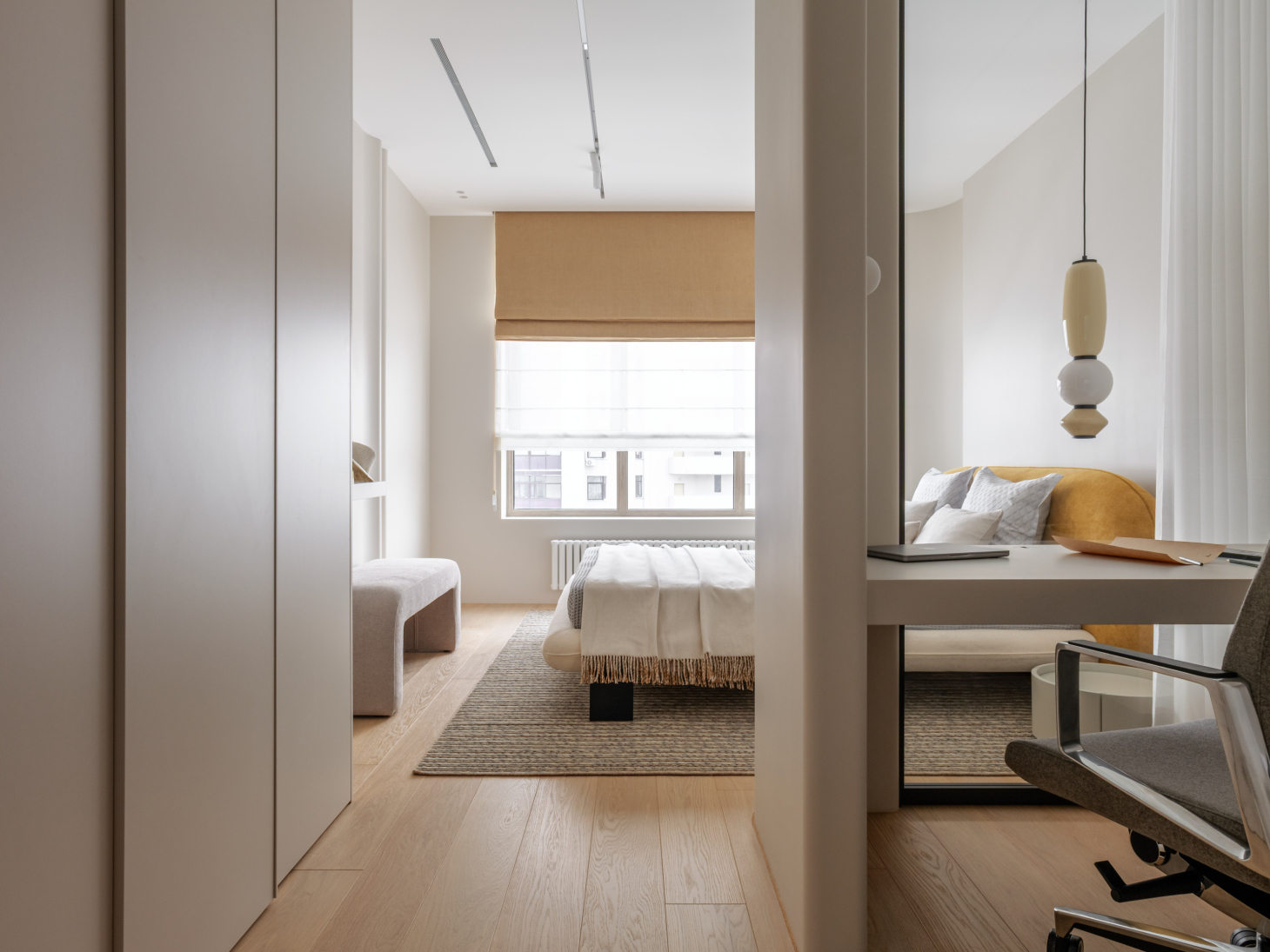
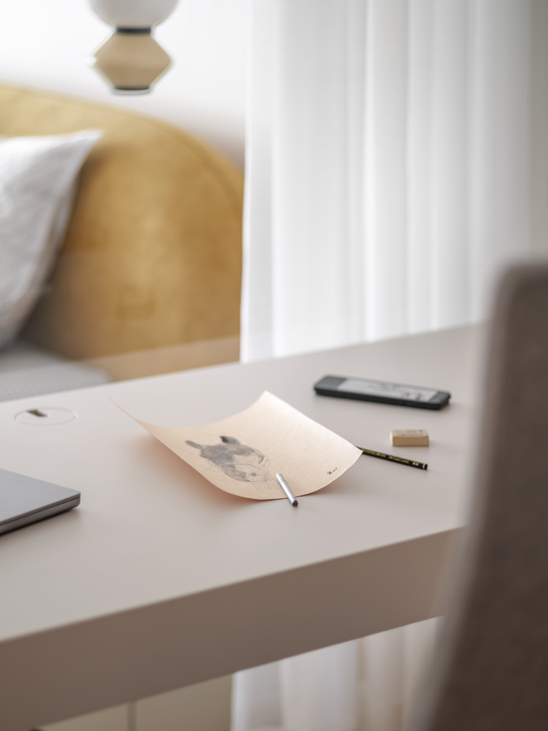
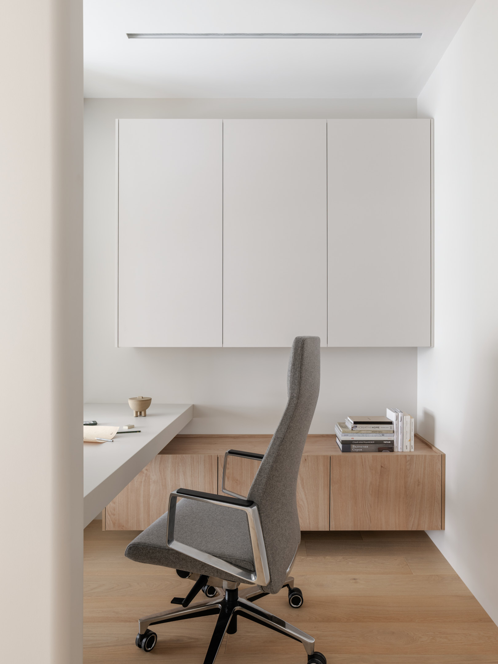
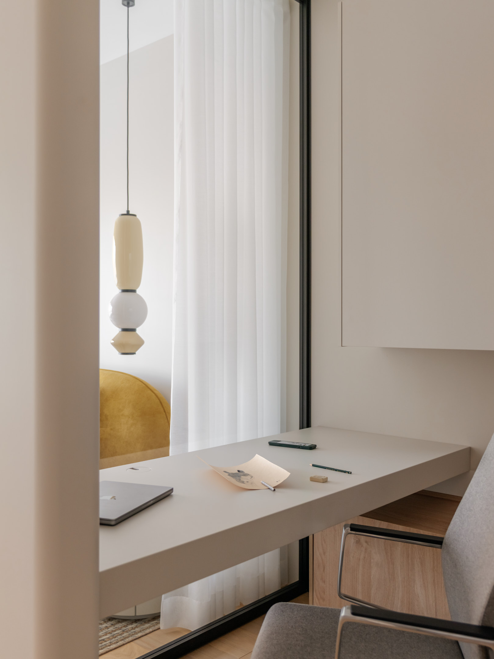
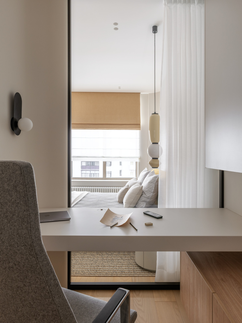
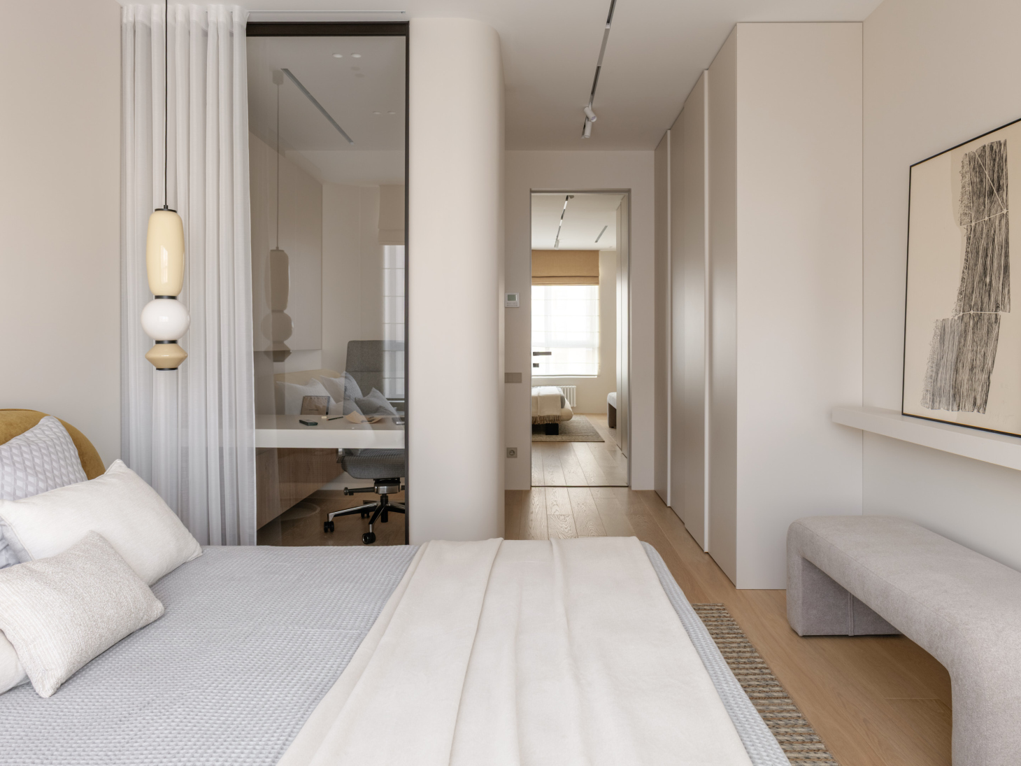
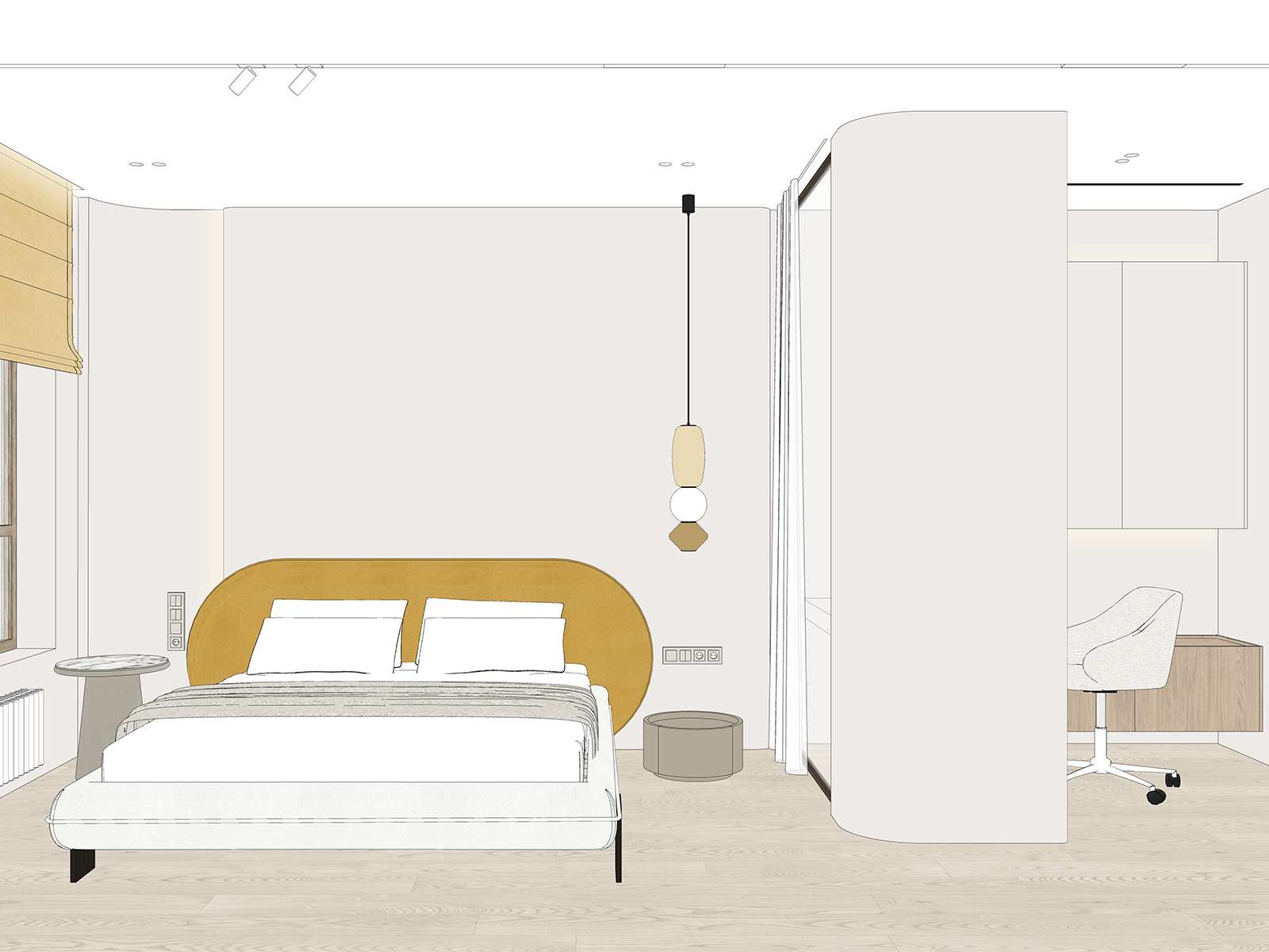
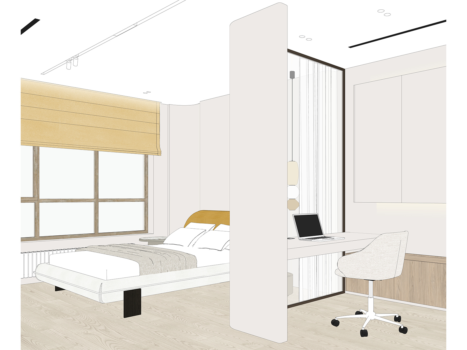
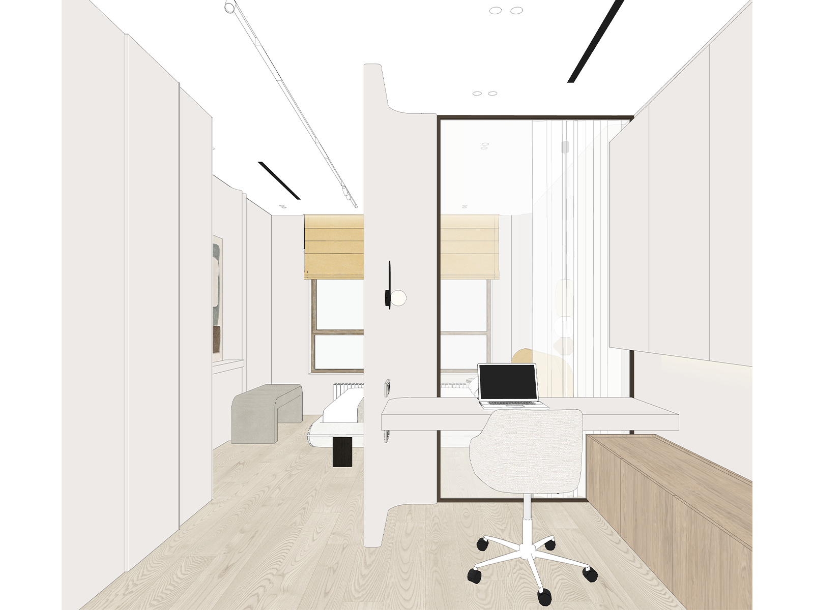
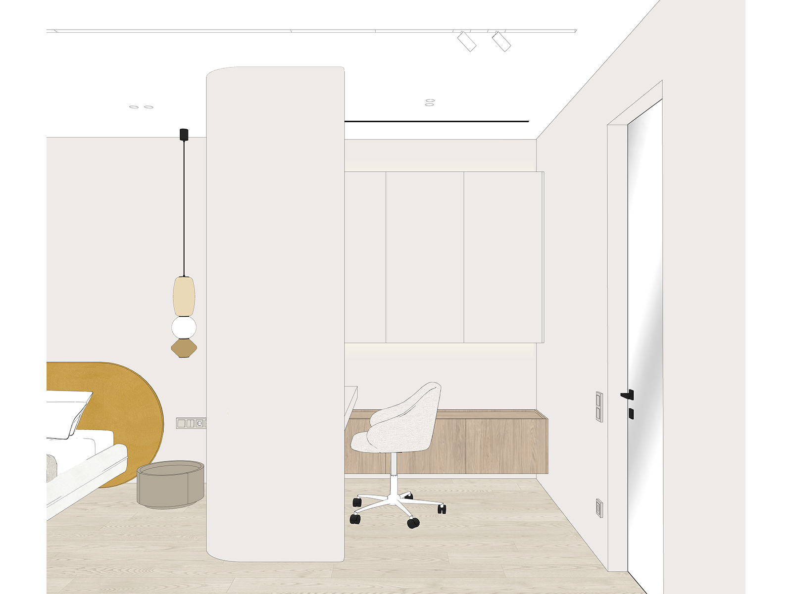
When planning the bedroom, we chose to include an office rather than a walk‑in closet, because the future homeowner will have a small storage room on the same floor where she can keep off‑season items. The office is softly integrated into the bedroom interior through several design moves.
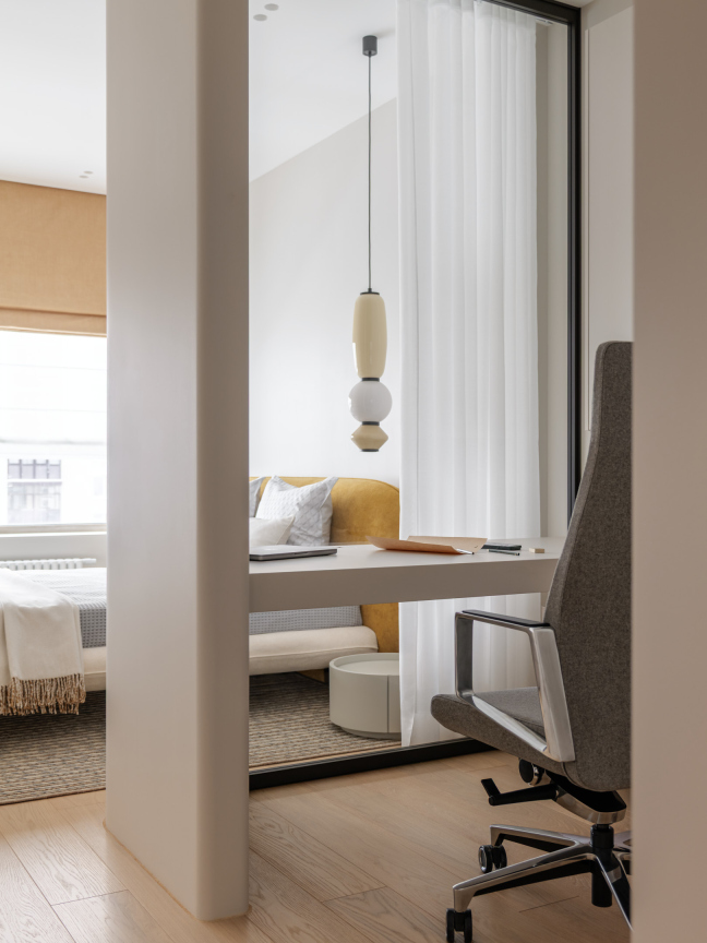
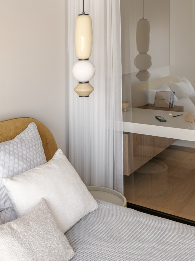
First, it is not separated by a door – that way, the small space of just over 3.5 m² doesn’t feel cramped. Second, between the bedroom and the office, there is a large, seamless glass partition that can be covered with a curtain when she wants to hide the work area. Third, the wall has a smooth curve where the partition attaches to it, echoing other rounded elements in the bedroom: the headboard, the lamp, the bedside table, the nightstand, and the curved details on the walls.
For this office, we designed and built the console table ourselves: it is 1.70 m long and 70 cm wide. It matches the wall color, and most importantly, it follows the curve of the partition.
When designing the office furniture, we planned a convenient spot for the printer: it sits on a pull‑out shelf behind the right front panel of the chest of drawers.
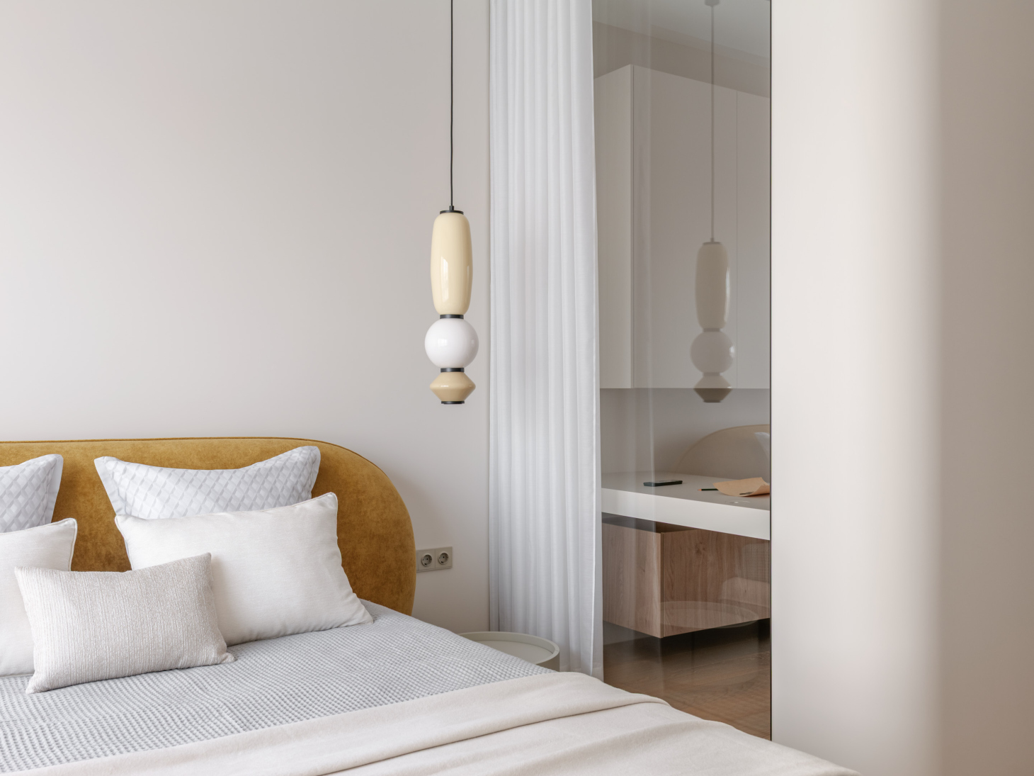
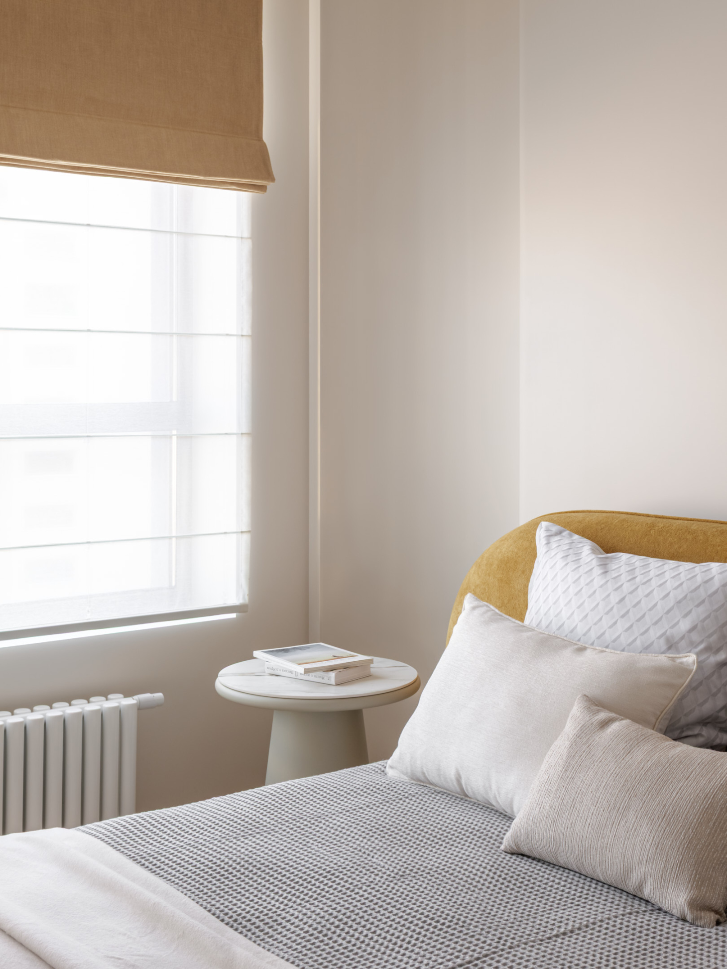
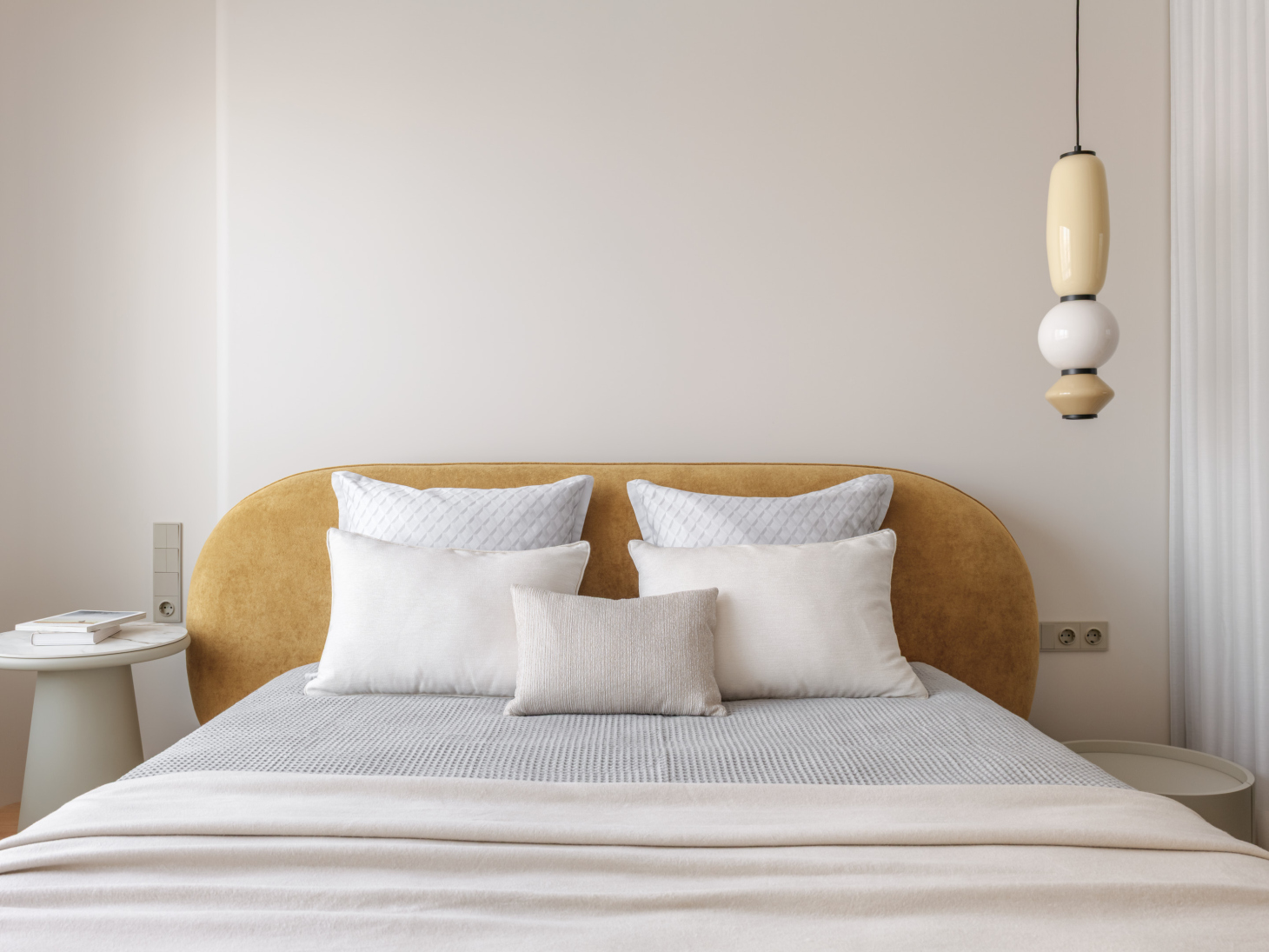
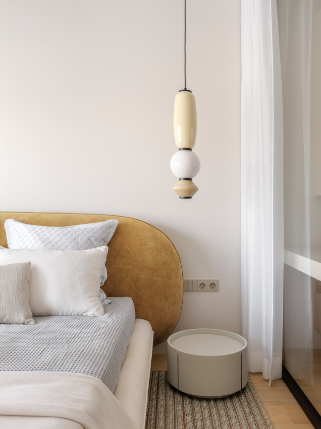
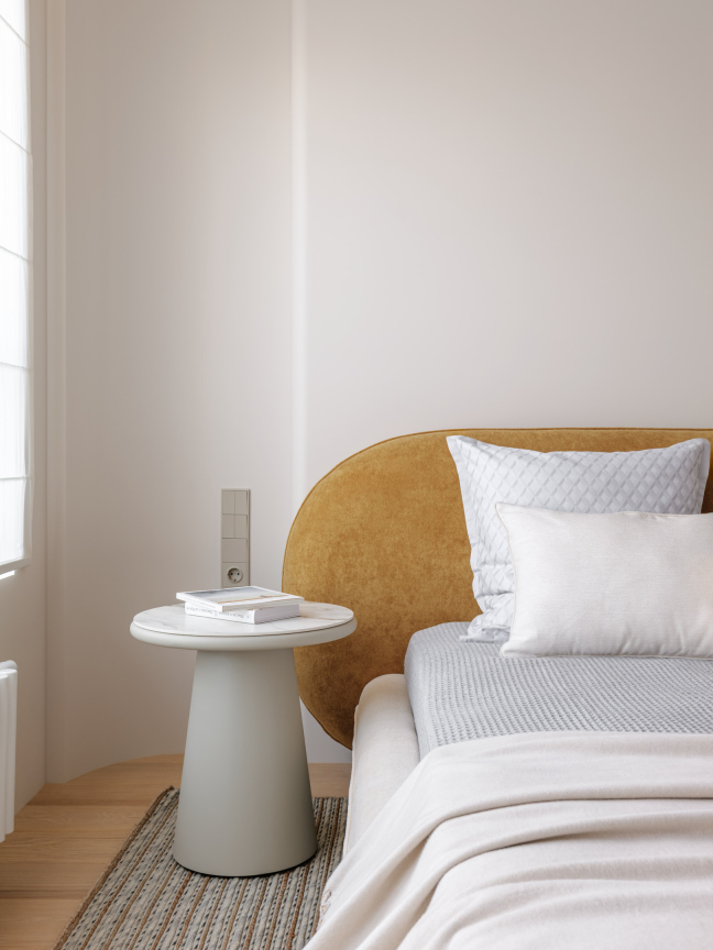
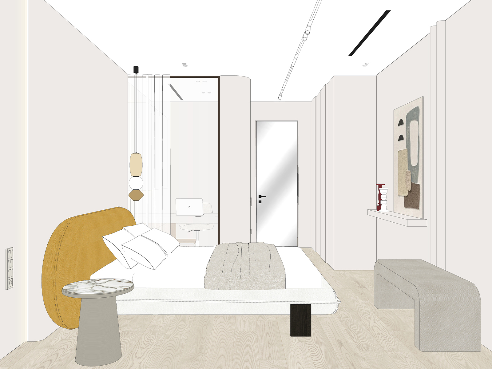
For the seating area in the bedroom, we chose only rounded accessories and furniture. The small table rhymes with the dining table in the living room, and the bright headboard adds another playful touch.
For clothing storage, we designed and built a large wardrobe that matches the wall color, but we made the fronts dynamic: varying the thicknesses creates a rhythmic pattern. We placed a mirror directly on one of the door panels – a convenient solution for small spaces.
That is how we presented the interior during the design phase: every item and material had already been chosen. Meticulous attention to detail allowed us to deliver an interior that matches the renderings perfectly.