Beige 79 m2 apartment with a walk-in closet in Yekaterinburg: photos, videos, and estimate of the completed interior
We designed and implemented this beige interior for the clients who are planning to gift an apartment to their daughter. The customers found us on the recommendation of their friends and came up with a clear task: to design a basic interior within a strict budget, which the future owner can fill with her things.
We have prepared the project, sourced all the materials and items, created a cost estimate, and fixed the selling price. Our clients were informed of the total cost of their interior before the work began, and this amount did not change during the renovation process. We designed and built custom cabinet furniture specifically for this apartment.
| Size |
79 m2 |
| Type |
A two-bedroom apartment |
| Years |
2023–2024 |
| Features |
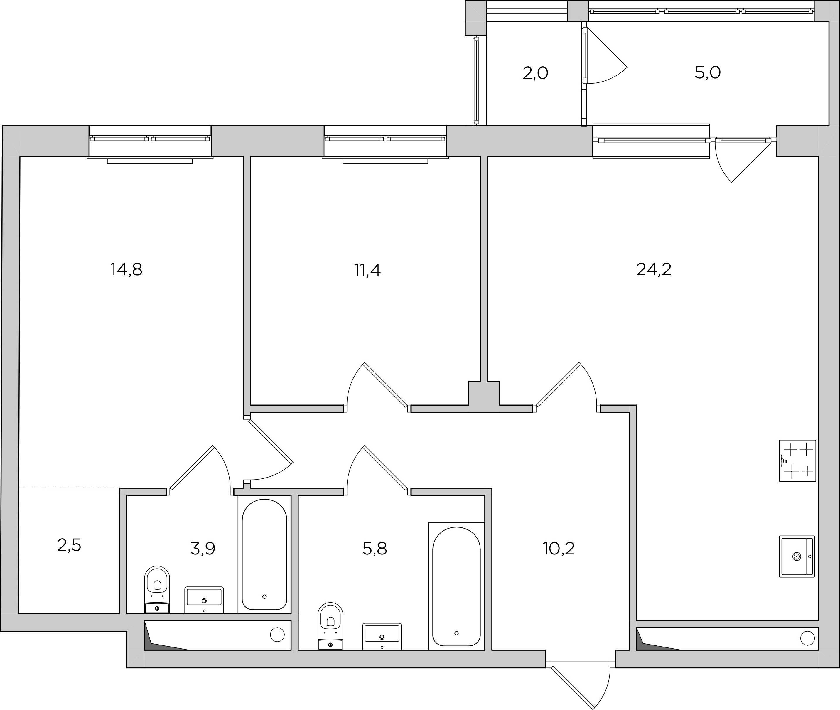
Load-bearing column in the center of the apartment, dark corridor, exit to a loggia with a window sill, and a small walk-in closet |

Exit to a loggia with a window sill
Load-bearing column in the center of the apartment

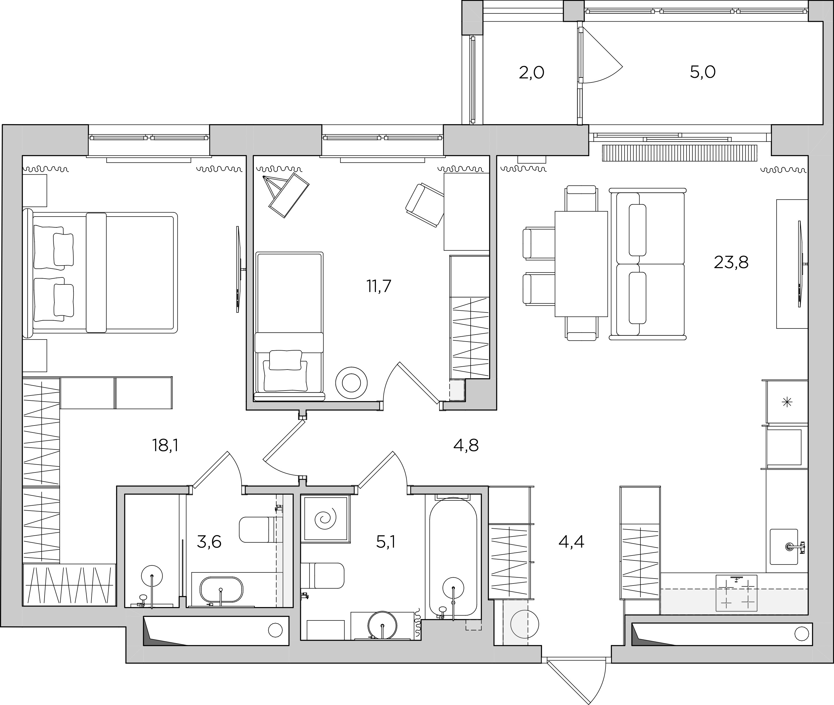
We removed the partition between the hallway and the kitchen, which helped to save storage space in the closet
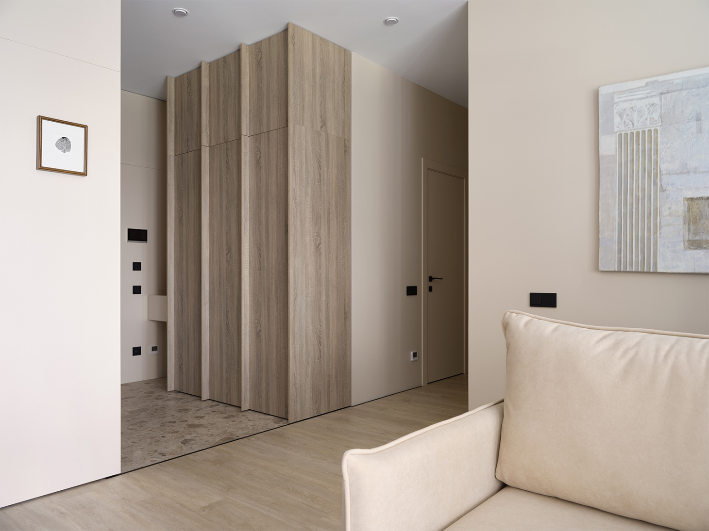
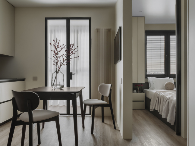
We combined the entrance hall, corridor, and an open-concept kitchen living room to create a larger and brighter space
Hid the load-bearing column with furniture
Converted part of the bedroom into a walk-in closet
The original developer's layout wasn't bad, but there was a dark corridor connecting the hallway and bedrooms. Additionally, there was a load-bearing column almost in the center of the apartment, which we carefully hid. We made a small redevelopment by removing the partitions between the hallway and the kitchen-living room, shortening the corridor, filling it with natural light, and expanding the walk-in closet while keeping the master bedroom.
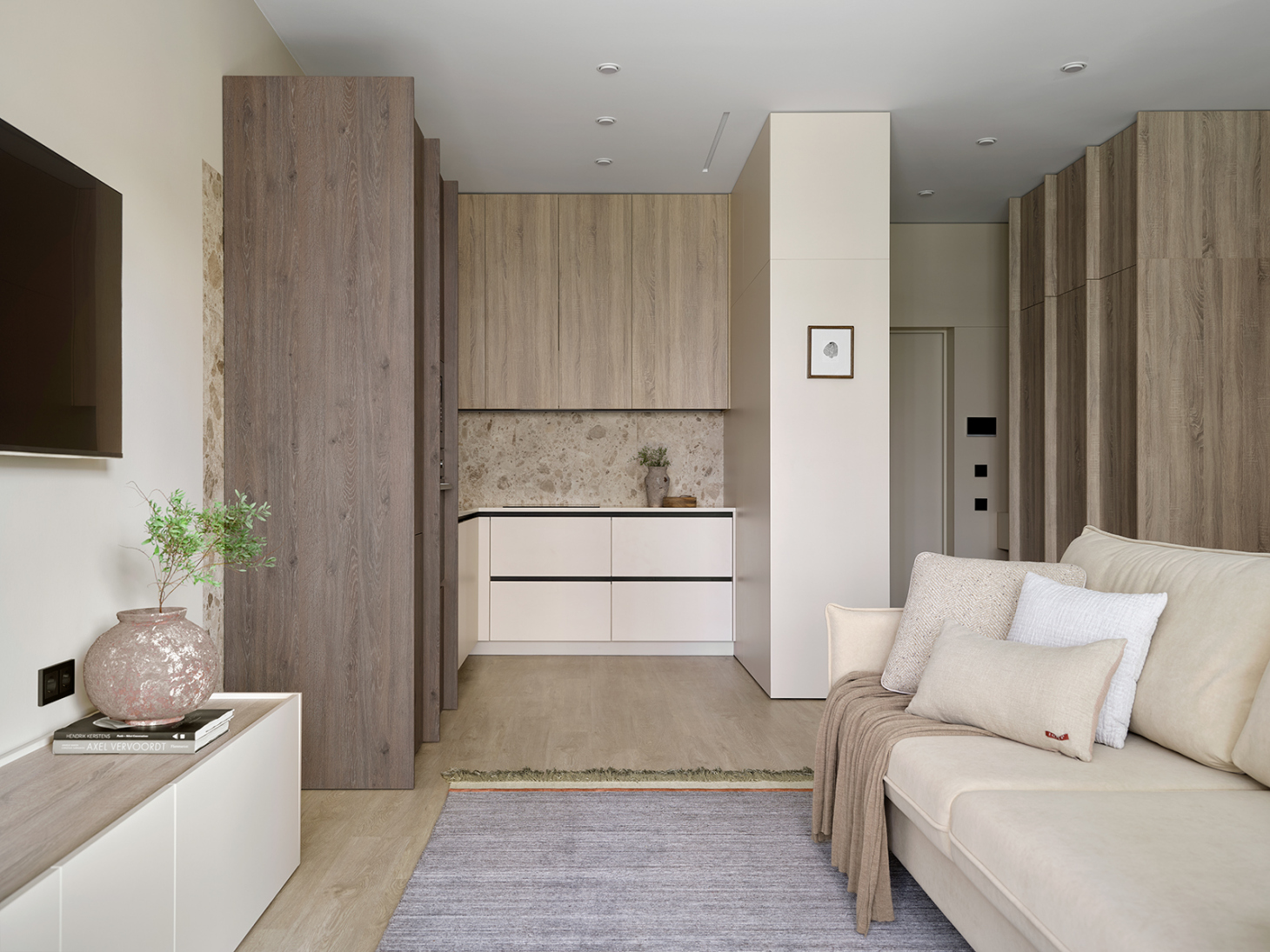
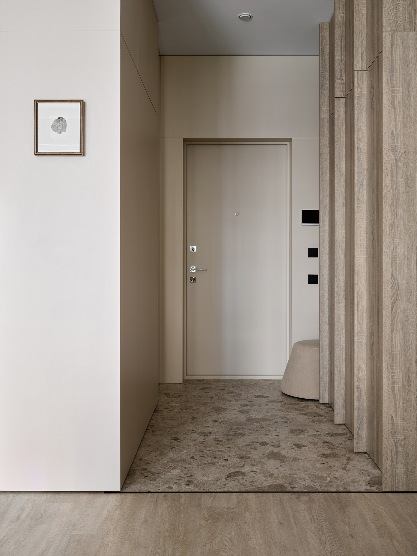
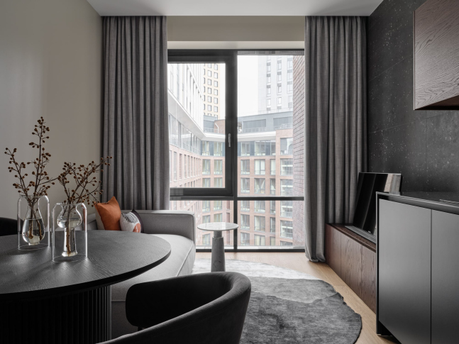
The decoration and furniture are neutral in this apartment, so the interior will become the basis for future memorabilia and decorative items for the owner. The wooden texture on the furniture, terrazzo pattern on the tiles, and black accessories and baseboards create a balanced interior.
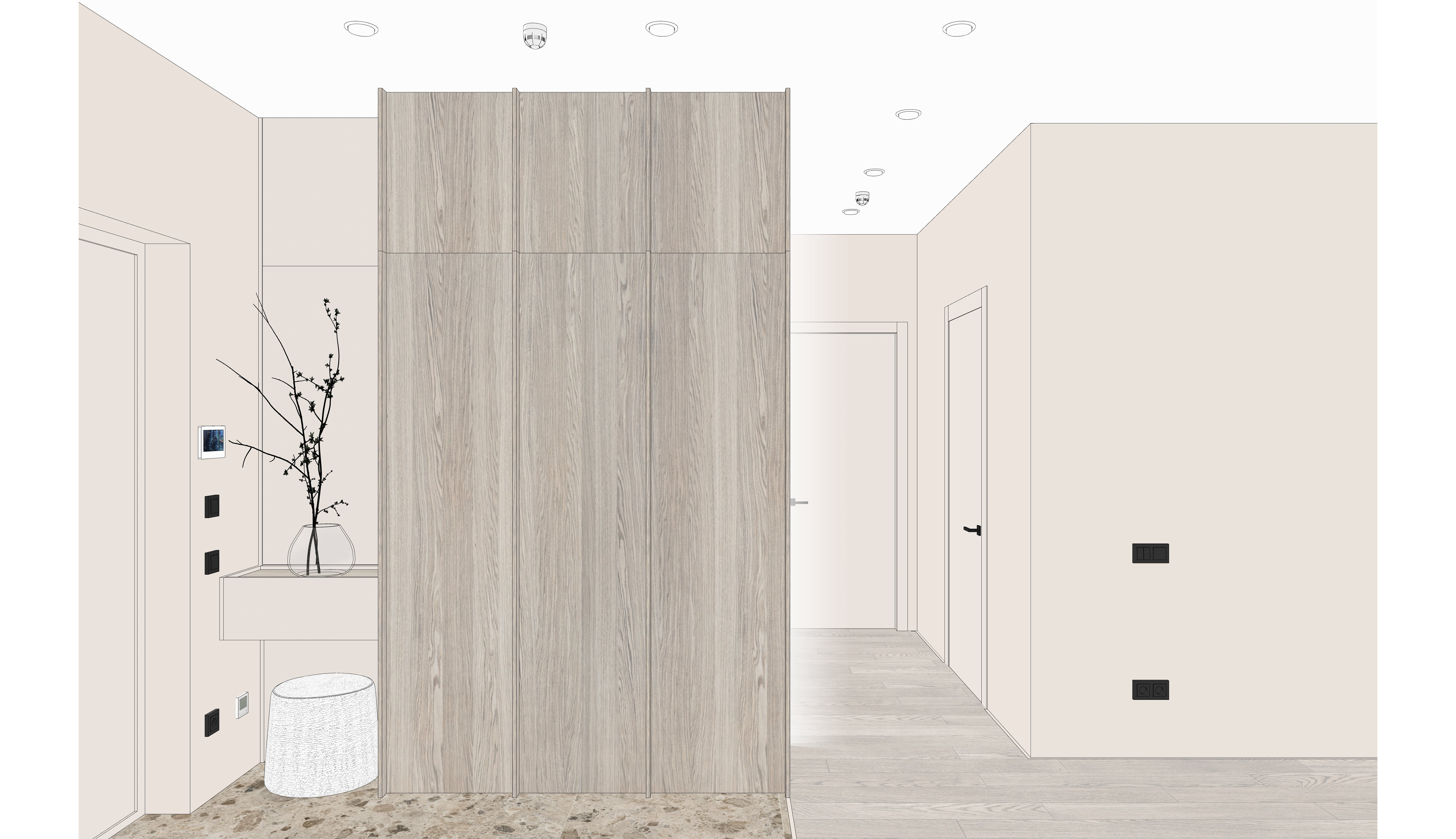
We placed a floor-to-ceiling mirror and two large wardrobes in the hallway. The first wardrobe, which is beige, separates the kitchen and hallway, while the second one has a module for charging the vacuum cleaner. Despite having a strict budget, we aimed to design a unique interior, so we added "ribs" handles to the second cabinet to introduce rhythm to the monotonous surface.
In this video, we discussed the unique handles of the cabinet and the kitchen cabinetry.
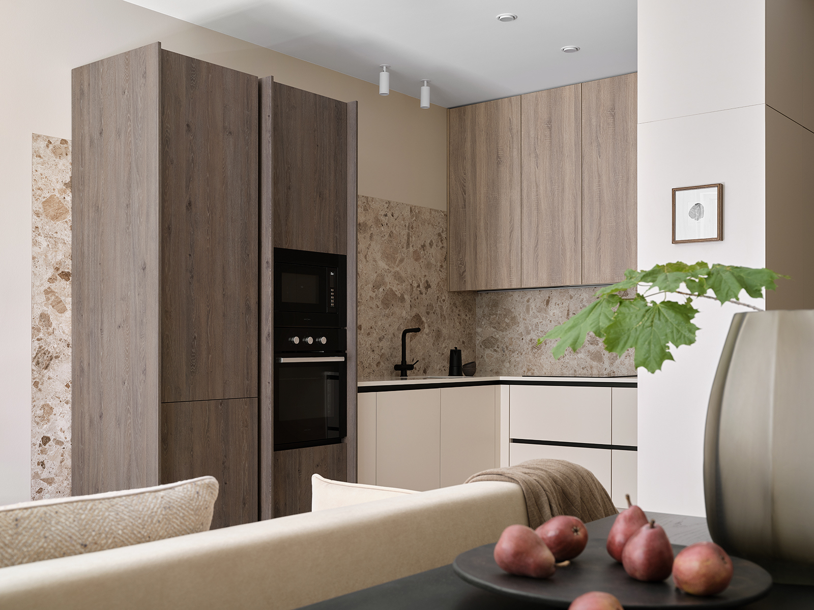
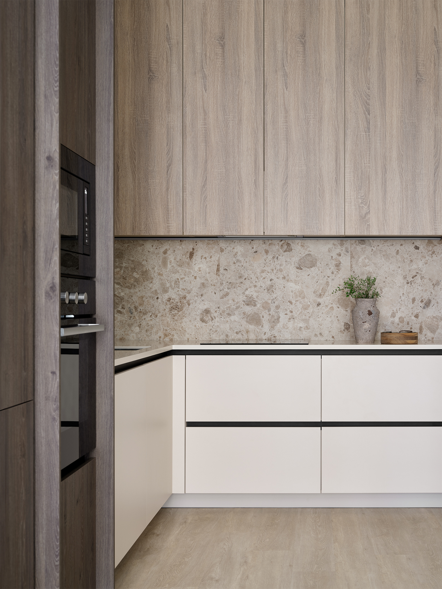
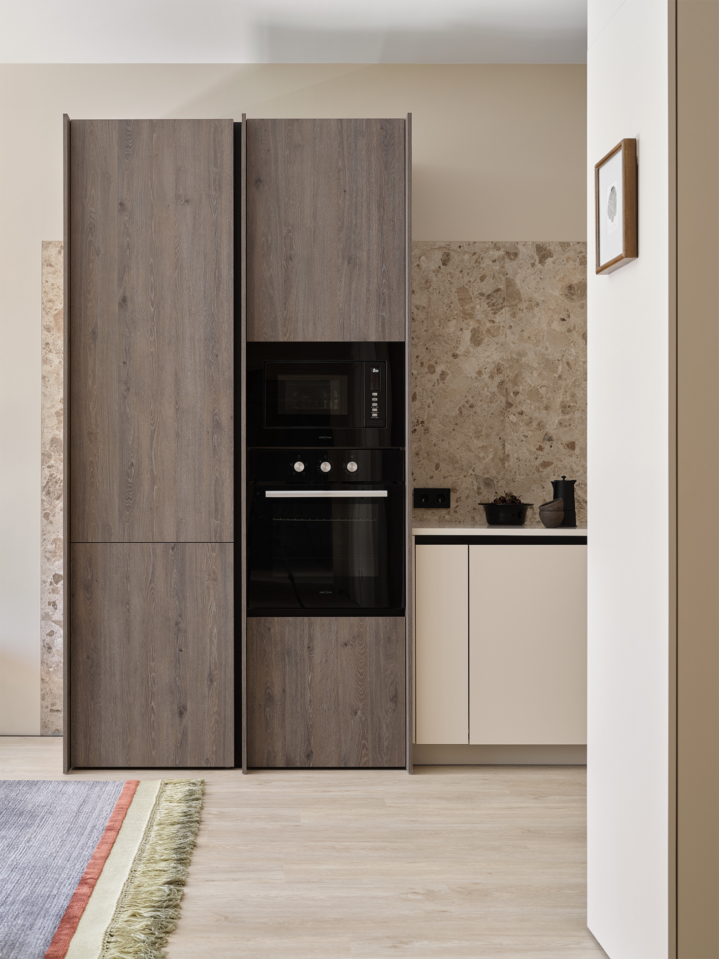
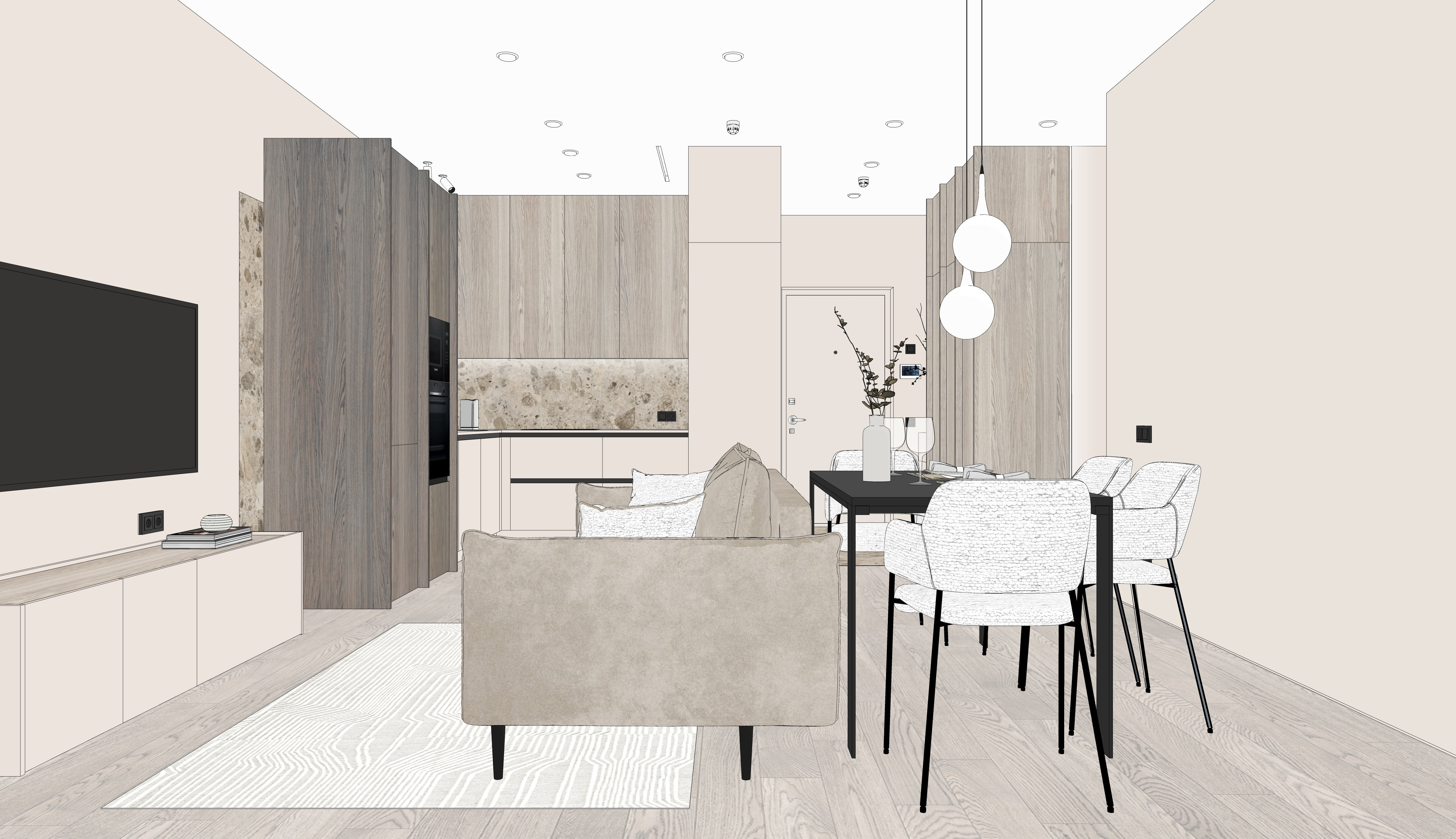
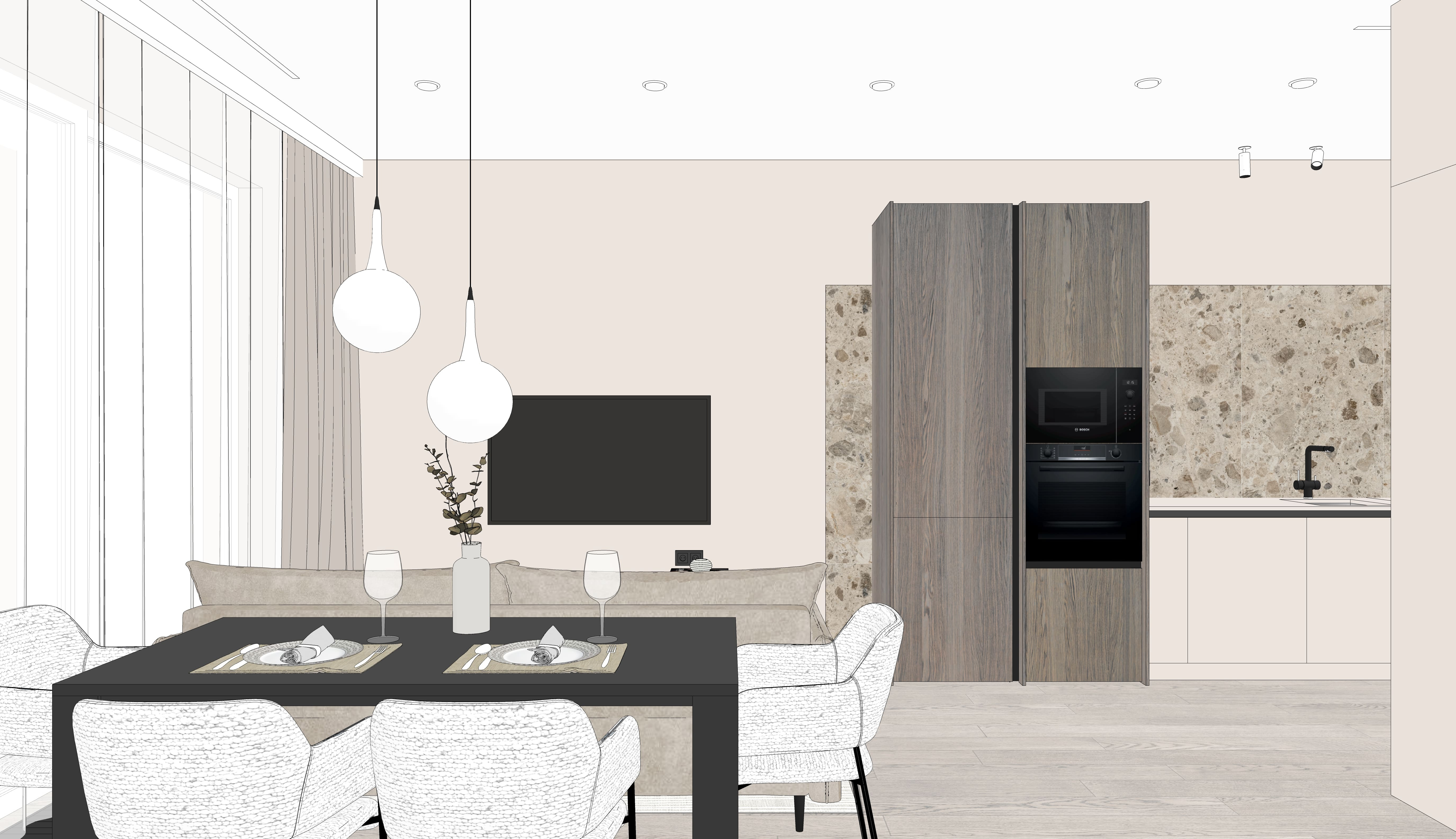
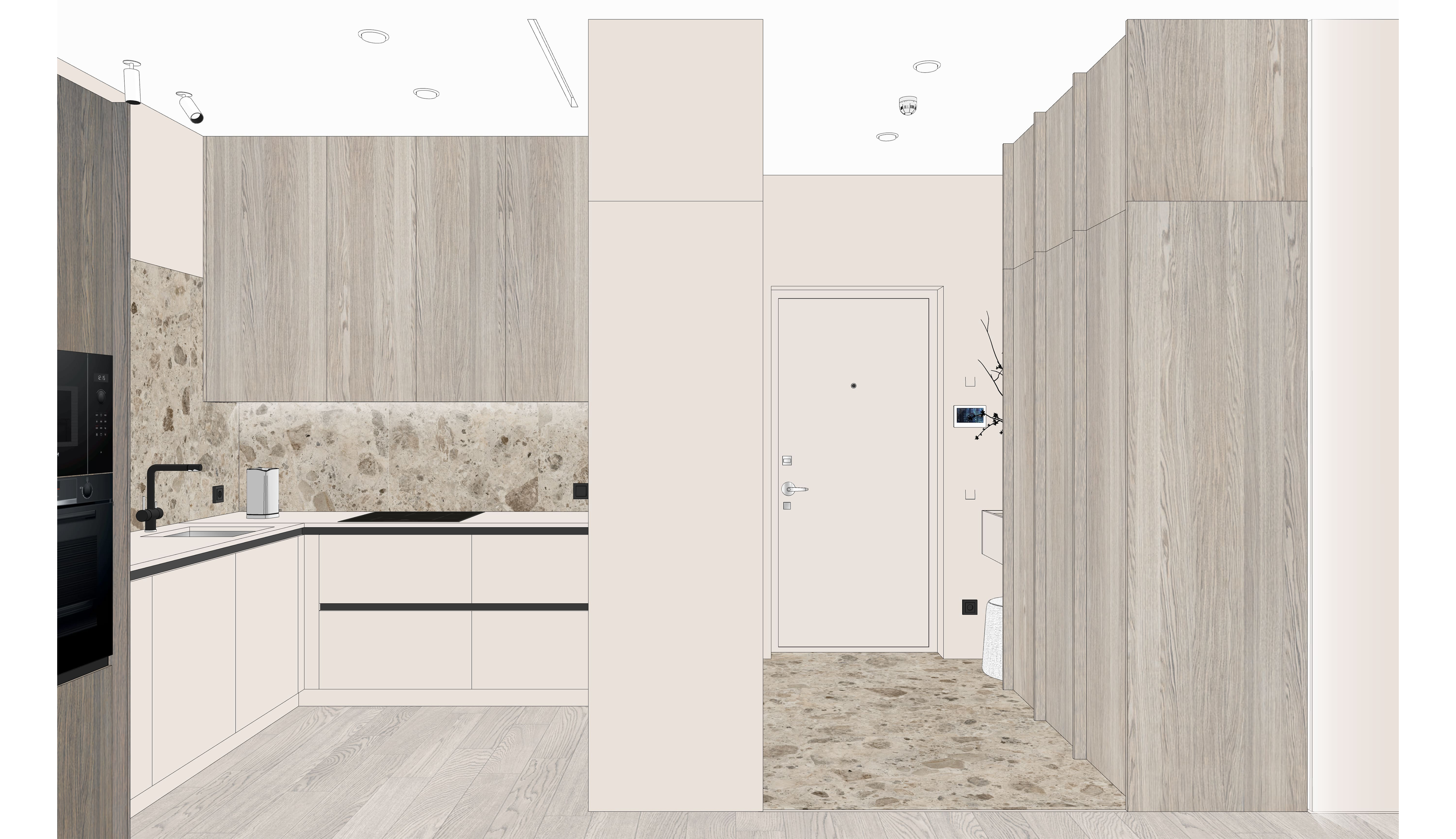
We designed the kitchen corner to maximize the use of the niche provided by the developer. The lower modules have drawers with built-in handles. The hood is concealed behind the upper cabinets. We chose not to extend the upper cabinets above the kitchen sink to simplify the kitchen layout.
For the same purpose, the column cabinets were not brought up to the ceiling. The apron features large-format porcelain tiles; we installed it to be flush with the wall and extended it slightly beyond the edge of the column cabinets to visually connect the kitchen and living room areas.
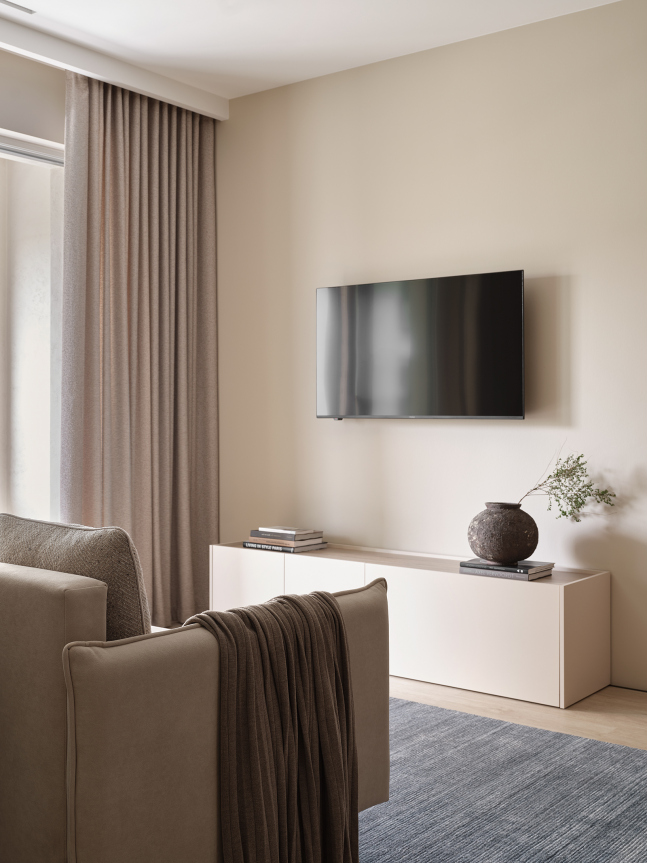
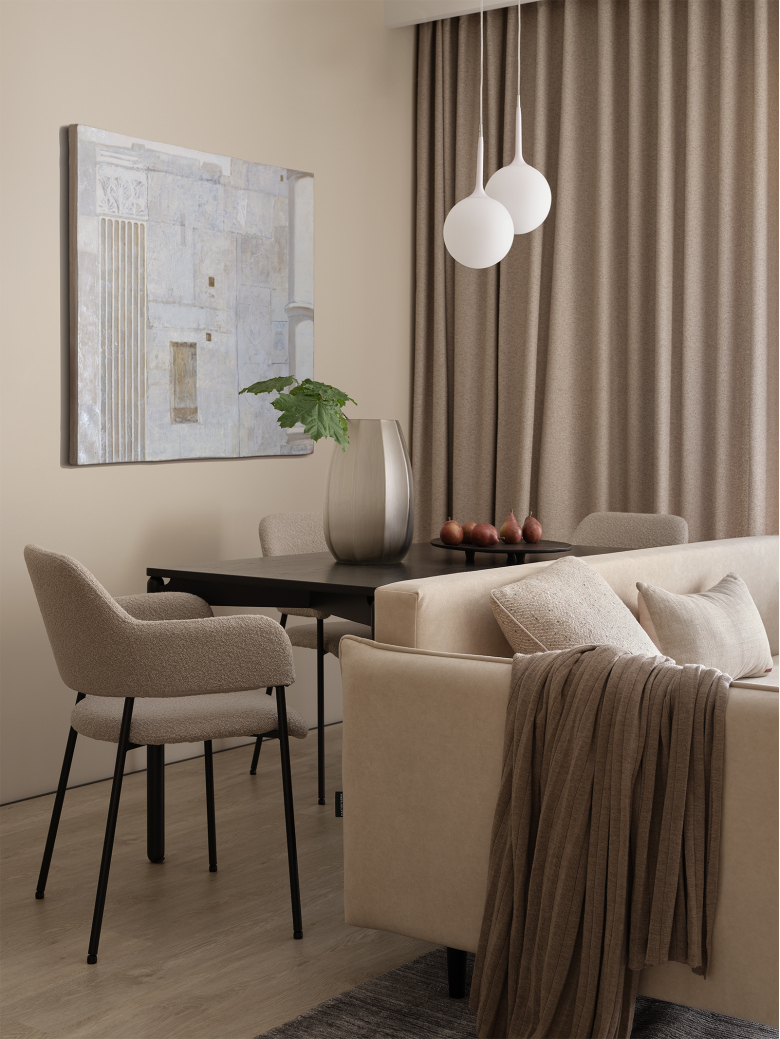
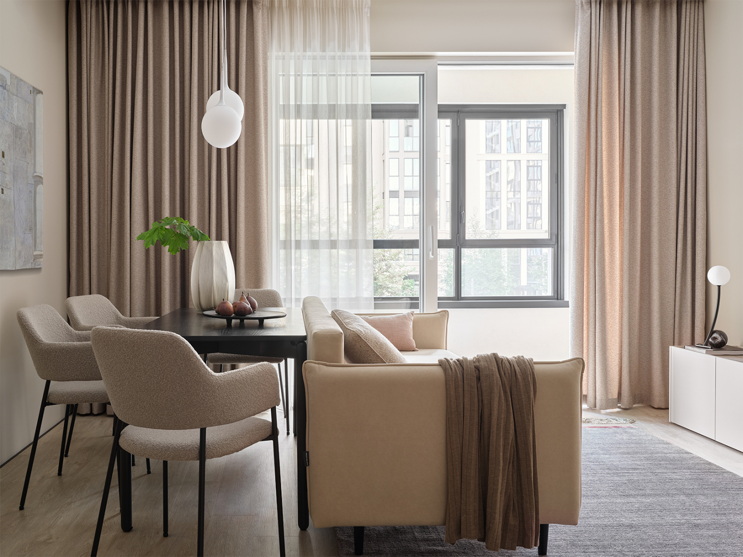
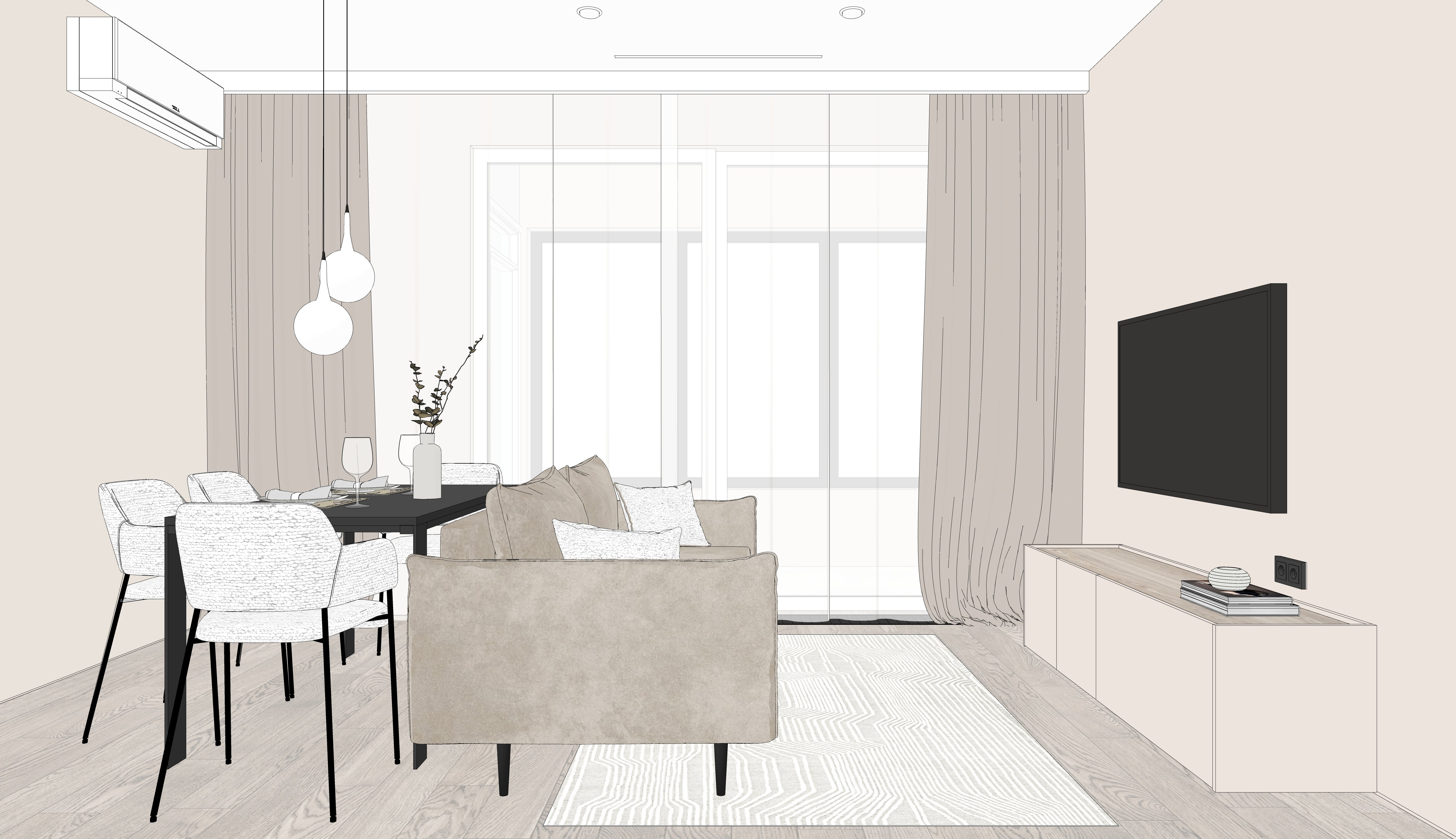
In the living room, we positioned a table and a sofa next to each other and mounted the TV on the wall on the same axis as the furniture pieces. The exit to the loggia was standard –with a window sill block and a radiator on it. We dismantled this block and installed a sliding door, moved the radiator to the wall on the left. Additionally, we installed an in-floor convector to minimize condensation on the window and keep the area around the door warm. Despite having a limited budget, the clients opted to have a fresh air ventilation system installed in the apartment to ensure clean heated air. We discreetly implemented this system using barely noticeable ceiling grilles in the rooms.
We showed what the exit to the loggia looked like before the renovation.
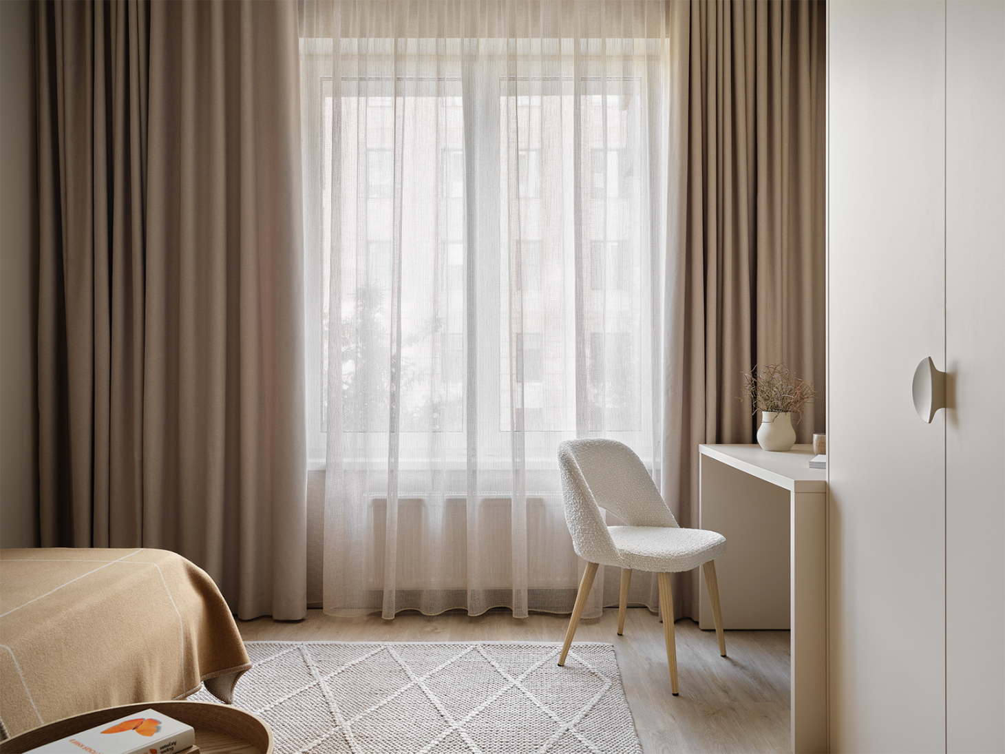
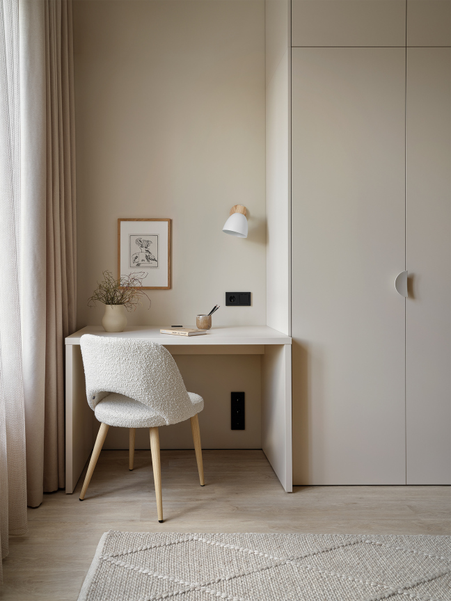
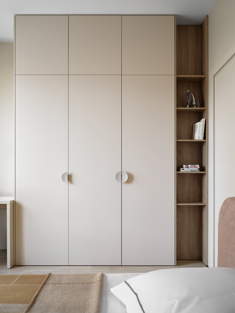
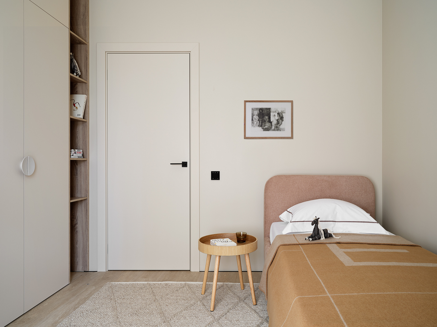
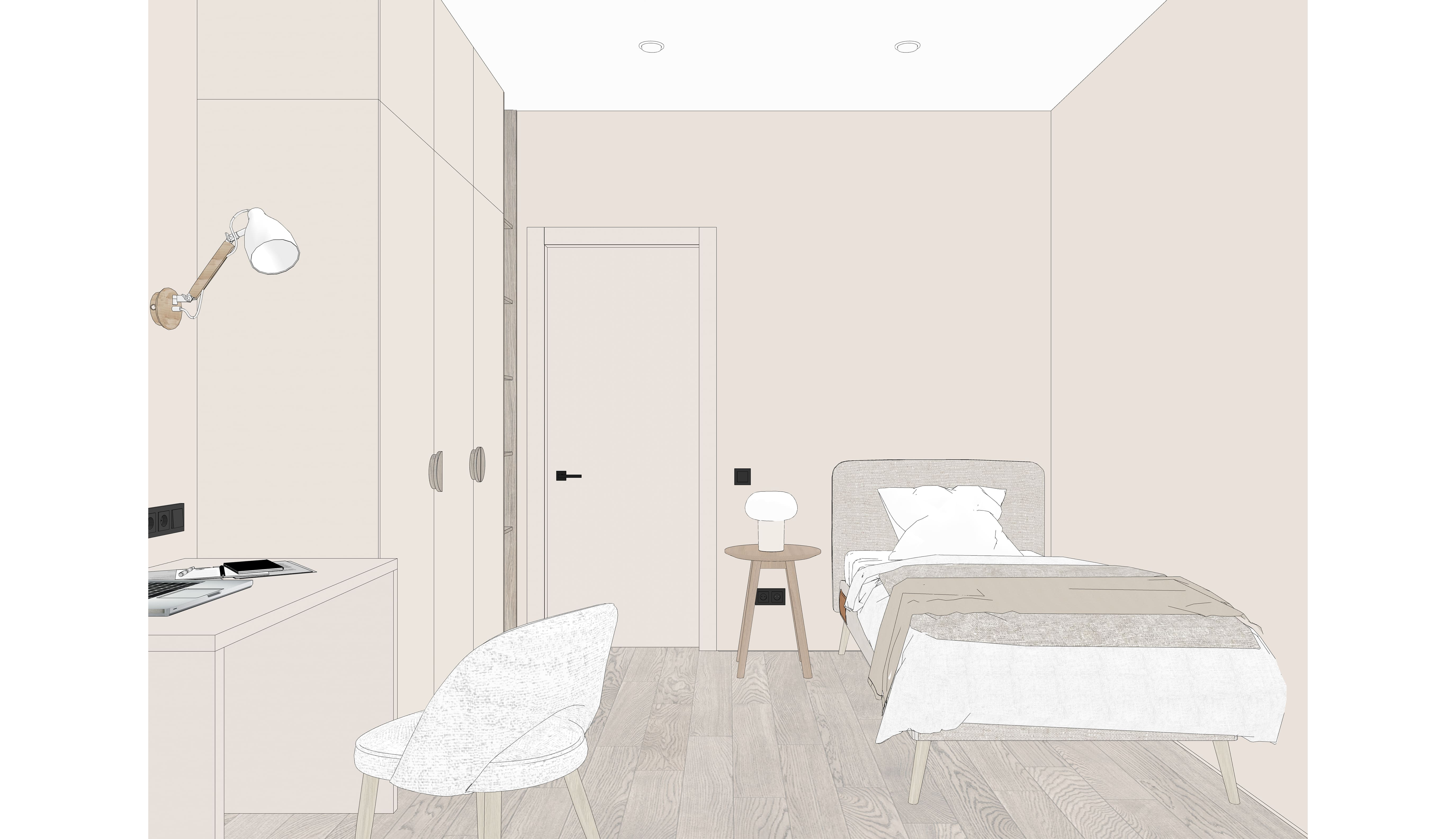
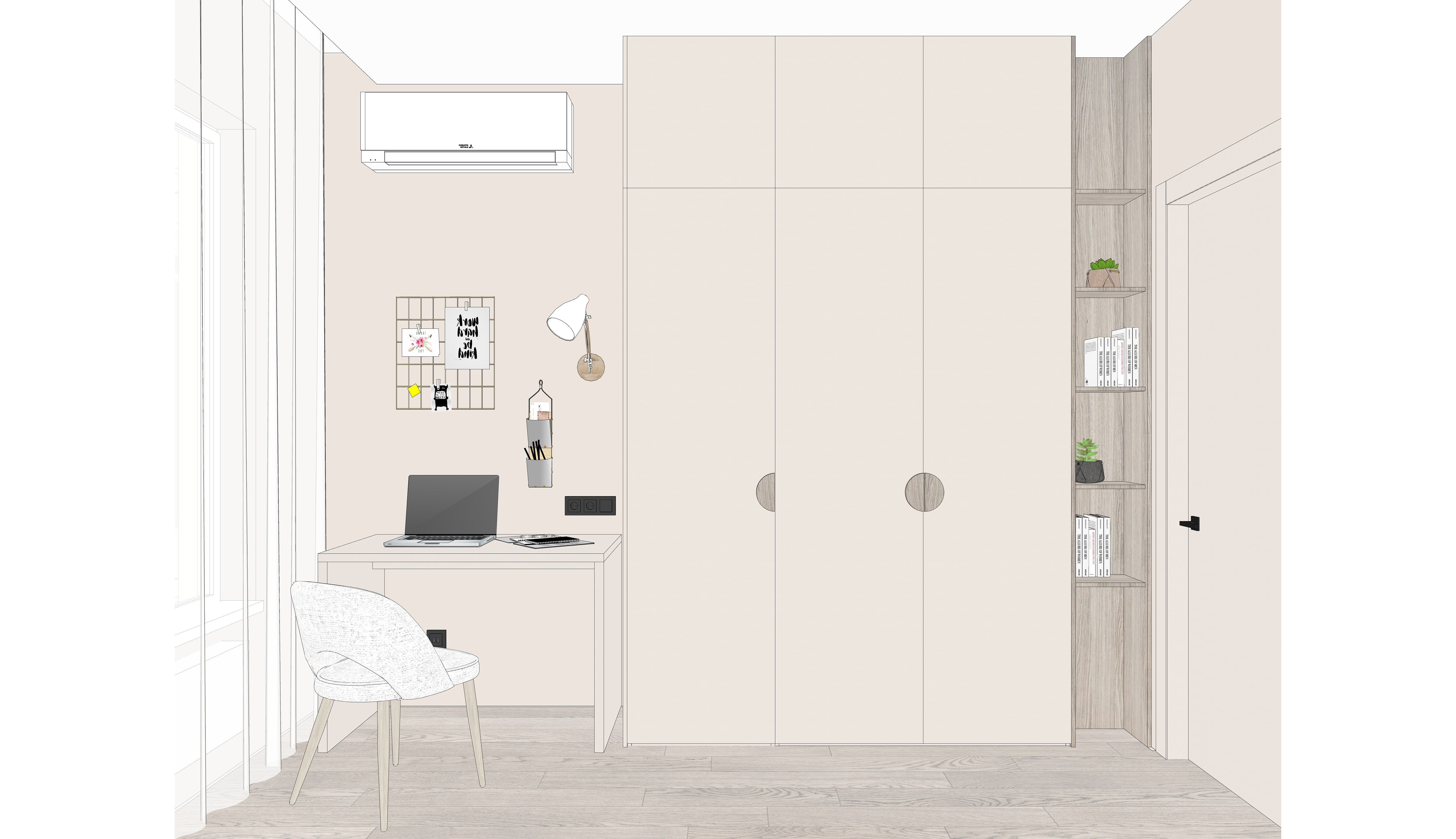
We made one of the rooms to be versatile; it can now function as a home office or a guest bedroom, and in the future, it can easily be converted into a kid’s room. It includes all the essentials: a desk, a spacious wardrobe, and a bed.
We hid the supporting column behind a small shelving unit.
For this interior, we opted not to use hidden doors, but instead paint the panels and frames in the color of the walls, so they almost blend in.
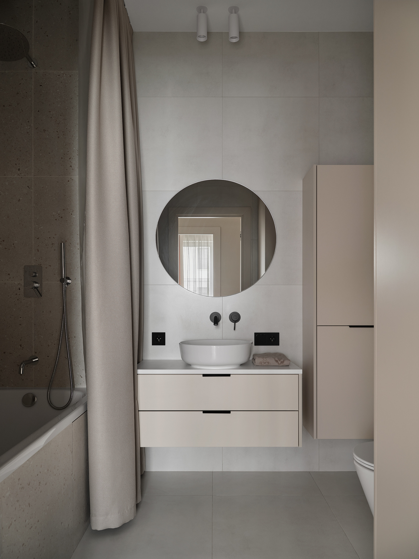
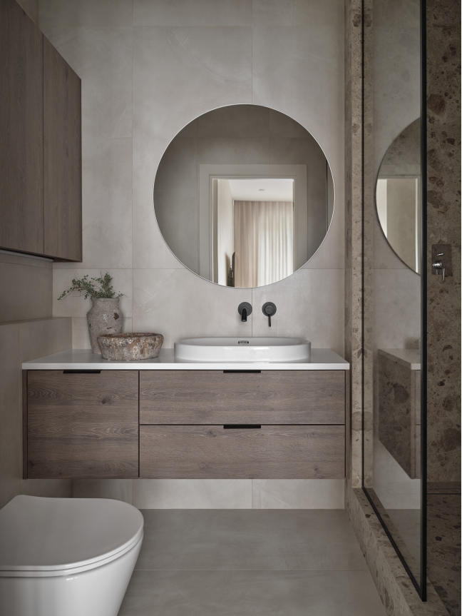
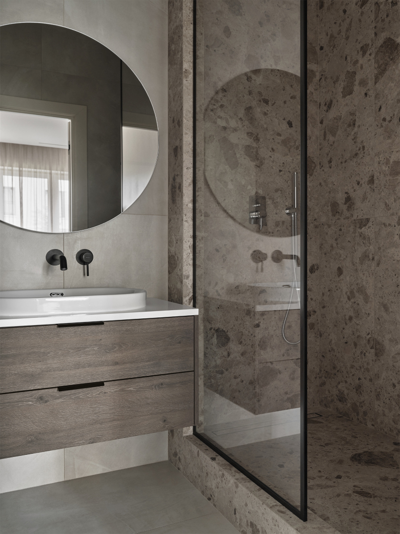
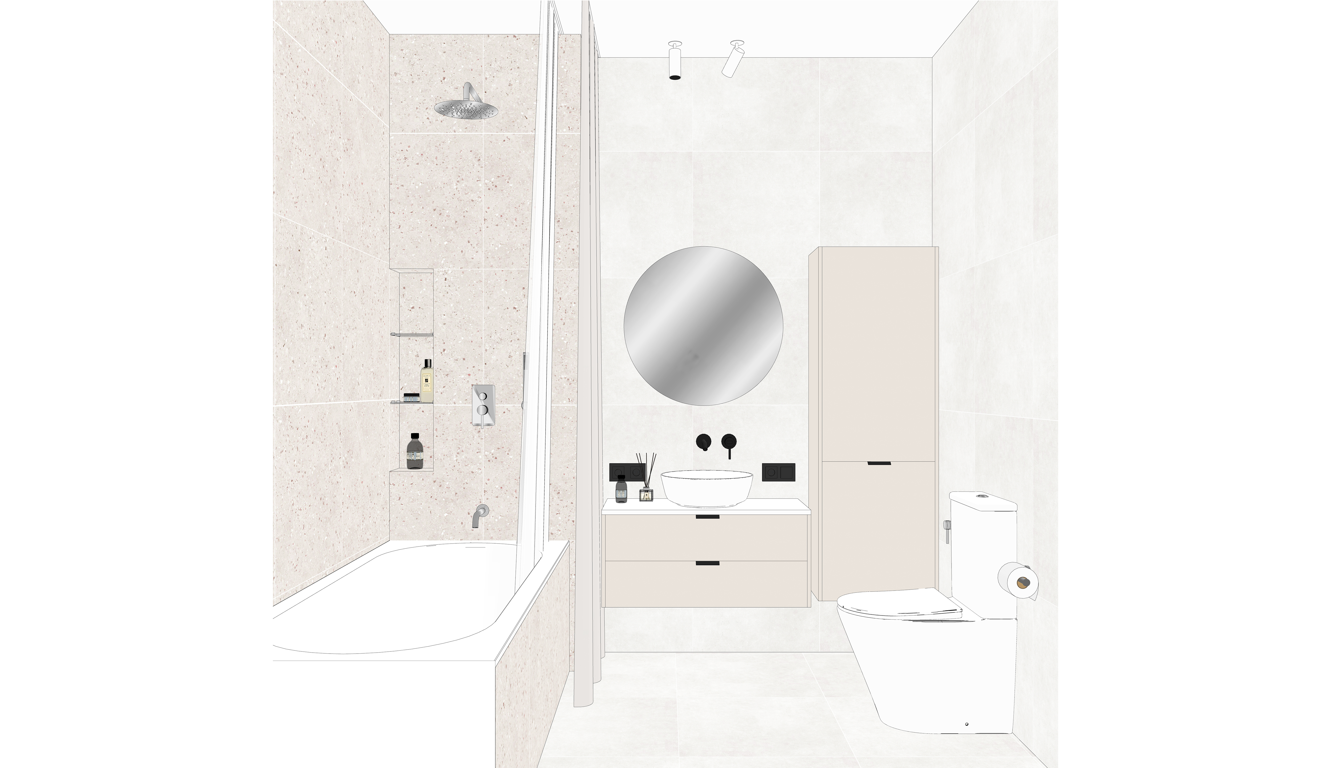
For the bathroom, we selected neutral porcelain tiles with a concrete texture. To the right of the sink, there is a cabinet, behind its lower folding façade, there is a laundry basket, which is easy to access and use for putting dirty clothes into for washing – the washing machine is hidden in the column cabinet. This bathroom has two curtains: a decorative one made of fabric and a functional water-repellent one.
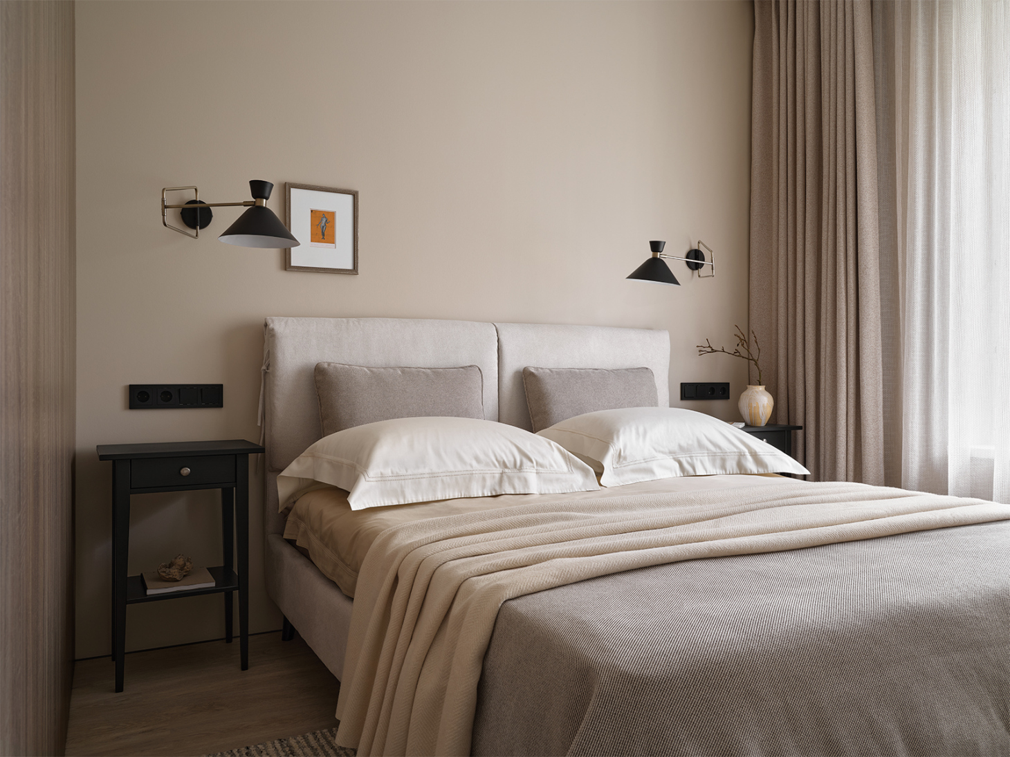
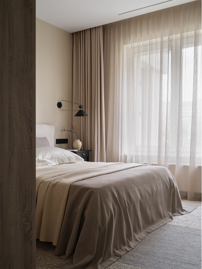
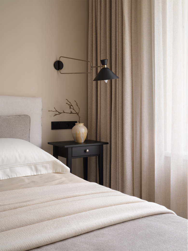
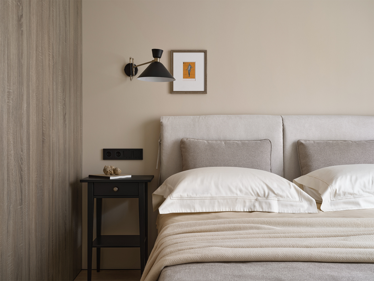
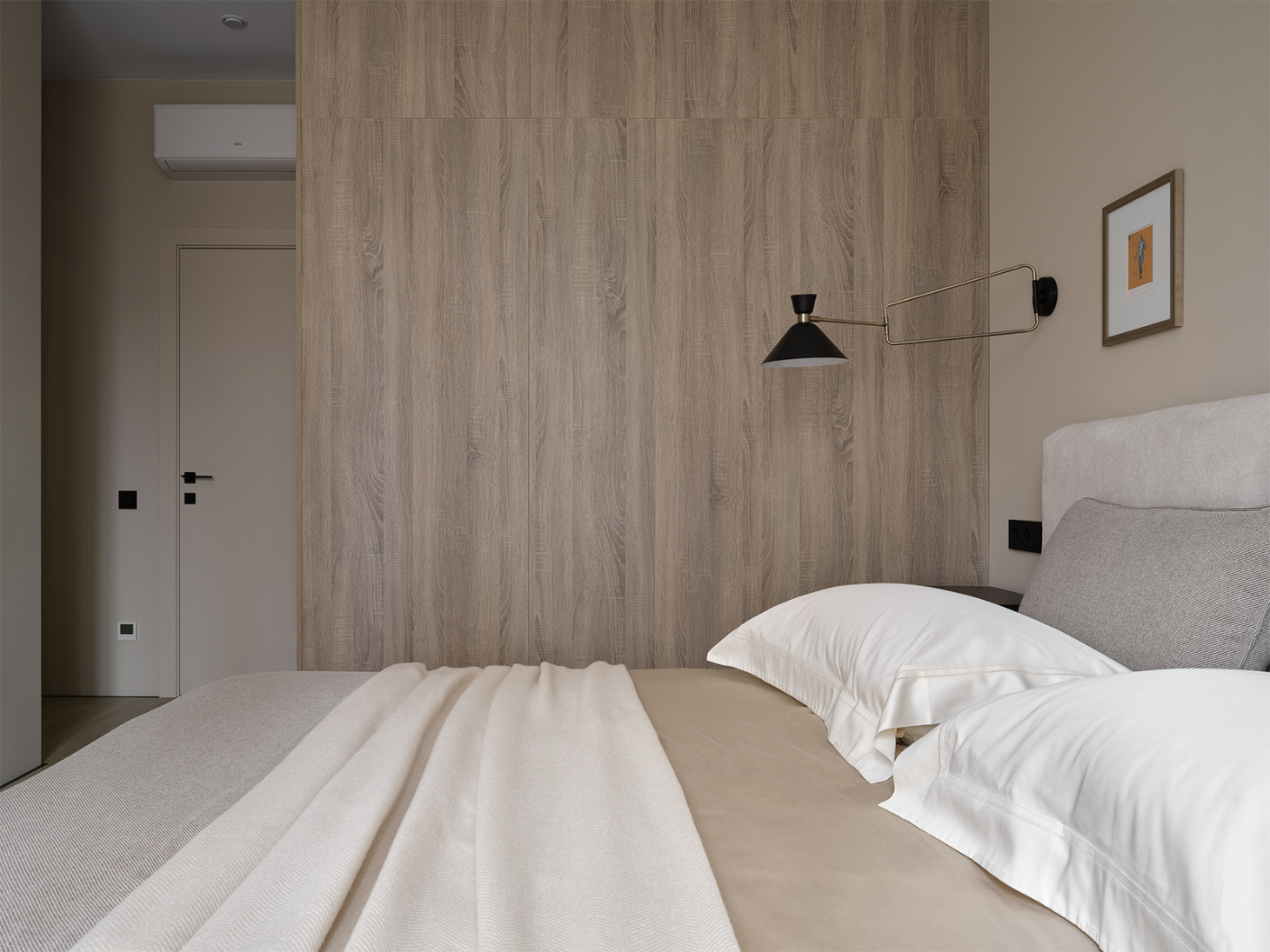
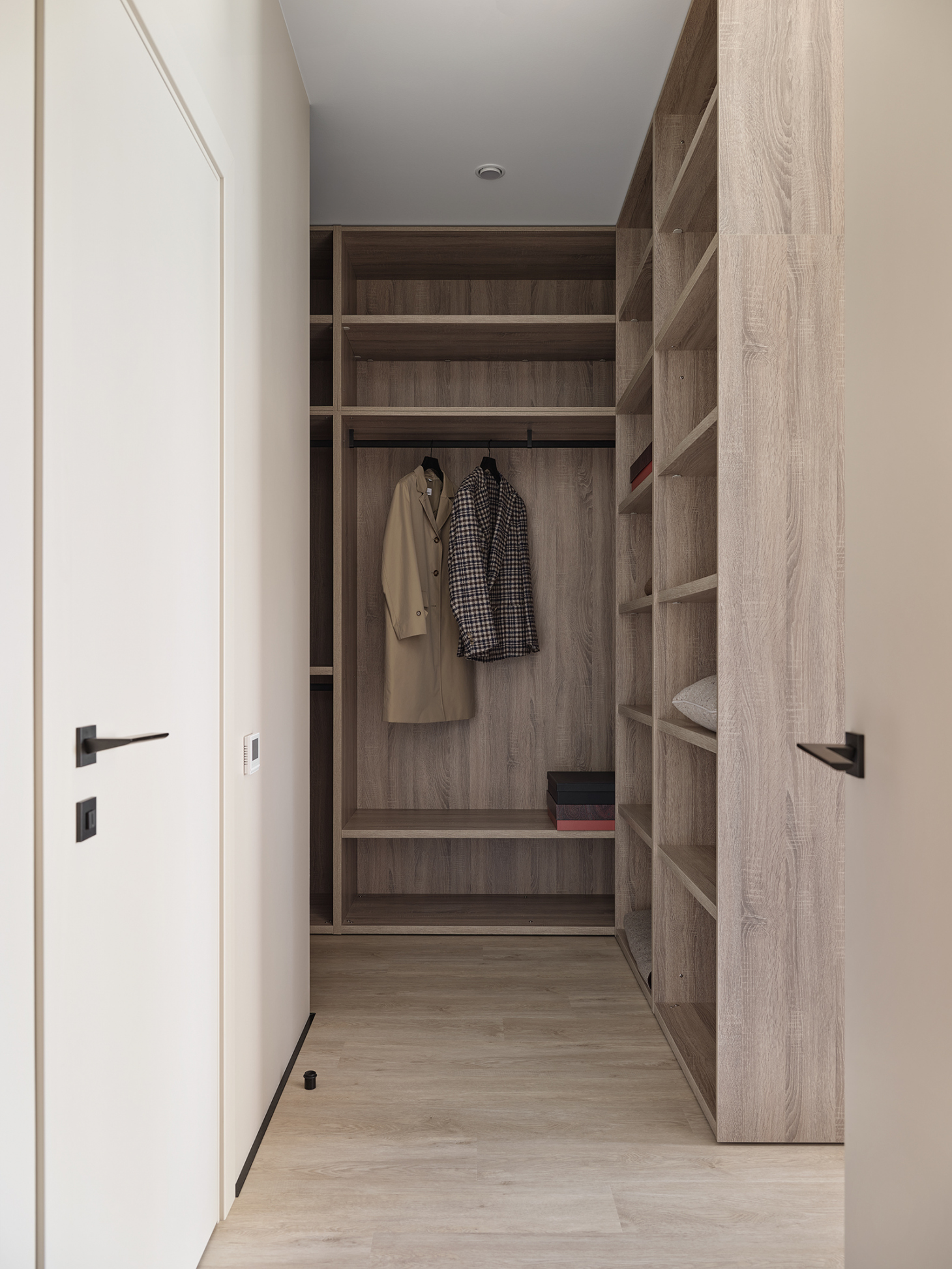
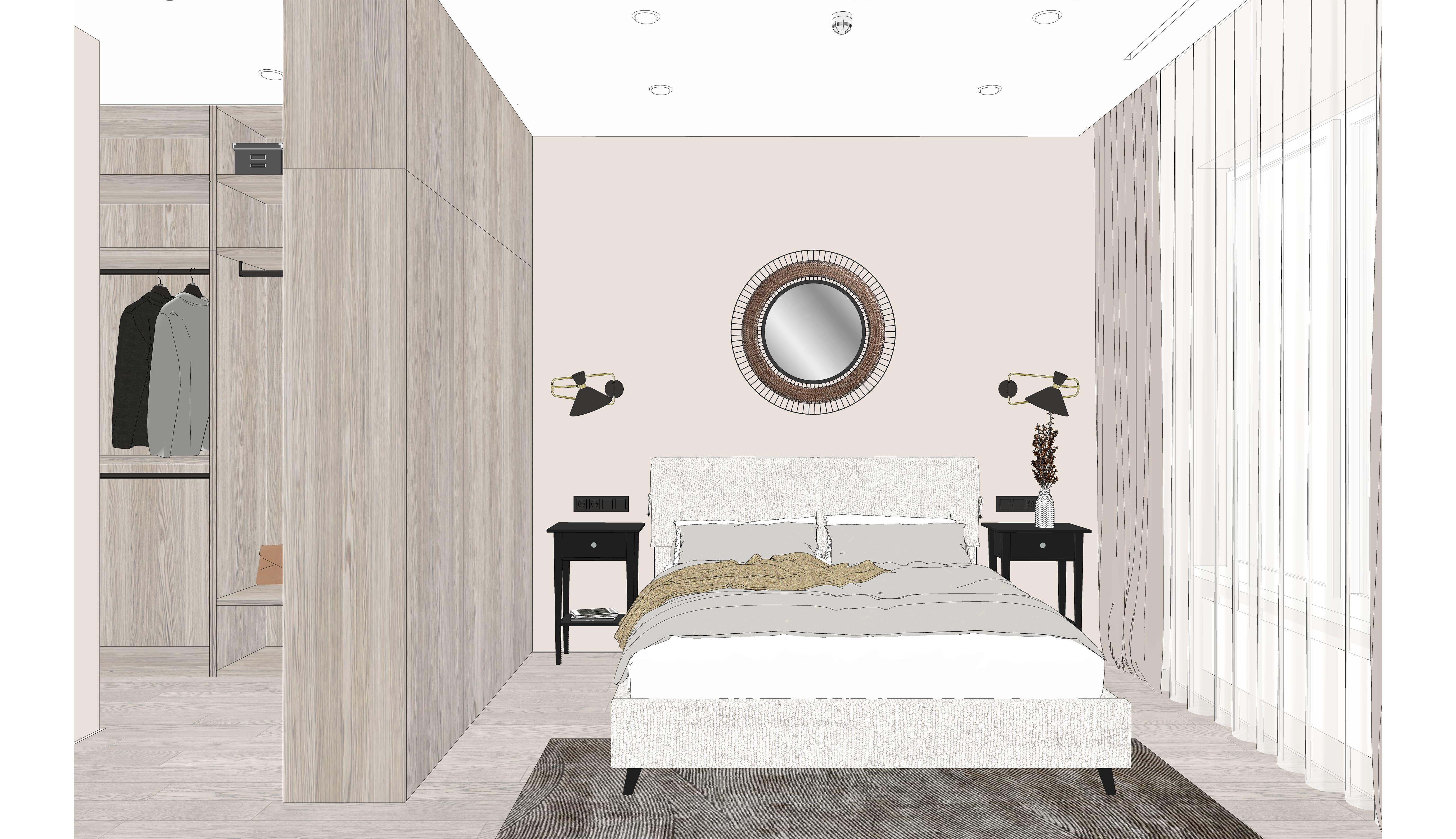
We kept the master bedroom but expanded the walk-in closet. We separated the dressing room and bedroom only with a closet instead of a partition to save space.
From the bedroom side, this closet looks like wall panels.
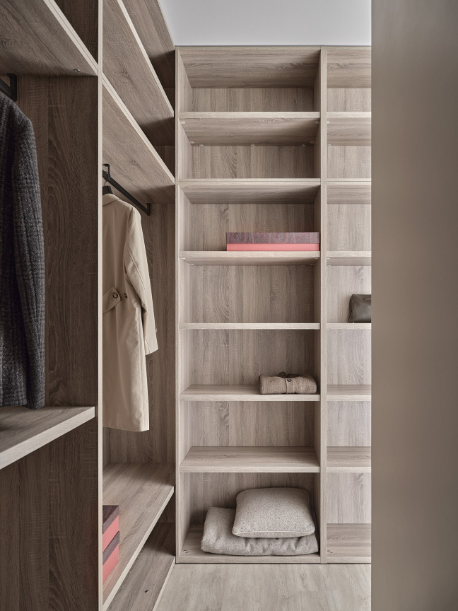
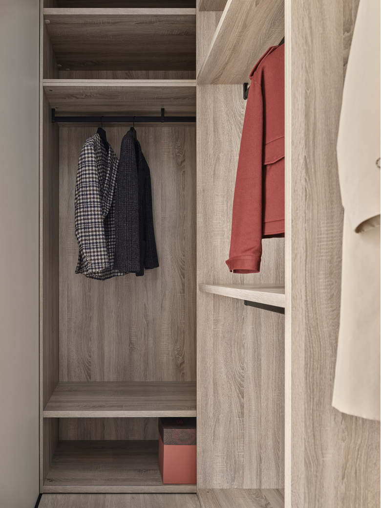
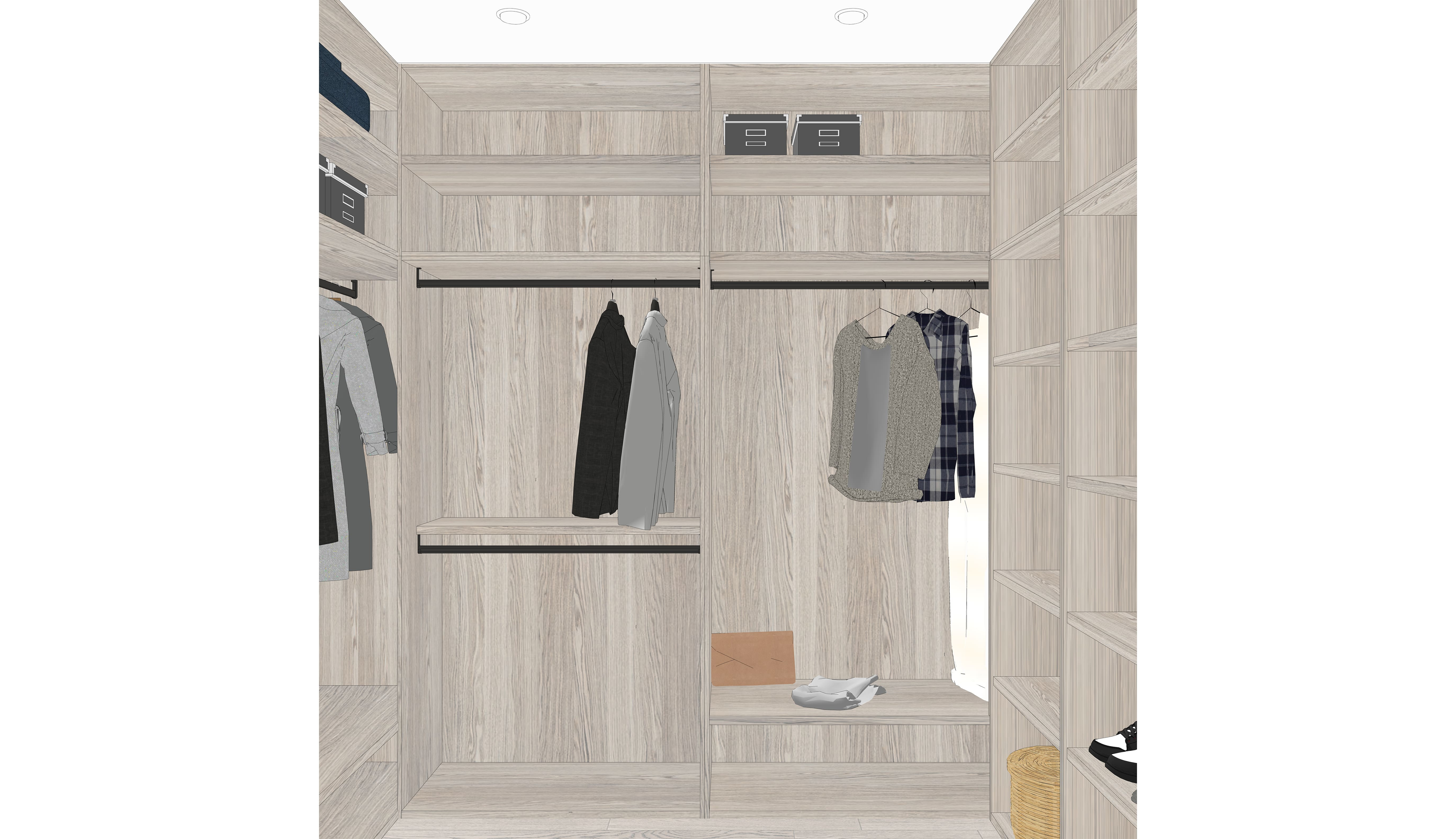
The walk-in closet itself is simple, without drawers or lighting. We designed it to fit the customer's budget. It is spacious: it reaches the very ceiling, and we extended the rods deep into the closets. This provides ample storage space for out-of-season clothes.
In the bathroom, we installed a walk-in shower with a partition and a large closet on the wall to store all the essentials.
As a result, we achieved an interior design that precisely met the customer's requirements: cost-effective, comfortable for everyday life, and adaptable for future decor changes.
We thoroughly showcased the bathroom in the video.
?autoplay="
title="YouTube video player" frameborder="0"
allow="accelerometer; autoplay; clipboard-write; encrypted-media; gyroscope; picture-in-picture"
allowfullscreen>
You can join us to explore the interior as it was presented to our customers. We conducted a comprehensive review, discussing both typical and atypical solutions. We published this video on YouTube as well.
This is how we presented the interior at the design stage: all objects and materials were carefully selected. Paying careful attention to detail allowed us to bring the interior to life as per the initial sketches.


