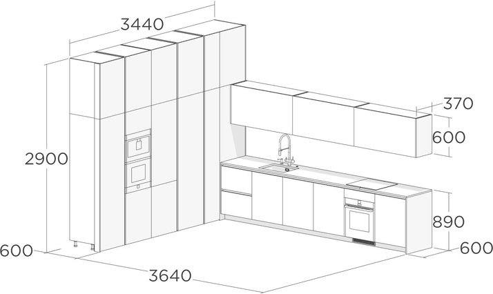
In more detail, we showed the design of this kitchen in the video.
We designed this kitchen for a brutalist interior with industrial aesthetics. In order for the kitchen to fit into the design of the space, we applied an unusual finish: the facades of the cabinets and lower modules are covered with metalized enamel.
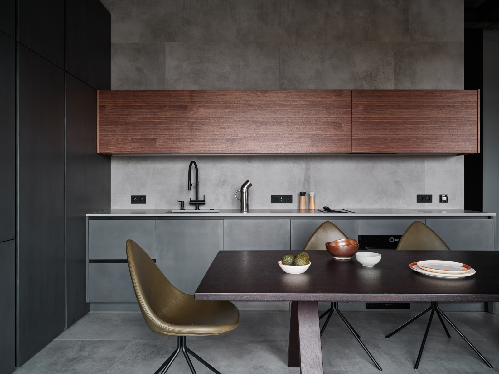
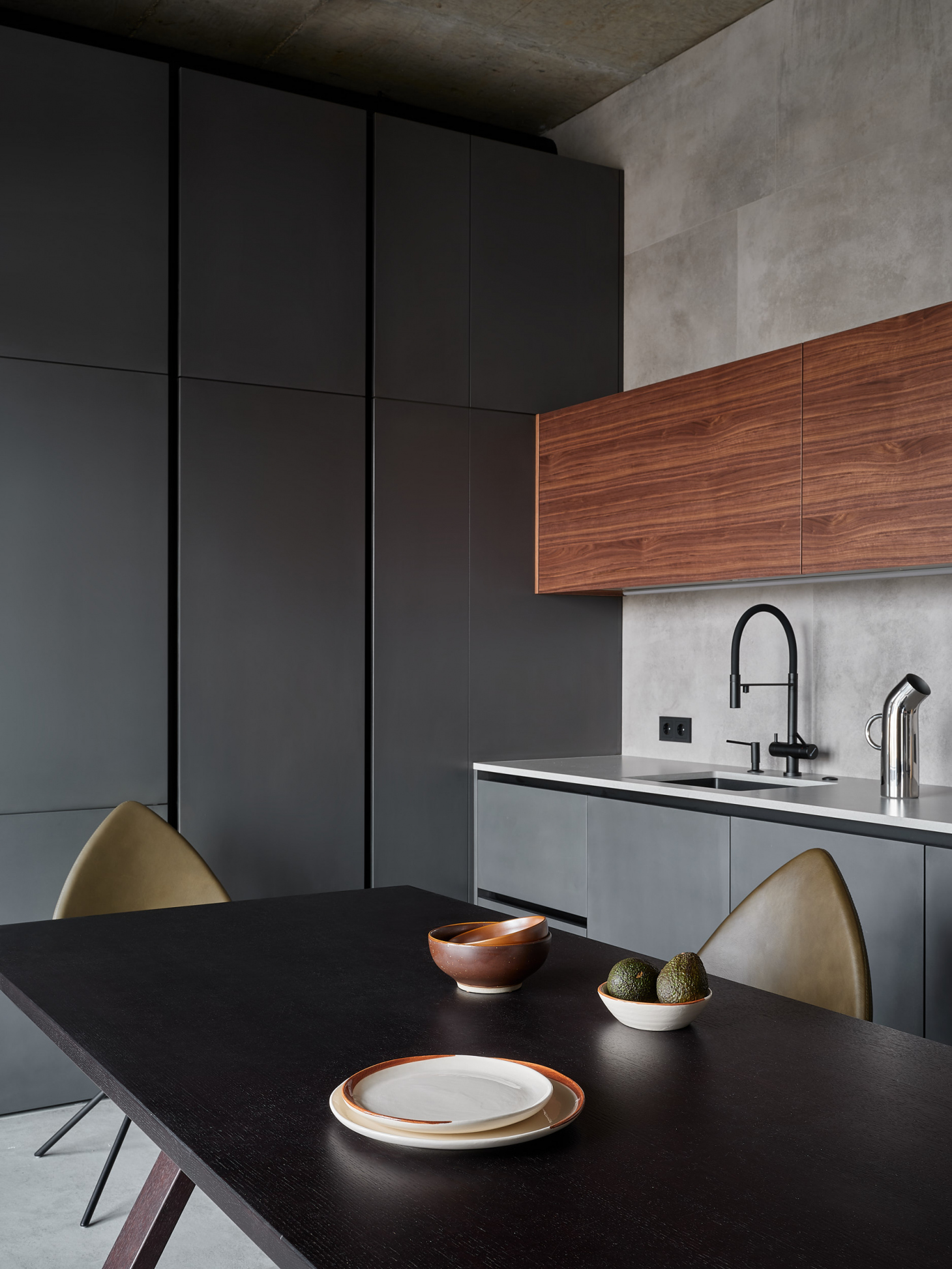
We finished the upper modules with American walnut veneer that has an active texture nicely contrasting with the metal. We did not extend the upper modules to the ceiling to visually lighten the kitchen; they form a narrow strip. One of the kitchen walls became longer after the remodeling. We placed a kitchen countertop with a concrete texture along it.
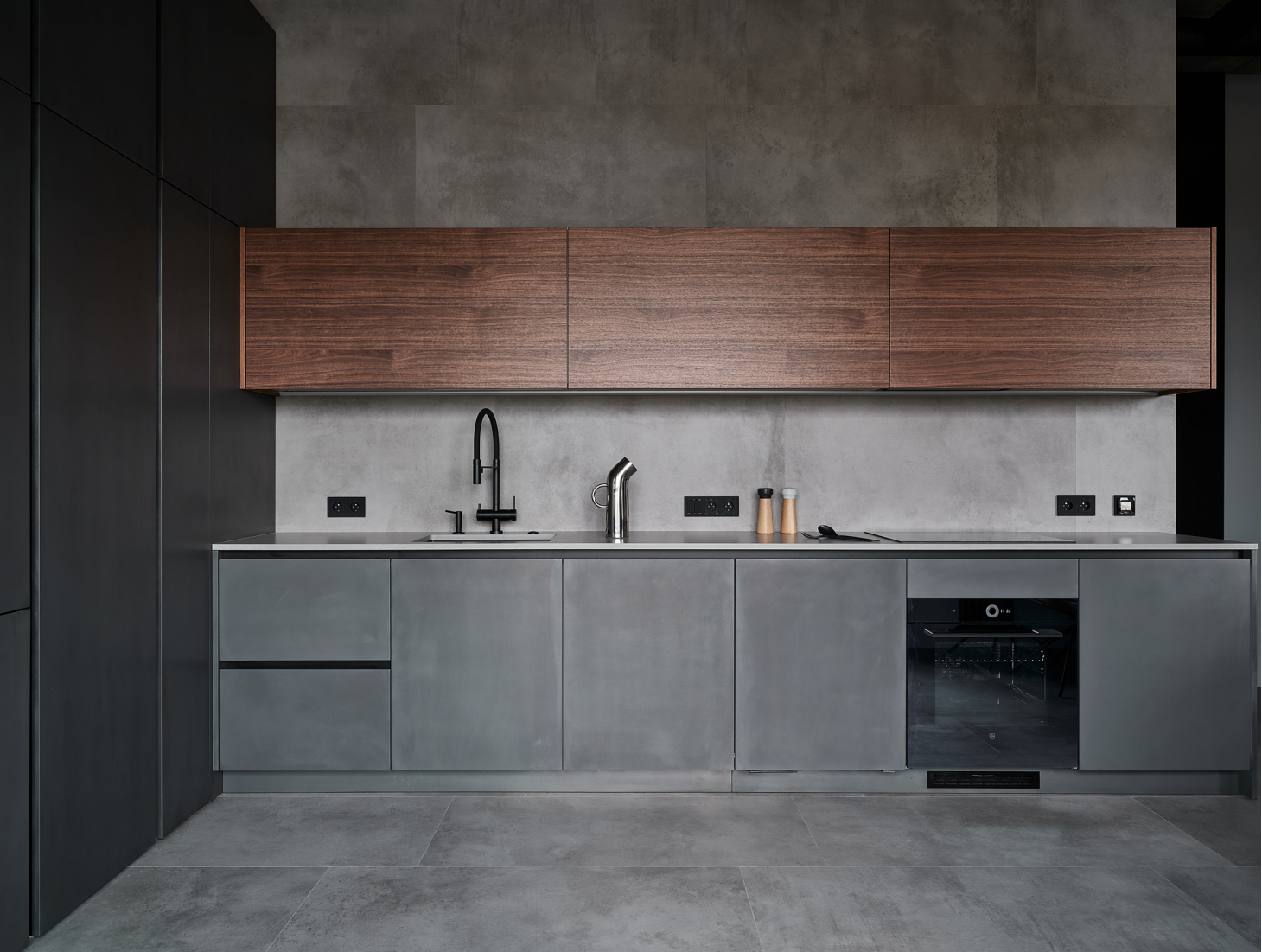
We experimented with a hood in this kitchen: a duct fan is located in the guest bathroom behind the wall; there is a regular hood above the hob, but it only serves as a filter. This is how we managed to make a quiet hood with a powerful draft and we kept the kitchen design clean, without a pipe running along the wall, at the same time.
In more detail, we showed the design of this kitchen in the video.
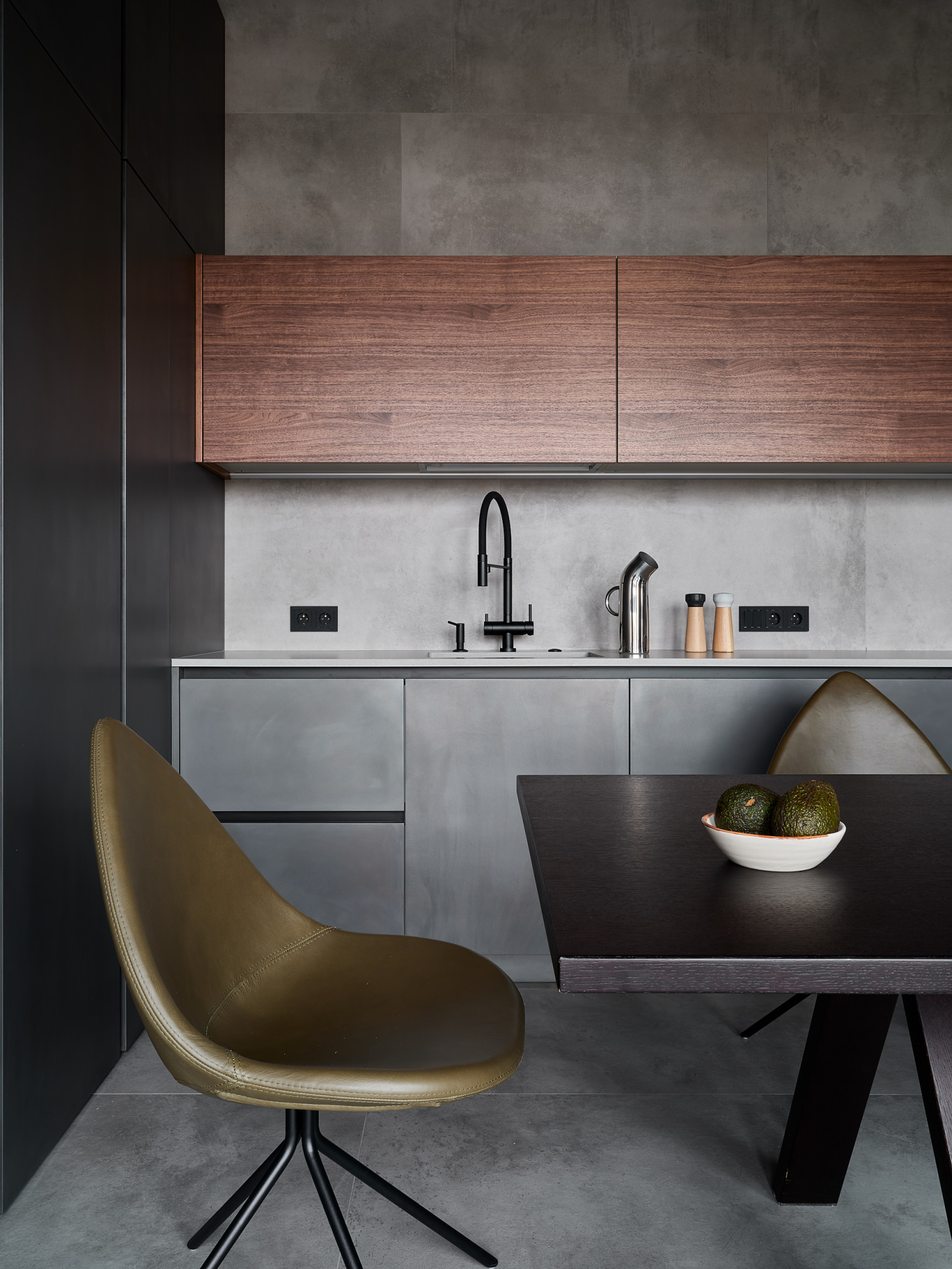
We made deep shelves with access from the left in the column cabinet which is adjacent to the tabletop. This is where the clients will store soda supplies for parties. We also organized a thoughtful storage system in the rest of the unit: there are shelves, drawers, and even a special place for storing sponges and towels in the module to the right of the sink.
A375 kitchen is part of our big work on the production of the entire interior of the apartment. At the end of the repair, we shot a video where we showed how this kitchen is arranged. We published this video on YouTube as well. Additional photos, layouts, and the estimate of this interior can be found on the project page.
 EGGER MDF with cobalt enamel
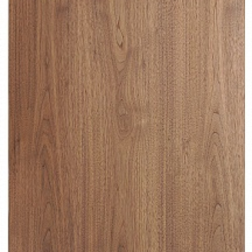 EGGER laminated chipboard со american walnut veneer
